The short answer: to take a website screenshot online, enter the page address in the free PromoPilot Website Screenshot tool, select the device—Desktop (approximately 1200 px wide) or Mobile (375 px)—and click "Capture." In a few seconds, you'll get a screenshot of the first screen and a PNG image below that you can download. No extensions or software are required. Below, we'll explain what to check in a screenshot, why it's important for SEO, and when you might need a different tool.
I've been making websites for 12 years and use online screenshots every week: to check how a client's landing page looks on a phone, to attach a "before" photo to a report, to show a contractor a broken block. I don't trust my browser for such things—it has cookies, a login to the admin panel, and a consent banner that's been closed for a long time.
What does the Website Screenshot tool do?
The main difference between an online screenshot and a screenshot on your computer is the clear view. A remote browser opens the page as a new visitor: without your cookies, authorization, or saved settings.
| Opportunity | How it works | Why does business need this? |
|---|---|---|
| Desktop mode | The image width is about 1200 px | It's clear what a person on a laptop sees without scrolling. |
| Mobile mode | The photo is 375 pixels wide, like a typical smartphone. | Mobile is the primary version for Google |
| The first screen and just below | Photo height up to ~1200 px | This is where it is decided whether the visitor will stay. |
| Download in PNG | A ready-made picture for a report or correspondence | No need to install extensions and trim manually |
| A new visitor's view | No cookies or account login | You can see banners, pop-ups, and everything else you haven't noticed for a long time. |
How to take a screenshot of a website online?
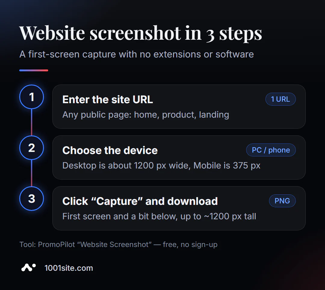
- Open Website Screenshot.
- Enter the address -
example.comor the full address of a specific page will suffice. - Select your device from the drop-down list: Desktop or Mobile.
- Click "Remove" and wait a few seconds.
- Download the PNG or open the image larger to see the details.
A good habit is to shoot both versions at once: first Desktop, then Mobile. The difference is often surprising.
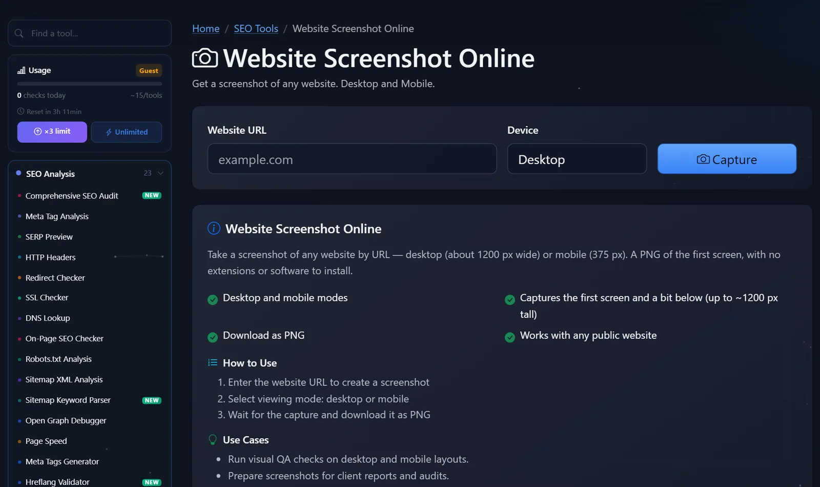
Limits: no more than 10 photos per minute, 15 per day for guests and 45 after free registration. If a photo of the same page has been taken recently, the tool can return a saved copy, which is stored for up to 24 hours.
What should I check in a website screenshot?
A screenshot is only useful if you know what to look for. My checklist for the first screen:
- Is it clear in three seconds what you're selling? The headline should answer the question "what is it and who is it for?" "Welcome!" isn't the answer.
- Is the action button visible? "Order," "Calculate Cost," "Write on Telegram "—on mobile, it should be on the first screen, not after three scrolls.
- Is the screen obscured by banners? A cookie banner, a subscription pop-up, and a chat widget combined can take up half the phone's screen. Google frowns on intrusive interstitial windows on mobile devices.
- Is the mobile layout broken? Text is spilling over the edges, buttons are overlapping, menus don't fit—a common issue after theme or plugin changes.
- Have the images loaded? Gray rectangles where photos should be are a sign of lazy loading, configured so that the first-screen images appear too late. This also worsens the LCP, one of Google performance metrics.
- Is the text legible? The light gray 12 px font on a white background is unreadable on a phone.
A practical tip: take screenshots of your competitors' homepage and two or three key pages in mobile mode and place them next to yours. This comparison is more convincing to a business owner than any report.
Why do I need a website screenshot for SEO?
The connection is direct. Google uses mobile-first indexing: the mobile version of a site is considered the primary ranking factor. If part of the content is hidden, doesn't load, or is obscured by windows on a phone, the search engine sees a truncated page.
Second, visitor behavior. Someone who came from a search and saw a full-screen banner or an incomprehensible first page quickly returns to the search results. A screenshot is the fastest way to see the page through their eyes and remove any distractions.
Third, reporting. "Before" and "after" photos of a redesign, layout correction, or initial screen change help explain to the client or manager what the money was spent on.
How to use screenshots when working with a contractor?
A screenshot is the best way to explain a problem without misunderstanding. "Something's wrong with my phone" becomes more specific when a photo with an arrow is attached to the message. A few tricks that save me hours of correspondence:
- Take photos with the address and device. In the photo caption, indicate the page and mode: "/catalog/, Mobile." The developer will immediately open the same app.
- Do a "before" and "after" routine. Capture the current view before making edits, and the new view after. This way, you can see the task is completed and nothing is broken.
- Collect a collection of photos before the redesign. A year from now, you'll have a clear picture of what the site looked like, which blocks were on the first page, and what changed with conversion.
- Compare with competitors at the same scale. The online tool captures all websites at the same width, ensuring a fair comparison.
This is especially convenient for regular client reports: screenshots of the first screen of key pages once a month show the work more clearly than a table.
Comparison: Online Screenshot and Alternatives
| Tool | What's free? | Restrictions | Who is it suitable for? |
|---|---|---|---|
| PromoPilot — Website Screenshot | The first screen in Desktop and Mobile versions, PNG, as seen by a new visitor | Only the first screen (~1200 px), you can't select the server country | Quick layout check and snapshots for reports |
| Chrome DevTools | Full page screenshot, cross-device emulation | You need to understand developer tools; the browser with your cookies | For developers and those who need the whole page |
| Google Search Console | A screenshot of the page as rendered by Google | Only for your verified site | Check what the search engine sees |
| PageSpeed Insights | Page Load Frames and Speed Metrics | The photos are small, the main goal is speed | Download speed analysis |
Conclusion: for everyday tasks—showing, comparing, and attaching to a report—an online screenshot is easier. If you need the entire page, use DevTools; if you care about how Google sees the page, use Search Console.
PromoPilot has 87 free SEO tools. If the screenshot shows that images are loading slowly, check out the adjacent article in the page speed analysis series.
What are the limitations of online screenshots?
It's worth knowing the limitations in advance so as not to be surprised by the result:
- Only the first screen and a little below - up to about 1200 px in height; the entire long page will not fit.
- Pages behind login, captcha, or geoblocking may be partially removed or covered up.
- The session after logging in is not emulated - you won't be able to access your personal account or shopping cart.
- You can't select the server country, so sites that display different content for different countries may look different to your visitors.
- 60-second timeout: If the page takes longer to load, the tool will show an error—and that's a reason to check the speed.
When is a free tool not enough?
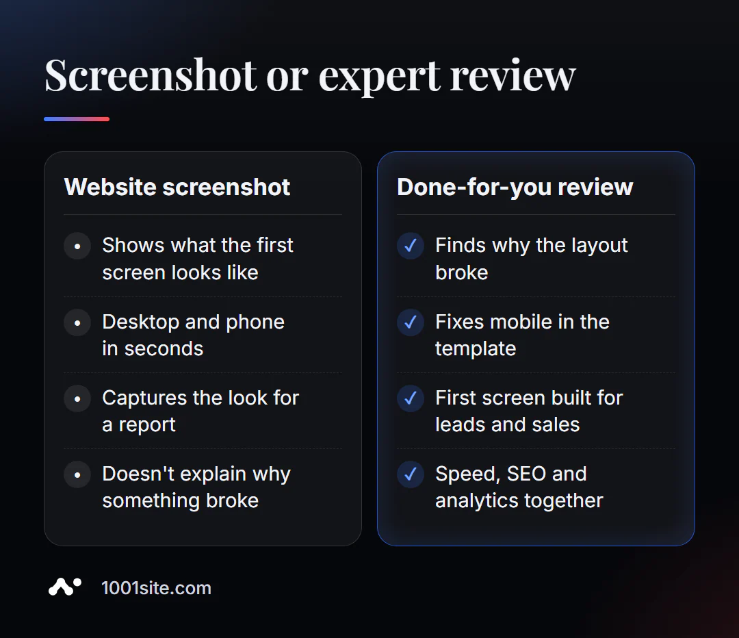
The screenshot shows the symptom: "everything on the phone is broken." But it doesn't tell you why it's broken or how to fix it so it doesn't break again. You need a specialist if:
- the mobile version breaks after every theme or plugin update;
- the first screen does not generate any requests and needs to be redesigned for a specific action;
- the site takes so long to load that there is no time to take a screenshot;
- It's easier to create a new website than to endlessly patch up an old one.
What can I do for your website?
I'm Valeriy Danyuk, a developer and SEO specialist with 12 years of experience and over 200 clients. I start almost every project with screenshots—of my client's website and their competitors'.
SEO and audit
- Turnkey website SEO audit: I check the mobile version, speed, indexing, and first-screen visibility, and correct any issues found in the code.
Websites and landing pages
- A website in the style of someone else's website you like can be created in minutes —all you need to do is show them an example you like.
- Landing page for a new product launched in one evening – NordHarvest case study.
- Tilda with a subscription fee or a website with AI and how much a turnkey website costs in 2026 – so you can choose an approach with your eyes open.
- At 1001site the website is built in the style of the world's best websites and is immediately adapted for mobile use.
Bots and AI services
- QuestFlow is a SaaS builder Telegram bots with AI.
- Vector-based AI reference book for equipment repairs with a bot.
Send me a mobile screenshot of your main page in Telegram - I'll tell you what's stopping a visitor from placing an order.
Result
- A website screenshot online shows the first page screen on a PC or phone through the eyes of a new visitor in seconds.
- Check the following on the screenshot: offer clarity, action button, banners, mobile layout, image loading, and readability.
- The mobile version is the main one for Google, so always remove both versions.
- If the layout breaks again and again, it's cheaper to rebuild the site—for example, on 1001site, where the mobile version is ready right away.
Take a mobile version of your homepage with a free online screenshot right now—and see it like a buyer.
Sources
- PromoPilot's "Online Website Screenshot" tool page — modes, limits, restrictions, and FAQ.
- Google Search Central - Documentation on mobile-first indexing.
- Chrome DevTools and Google PageSpeed Insights documentation.