
Substack
orange ink on the desk in the editorial office
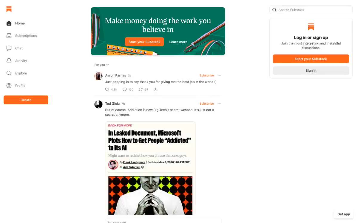
Substack looks like a well-worn newsroom dashboard—a white canvas, warm, almost black text, and a single bright orange accent marking each stage of content creation. The visual hierarchy is built on density rather than decoration: thin gray lines separate feed elements, avatars are small, metadata is muted, and the reader's eye is trained to focus on the orange call to action, orange logo, orange "Subscribe" link, and orange "Create" button. Surfaces are kept flat and unconstrained—no card shadows, no chrome panel elements—letting the typography (a compact chrome system UI element paired with a custom serif headline font) carry the brunt of the editorial weight. The signature style is restrained chrome elements and vibrant, single-color pops: a reading app that feels like a publishing tool.
A three-column desktop layout: a fixed left sidebar (~200px, navigation with icons and labels, sticky), a center feed (max width ~600px, vertically scrolling list of posts), and a fixed right sidebar (~300px, search + recommendations + registration). The center feed is the editorial core—no cards, just posts stacked on top of each other with thin dividers and 32px gaps between sections. The main banner sits at the top of the feed as a single full-width card. The left sidebar contains the brand logo (an orange sign with overlayed lines), six navigation items, and a full-width orange "Create" button at the bottom. The right sidebar contains a search field, a registration card, and an "Up Next" list for reading. Navigation is minimal—no top bar, no breadcrumbs; the sidebar IS the navigation. Content density is high: posts use 12-13px metadata and 15-19px body text, creating a newspaper-like rhythm rather than the feel of a marketplace's card grid.
Photos are user-generated content (author avatars, post thumbnails, post images)—Substack doesn't provide its own decorative photos. The main card uses a turquoise to green gradient with abstract illustrative elements (geometric shapes, stylized objects like pens and notes) as a background. Post thumbnails in the right sidebar are small (64px), enclosed in an 8px radius, and function as a preview of the reading list. The overall visual language is text-based: the interface is a reading canvas, and images serve as small visual anchors rather than creating atmosphere.
Palette
Brand
- Signal Orange
#ff6719— Orange is used as a secondary accent for decorative details and to highlight infrequent cues. It should not be used as the primary color for calls to action.
Neutral
- Ink
#363737— Body text—the main text, headings, post titles, timestamps, and author names; a warm, almost black color instead of pure #000 for easier reading. - Paper
#ffffff— The page canvas, card surfaces, input fields, and navigation background are the dominant surfaces that occupy the vast majority of the interface. - Charcoal
#232525— Hover state for additional text and links with high selection levels; deeper than Ink mode for code blocks and selection blocks. - Stone
#777777— A neutral color is supported for secondary UI elements, dividers, and muted labels. It should not be used as the primary color for calls to action. - Ash
#b6b6b6— Thin border lines, button outlines, icon outlines, borders on disabled controls. - Mist
#c8c8c8— Dividing lines, unobtrusive background for icons, filling empty cells in the form of a skeleton.
Typography
from 12 to 32px · 5 steps
- system-ui — replacement: -apple-system · outlines 400, 500, 600 · The primary font for the user interface and body text is used for navigation labels, buttons, message text, metadata, input fields, and all interface elements. Compact sizes of 12-13px for metadata and 15-19px for body text create the feeling of a dense news feed. The weight is 400 for body text, 500 for navigation elements and button labels, and 600 for highlighted message titles and section headings.
- Cahuenga — replacement: Charter · outlines 500 · A signature decorative serif font for product-level headings (sidebar headings, registration card headings, main text). Its medium weight and slight line height give it a distinguished appearance without feeling bulky; it's the only font that, besides the orange color, signals Substack's identity.
- Spectral — replacement: Charter · outlines 400 · A serif font for long posts—used in reading rooms and in newsfeed content to improve the readability of editorial materials. A slightly tighter line spacing (1.20) ensures comfortable paragraph reading while maintaining the compactness typical of newsrooms.
Intervals and form
| Purpose | Meaning |
|---|---|
| Density | dense |
| Basic step | 8px |
| Button radius | 9999px |
| Card radius | 12px |
| Shadows | no - borders instead of shadows |
| Between sections | 32px |
| Page width | 1200px |
AI will build your website in Substack style and fill it
- Fill with products and posts via the link - Instagram, TikTok, Facebook.
- Transfer content from your old site—just specify the address.
- Modern design on the best engine: React ( Next.js) with server rendering and SEO optimization out of the box.
- Fully automated SEO optimization for search results and neural network recommendations.
Similar styles
- ElevenLabs — A photo essay in warm cream tones with subtle headlines. A Bauhaus-style notebook—eggshell-colored paper, black ink, and a single purple and orange accent for product display.
- Awesomic — Editorial zinc mesh with orange punctuation marks reminiscent of confetti
- Monad — editorial technical journal on warm parchment
- Dub — Link's matte rice paper control panel
- Seline Analytics — A quiet analytical table on warm paper
- Notion — A warm paper notebook in the midday sun
- Anthropic — A scientific field journal on warm vellum—calm ivory surfaces, serifed editorial headings, and a single clay accent that appears only when action is needed.
- Calendly — Dark blue ink on cold marble
- Augen Pro — Apple's white presentation features a clinical, weightless, electric blue as the sole accent in a monochrome space.
- Antimetal — An editorial chronicle on cream paper—a quiet morning at a scientific journal, where restraint conveys confidence and serifs do the heavy lifting
- Perk — Electric lime on warm parchment paper
- Ditto — A sunlit workshop creating wildflower samples. Warm cream surfaces, a vibrant yellow base color, deep navy blue inks, organic color forms blooming behind the piece.