
Dub
Link's matte rice paper control panel
Dub's visual system has a restrained, almost editorial SaaS aesthetic: a near-white canvas held together by thin borders rather than protruding elements, with dense monochrome typography providing structural support and a single bright blue color (#2563eb) making a statement. Surfaces remain flat and frameless at first glance, but each container has a 1px #e5e5e5 margin, evoking the feel of a printed document. Personality is achieved through a small set of colored "pill" accents (orange, green, purple) that float above the neutral palette, and headers that feel confident and modern without being flashy. Components are compact and dense: 8px gutters, 12px card radius, pill-shaped labels at 9999px, and invisible controls instead of heavy, filled buttons.
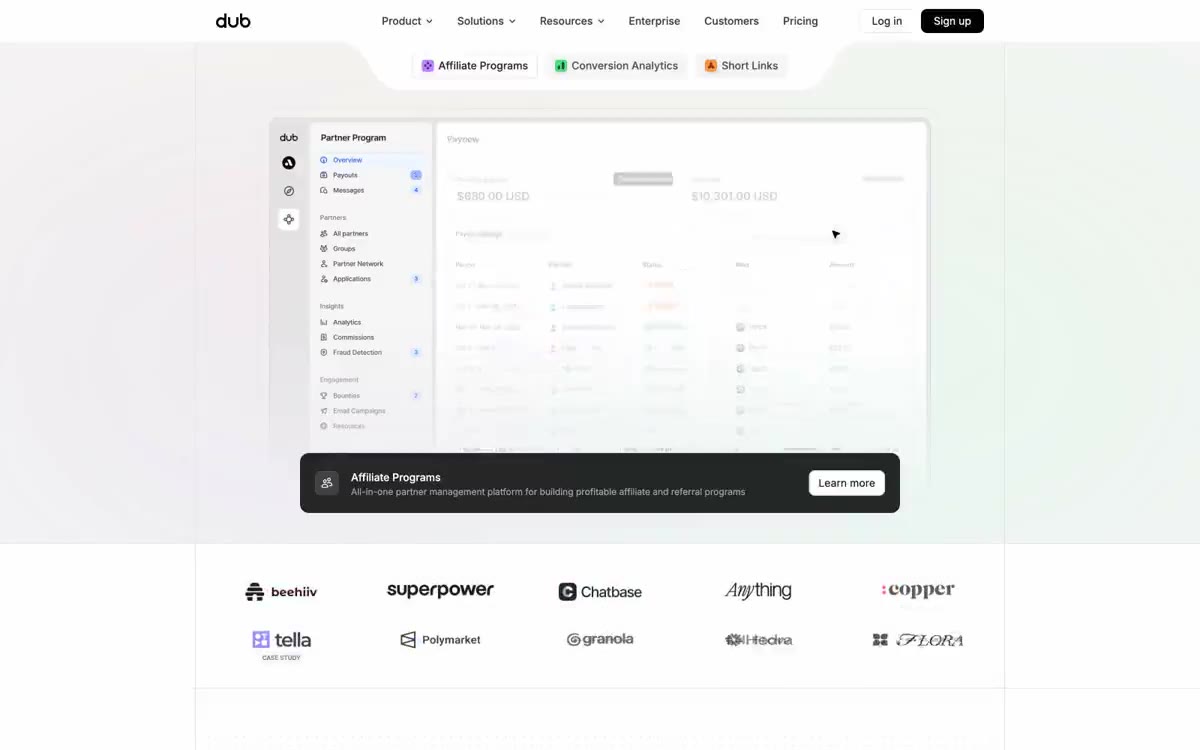
The page is built on a centered layout with a maximum width of approximately 1200px. The main element is a centered text block with three floating elements (Affiliate Programs, Conversion Analytics, Short Links) positioned horizontally above a large product layout. Sections are arranged vertically with consistent 64px gutters, alternating between white canvas and #f5f5f5 paper haze for tonal separation. The bottom section uses a Z-shaped layout: editorial text is centered in the middle third, and floating UI cards are anchored to the left and right margins, creating an asymmetrical, magazine-like rhythm. The logo cloud is a simple 5x2 grid, centered on the page. Navigation is a minimalist top bar—logo on the left, navigation in the center, a group of two buttons (a ghost "Login" button + a filled "Register" button) on the right—without a fixed or mega-menu. The main window's dashboard layout showcases a classic two-column app layout: a fixed sidebar (similar to 240px) + a content area that defines the density of product information for visitors before they start scrolling.
The visuals are product-focused, not lifestyle-focused. The main screen is centered on a large dashboard screenshot, representing a real-world product mockup with a sidebar navigation, data table, and floating UI elements, laid out as a flat panel on a white canvas. Client logos are displayed in a desaturated grayscale grid (beehiv, superpower, Chatbase, etc.) to acknowledge their social media performance, stripped of color to allow the single blue accent of the page to remain dominant. Floating partner cards (small profiles and tiles with revenue/payment data) move around blocks of editorial text at the bottom, creating a sense of depth without the use of shadows on the text itself. The dotted grid background pattern is a signature feature: a thin row of small dots with very low opacity creates texture and the feel of a design system/drawing surface, emphasizing the site's positioning as a "modern link attribution platform." The iconography is minimal, with outlines and fills, and uses an accent palette (tangerine orange, lavender purple, mint green) for feature tags. No photographs, illustrations, or 3D models are used—the product's user interface itself is a visual language.
Palette
Brand
- Electric Blue
#2563eb— The primary brand color—the logo, links, key performance indicators, active states, and icon accents—is used. A rich blue on a white background creates the system's only visual appeal. - Deep Sapphire
#1e40af— The main background of the action button, the bold fill of the call to action—the only color denoting the action—is used sparingly to attract attention.
Neutral
- Canvas White
#ffffff— Page background, card surface, pop-up panels are the absolute foundation of every screen. - Paper Mist
#f5f5f5— Subtle hover color changes for nested cards, additional panels, and fills. - Ash
#e5e5e5— The thin borders on the cards, input connectors and dividers are the structural line that holds the system together. - Smoke
#d4d4d4— Sharper borders for selected containers and additional button outlines. - Pebble
#c8c8c8— Borders, control outlines, and structural dividers with medium contrast. This color should not be used as the primary color for calls to action. - Midnight Ink
#0a0a0a— The main text of the buttons, highlighted buttons, and navigation text are almost black for maximum contrast.
Typography
from 11 to 48px · 9 steps
- Satoshi — replacement: Inter (weight 500 · outlines 500 · Display Headings – used only in 36–48px lines for heading and section titles. Font weight – 500 (medium, not bold): Headings look confident and modern, but never overpowering. Satoshi's geometric proportions give the typeface a slightly editorial, modern feel that Inter's body copy can't replicate.
- Inter — replacement: Inter (native) · outlines 400, 500, 600 · Body copy, UI labels, navigation, subheadings, and minor headings. Inter is the primary workhorse, handling everything from 11px micro-labels to 30px secondary headings. A weight of 400 is the default for body copy, 500 for highlighted elements and button labels, and 600 is reserved for important UI labels. 16px with a line height of 1.5 is the most frequently encountered single-step size (1220 occurrences), confirming that 16px is the canonical body copy size.
- Geist Mono — replacement: JetBrains Mono or IBM Plex Mono · outlines 400, 500 · Code snippets, technical metadata, and embedded monospaced tokens are used in code blocks at 12–14px and in large code display elements at 24px. This ensures the developer tool's credibility, consistent with Dub's product positioning.
Intervals and form
| Purpose | Meaning |
|---|---|
| Density | average |
| Basic step | 8px |
| Button radius | 8px |
| Card radius | 12px |
| Shadows | no - borders instead of shadows |
| Between sections | 64px |
| Page width | 1200px |
AI will build your website in Dub style and fill it
- Fill with products and posts via the link - Instagram, TikTok, Facebook.
- Transfer content from your old site—just specify the address.
- Modern design on the best engine: React ( Next.js) with server rendering and SEO optimization out of the box.
- Fully automated SEO optimization for search results and neural network recommendations.
Similar styles
- ElevenLabs — A photo essay in warm cream tones with subtle headlines. A Bauhaus-style notebook—eggshell-colored paper, black ink, and a single purple and orange accent for product display.
- Awesomic — Editorial zinc mesh with orange punctuation marks reminiscent of confetti
- Monad — editorial technical journal on warm parchment
- Seline Analytics — A quiet analytical table on warm paper
- Notion — A warm paper notebook in the midday sun
- Anthropic — A scientific field journal on warm vellum—calm ivory surfaces, serifed editorial headings, and a single clay accent that appears only when action is needed.
- Calendly — Dark blue ink on cold marble
- Augen Pro — Apple's white presentation features a clinical, weightless, electric blue as the sole accent in a monochrome space.
- Antimetal — An editorial chronicle on cream paper—a quiet morning at a scientific journal, where restraint conveys confidence and serifs do the heavy lifting
- Perk — Electric lime on warm parchment paper
- Ditto — A sunlit workshop creating wildflower samples. Warm cream surfaces, a vibrant yellow base color, deep navy blue inks, organic color forms blooming behind the piece.
- Officevibe — An editorial magazine on warm cream-colored paper. Imagine a thoughtful essay on HR management, presented as a product—a cursive serif font whispering through a modern blue interface.