
Seline Analytics
A quiet analytical table on warm paper
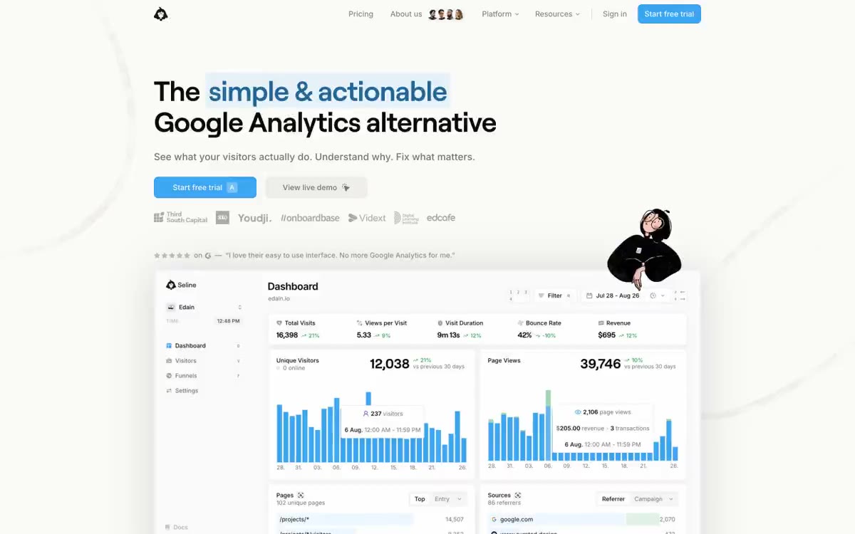
Seline is set against a warm stone background (#fafaf9) with a single vibrant blue accent—all other colors are neutral and drawn from the Tailwind stone color palette. Headlines are rendered in a custom-designed geometric sans-serif font (roobert) with a weight of 400 and narrow negative letter spacing, lending the text a leisurely, almost whisper-like confidence that contrasts with the typically loud SaaS style. UI surfaces are flat white cards, floating above the warm background with a single, soft, 16px blur; borders are created with thin, 1px stone-toned lines, generously used as the primary structural element in lieu of heavy dividers or panels. The layout breathes: full-width content centered on a generous vertical rhythm, with pill-shaped interactive controls, a mascot illustration for personality, and dashboard screenshots as product proof. The overall impression is editorially analytical: calm, monochrome, confident, with the blue call to action being the most striking element on the page thanks to the deliberate restraint of everything else.
The page is max-width, centered at approximately 1200px with plenty of vertical space. The hero is a two-line, left-aligned block of text with a single, highlighted phrase ("simple and effective") in blue, followed by a row with two calls to action (blue pill + ghost pill), then a row of partner logos in grayscale, then a row of trust ratings, and then a full-width floating dashboard preview, slightly overlapping the next section. Below the fold are alternating rows of testimonials in a single-column grid, followed by full-width sections with feature descriptions, left-aligned text, and centered product visuals. The navigation is a minimalist top bar—logo on the left, centered navigation links, login + blue call to action on the right—with a floating cluster of avatars in the middle of the navigation serving as identity verification. The spaces between sections are wide (96px) to create an editorial rhythm rather than a dense jumble of information.
The visual language is dominated by screenshots of the product's user interface—the dashboard preview is a photograph rendered with a grayscale (1) (0.94) contrast filter, which mutes the colors of the data to a monochrome hue. The only human figure is a linear mascot sticker (a hooded character), drawn in SVG style with outlines only, placed once per section as a playful counterpoint to the analytical content, with a soft shadow to create a sticker-like effect of depth. The brand logo and glyphs are small black sparks/flames. There are no photographs—no lifestyle shots, no team photos, no environmental images. The object (the dashboard) is the protagonist. All decorative icons are 1px outline style in either #0c0a09 or #3ba6f1, never filled.
Palette
Brand
- Cyan Signal
#3ba6f1— The main call to action, active links, and outline of brand icons are the only color accents on the page, used sparingly to draw attention to the action. - Cyan Edge
#3398e1— Blue is used to highlight action outlines, link labels, and interactive elements. It should not be used as the primary color for calls to action.
Neutral
- Ink Black
#0c0a09— Main headings, highlighted body text, and expressive icons are in a warm, almost black color. - Stone Canvas
#fafaf9— The page background is a warm, creamy shade that feels like paper rather than the white of a screen. - Pure White
#ffffff— Map surfaces, protruding panels, and input field fills are flat and shadowless by default. - Stone Border
#e8e6e5— Thin borders on cards, navigation, and input fields are the primary structural element, not separators. - Stone Muted
#d6d3d1— Additional frames, subtle background shades, decorative dividers. - Ash Gray
#a8a29e— Help text, icon outlines, disabled states - readable but inactive.
Typography
from 10 to 52px · 5 steps
- Roobert — replacement: Inter Tight or Satoshi · outlines 400, 500 · The font for headings and text layout is a unique geometric sans-serif with minimal negative letter spacing (-0.025em at 32px, -0.021em at 52px). The 400 x 52px weight is the font's signature: unconventional, subtle, yet authoritative, yet understated. Headlines occupy their place without being overbearing.
- Inter — replacement: Inter · outlines 400, 500, 600 · The primary font for body text, navigation, UI, and headings is a neutral, universal font for all off-screen text. 14px with a weight of 400 and a line spacing of 1.64 is the predominant size for body text (frequency 1174). Positive letter spacing (0.004em) at small sizes ensures readability of dense UI.
Intervals and form
| Purpose | Meaning |
|---|---|
| Density | spacious |
| Basic step | 8px |
| Button radius | 9999px |
| Card radius | 10px |
| Shadows | soft shadows |
| Between sections | 96px |
| Page width | 1200px |
AI will build your website in Seline Analytics style and fill it
- Fill with products and posts via the link - Instagram, TikTok, Facebook.
- Transfer content from your old site—just specify the address.
- Modern design on the best engine: React ( Next.js) with server rendering and SEO optimization out of the box.
- Fully automated SEO optimization for search results and neural network recommendations.
Similar styles
- ElevenLabs — A photo essay in warm cream tones with subtle headlines. A Bauhaus-style notebook—eggshell-colored paper, black ink, and a single purple and orange accent for product display.
- Awesomic — Editorial zinc mesh with orange punctuation marks reminiscent of confetti
- Monad — editorial technical journal on warm parchment
- Dub — Link's matte rice paper control panel
- Notion — A warm paper notebook in the midday sun
- Anthropic — A scientific field journal on warm vellum—calm ivory surfaces, serifed editorial headings, and a single clay accent that appears only when action is needed.
- Calendly — Dark blue ink on cold marble
- Augen Pro — Apple's white presentation features a clinical, weightless, electric blue as the sole accent in a monochrome space.
- Antimetal — An editorial chronicle on cream paper—a quiet morning at a scientific journal, where restraint conveys confidence and serifs do the heavy lifting
- Perk — Electric lime on warm parchment paper
- Ditto — A sunlit workshop creating wildflower samples. Warm cream surfaces, a vibrant yellow base color, deep navy blue inks, organic color forms blooming behind the piece.
- Officevibe — An editorial magazine on warm cream-colored paper. Imagine a thoughtful essay on HR management, presented as a product—a cursive serif font whispering through a modern blue interface.