
Notion
A warm paper notebook in the midday sun
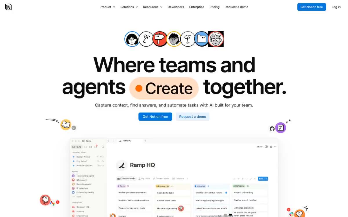
Notion's interface looks like a beloved paper notebook in broad daylight: a warm, creamy canvas (#f6f5f4) that feels tactile rather than sterile, generous sans-serif typography lending editorial weight to the product copy, and color used as sparse punctuation—peach "pills" highlight verbs, a single blue anchors the main action, and a rotating array of accent hues (coral, amber, sky, midnight) color the card backgrounds like stickers. Cards are arranged on a canvas with thin borders and corners—no shadows, no chrome—like the lined sections of a Moleskine notebook. Animation is playful and springy, with smooth transitions at 200ms and springy character animations that bring life to the interface without being decorative.
Centered, the maximum width is limited to approximately 1440px. The main element is a centered stack: a row of symbols → a large two-line headline with an embedded colored pill → a subheading → a row with two call-to-action buttons → a large product UI mockup. Below the main element, sections alternate between grids of white cards and full-color accent panels. The logo wall is a centered single-row grid of partner logos in grayscale. The feature blocks use a two-column layout (text on the left, colored panel on the right), alternating left to right between sections. The "Ask your assistants on demand" section uses a 2x2 card grid, where the top card takes up the full width, and the bottom row is divided into two equal columns. The gutters between sections are generous (~80px), creating a calm vertical rhythm. The navigation is a fixed 64px tall top bar with centered navigation elements and right-aligned action buttons.
Illustrations are paramount, with no photos. The visual language is built on flat, illustrated symbols (rounded edges in 2px colored circles), abstract decorative elements (hand-drawn squiggles, glitter, arrows, flower shapes), and mockups of the product's user interface. The symbols appear in the main window as a horizontal row of seven avatars and are scattered across the page as playful punctuation. Product screenshots are the only "real" visual elements: they show the actual Notion interface (Kanban boards, document views, AI agent panels) with a full set of elements and real data. The product mockup in the main window is large, centered, and casts a single shadow separating it from the canvas. There are no lifestyle photos, no stock images, no abstract 3D renders.
Palette
Brand
- Notion Blue
#0075de— The main element filling the call-to-action (CTA) button, an accent in the active navigation, filled action buttons are the only color scheme in a nearly monochrome system that is saturated enough to be perceived as a switch.
Neutral
- Paper Warmth
#f6f5f4— The page canvas, main window background, and section background are all warm, slightly beige colors that give the system a tactile, analog feel. - Pure White
#ffffff— Card surfaces, raised panels, logo background, contrasting text on dark cards. - Ink Black
#000000— Main text, navigation links, headings - used with different transparency (100%, 95%, 90%, 60%, 40%, 20%) to build hierarchy without adding new colors. - Charcoal
#111111— A dark text option for those UI areas where pure black would look too harsh. - Stone
#757575— Secondary navigation text, muted helper text, disabled button labels - 60% ink alpha - Graphite
#615d59— The main text has a warm tone - brownish gray, which harmonizes with the warm background.
Typography
from 12 to 96px · 10 steps
- NotionInter — replacement: Inter · outlines 400, 500, 600, 700 · The main sans-serif font is a geometric humanist with subtle nuances, used at sizes 400 for body text, 500 for navigation/user interface, and 600-700 for headings. The font scale uses aggressive negative letter spacing at larger sizes (-4.6px at 96px, -2px at 72px), which makes the heading feel more compact and confident, rather than airy.
- Lyon Text — replacement: Source Serif Pro · outlines 400 · The editorial serif font, reserved for individual sections of the main text and section introductions, is used sparingly (four times) to give the typeface literary weight, similar to a quote in a magazine layout. It functions as a systemic accent rather than a parallel hierarchy.
Intervals and form
| Purpose | Meaning |
|---|---|
| Density | average |
| Basic step | 8px |
| Button radius | 8px |
| Card radius | 12px |
| Shadows | no - borders instead of shadows |
| Between sections | 80px |
| Page width | 1440px |
AI will build your website in Notion style and fill it
- Fill with products and posts via the link - Instagram, TikTok, Facebook.
- Transfer content from your old site—just specify the address.
- Modern design on the best engine: React ( Next.js) with server rendering and SEO optimization out of the box.
- Fully automated SEO optimization for search results and neural network recommendations.
Similar styles
- ElevenLabs — A photo essay in warm cream tones with subtle headlines. A Bauhaus-style notebook—eggshell-colored paper, black ink, and a single purple and orange accent for product display.
- Awesomic — Editorial zinc mesh with orange punctuation marks reminiscent of confetti
- Monad — editorial technical journal on warm parchment
- Dub — Link's matte rice paper control panel
- Seline Analytics — A quiet analytical table on warm paper
- Anthropic — A scientific field journal on warm vellum—calm ivory surfaces, serifed editorial headings, and a single clay accent that appears only when action is needed.
- Calendly — Dark blue ink on cold marble
- Augen Pro — Apple's white presentation features a clinical, weightless, electric blue as the sole accent in a monochrome space.
- Antimetal — An editorial chronicle on cream paper—a quiet morning at a scientific journal, where restraint conveys confidence and serifs do the heavy lifting
- Perk — Electric lime on warm parchment paper
- Ditto — A sunlit workshop creating wildflower samples. Warm cream surfaces, a vibrant yellow base color, deep navy blue inks, organic color forms blooming behind the piece.
- Officevibe — An editorial magazine on warm cream-colored paper. Imagine a thoughtful essay on HR management, presented as a product—a cursive serif font whispering through a modern blue interface.