
ElevenLabs
A photo essay in warm cream tones with subtle headlines. A Bauhaus-style notebook—eggshell-colored paper, black ink, and a single purple and orange accent for product display.
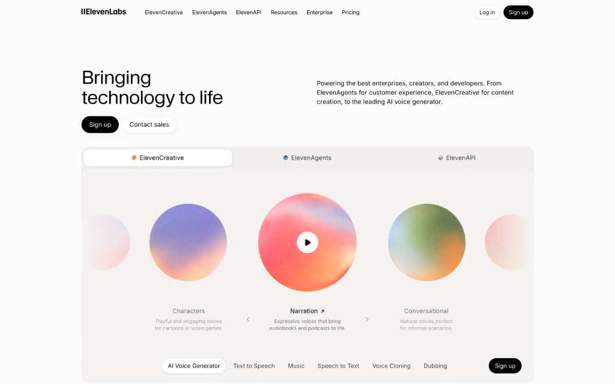
ElevenLabs works in a warm, white minimalist style: an eggshell-colored canvas (#fdfcfc) with black type and a single layer of warm taupe surfaces (#f5f3f1). The brand identity is quiet and confident—the barely distinguishable Waldenburg 300 typeface highlights the headlines with extreme clarity (-0.02em), while Inter 400/500 gives everything else a calm neutrality. Two accent colors—vibrant purple #0447ff and vibrant orange #ff4704—pop only within the product's visual elements (audiospheres, product icons), never as chrome in the UI. Components remain flat or slightly raised with thin 1px borders, wide 20px radii on cards, and fully filled 9999px buttons. The system is reminiscent of a Bauhaus studio on cream paper: restrained, editorial and technically precise.
Full-width sections are arranged vertically in a single, maximum-width central column with 1280px outer gutters. The main section is asymmetrical: the heading is left-aligned at the 48px Waldenburg level, the description text is right-aligned, and two pill-shaped buttons are located below the heading. Below the main section is a large tabbed navigation bar that spans the entire content width. Sections alternate between eggshell-colored and taupe backgrounds with vertical gutters of 96–125px. The footer is a compact, single strip. Navigation is a minimalist top bar—no fixed behavior, no mega-menus. The content rhythm matches the editorial style: plenty of white space, one main visual element per section, and no card grids under the "Trust" section.
The visual design is dominated by a color scheme: large gradients in the form of soft audio spheres (200px+ circles with radial transitions from purple to orange and pink) serve as the main graphic element. Logos in the "Trust" section are presented in a low-contrast grayscale against a matte canvas background. Photography is minimal—there are no lifestyle or product photos. The iconography is sparse and monochrome (black outline or filled icons, no chromatic icons). The visual system is more reminiscent of a design publication than a product catalog—editorial restraint prevails over marketing impact.
Palette
Brand
- Violet Spark
#0447ff— Product Visual Emphasis - Appears only within audio sphere illustrations and decorative product icons; never used for interface elements.
Neutral
- Eggshell
#fdfcfc— The page canvas, button surfaces, and card surfaces are warm, slightly creamy, rather than stark white, to avoid digital glare and give the site the calm of paper. - Warm Taupe
#f5f3f1— Divider strips, decorative cards and an additional surface level – one step deeper than the matte surface – create a quiet, borderless separation. - Stone
#ebe8e4— Thin borders, dividers, and icon backgrounds are a warm gray that sits between taupe and medium gray without feeling cold. - Ink
#000000— Whether it's body text, filled buttons, navigation, or links, pure black serves as the foundation for a warm color palette and creates the only sharp contrast in the system. - Graphite
#44403b— Body text, section headings - a subtle warm dark gray for text that needs to be punchy without the harshness of black. - Smoke
#777169— The main text, discreet descriptions, and captions are in a medium-warm gray; the dominant, readable, yet calm style of the cards and thematic texts.
Typography
from 10 to 48px · 8 steps
- Waldenburg — replacement: Inter (300) or Söhne Light · outlines 300 · For headings and design elements only. Used in 48/36/32px formats with a font weight of 300—an ultra-light font is unconventional; most websites use 600-700; this subtle font conveys authority through restraint. Tight letter spacing of -0.02em creates a closer fit between letters at larger sizes. Alternatives: "Inter" in 300 weight or "Söhne" in light weight as a premium alternative.
- Inter — replacement: Inter or system-ui · outlines 400, 500 · Everything off-screen: body text, navigation, buttons, links, labels, input fields, cards. 400 is the default weight; 500 is reserved for buttons and highlighted links. Sizes range from 10 to 10, with reduced line spacing (1.47–1.6), giving paragraphs room to breathe. A small letter spacing of +1 (2) at sizes from 14 to 3 improves legibility at small sizes.
- Geist Mono — replacement: JetBrains Mono or IBM Plex Mono · outlines 400 · Microtext located next to code or technical text, positioned at 13px—rarely used (frequency = 28) for technical labels or metadata. Single layer, large line height of 1.69.
Intervals and form
| Purpose | Meaning |
|---|---|
| Density | dense |
| Basic step | 8-16px |
| Button radius | 9999px |
| Card radius | 20px |
| Shadows | no - borders instead of shadows |
| Between sections | 96-125px |
| Page width | 1280px |
AI will build your website in ElevenLabs style and fill it
- Fill with products and posts via the link - Instagram, TikTok, Facebook.
- Transfer content from your old site—just specify the address.
- Modern design on the best engine: React ( Next.js) with server rendering and SEO optimization out of the box.
- Fully automated SEO optimization for search results and neural network recommendations.
Similar styles
- Awesomic — Editorial zinc mesh with orange punctuation marks reminiscent of confetti
- Monad — editorial technical journal on warm parchment
- Dub — Link's matte rice paper control panel
- Seline Analytics — A quiet analytical table on warm paper
- Notion — A warm paper notebook in the midday sun
- Anthropic — A scientific field journal on warm vellum—calm ivory surfaces, serifed editorial headings, and a single clay accent that appears only when action is needed.
- Calendly — Dark blue ink on cold marble
- Augen Pro — Apple's white presentation features a clinical, weightless, electric blue as the sole accent in a monochrome space.
- Antimetal — An editorial chronicle on cream paper—a quiet morning at a scientific journal, where restraint conveys confidence and serifs do the heavy lifting
- Perk — Electric lime on warm parchment paper
- Ditto — A sunlit workshop creating wildflower samples. Warm cream surfaces, a vibrant yellow base color, deep navy blue inks, organic color forms blooming behind the piece.
- Officevibe — An editorial magazine on warm cream-colored paper. Imagine a thoughtful essay on HR management, presented as a product—a cursive serif font whispering through a modern blue interface.