
Calendly
Dark blue ink on cold marble
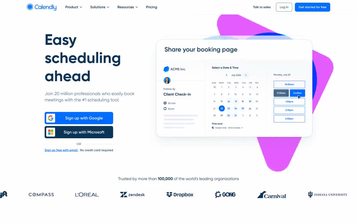
Calendly feels like a calm, confident planning workspace: a near-white canvas with plenty of breathing room, crisp white product cards floating against a cool gray background, and all typography rendered in a dark blue ink rather than pure black. The defining element is the dark blue color (#0b3558), used everywhere text appears—headlines, buttons, icons, links—which softens the entire interface, making it warmer and more stylish than the typical SaaS landing page. A single bright blue (#006bff) is used for all primary actions, and decorative pink and blue splashes extending beyond the product layouts add warmth without creating clutter. Components are kept understated: thin 1px borders, subtle blue-tinted shadows, large 24px card radii, and 8px button corners feel deliberate rather than bland.
Maximum width 1200px, centered, with wide margins on desktop. The main screen is divided into two columns: the left column contains an 80px header + body text + stacked login buttons, while the right column contains a booking widget card with decorative elements in the background. Below the main screen is a single, full-width stripe with the Trust logo. Subsequent sections alternate between centered header blocks (H2 + subtext + optional call to action), followed by two-column blocks describing features (text left/product right or product left/text right) with decorative accent elements behind each product image. Card grids are rarely used—the layout favors paired sections placed side by side rather than multi-column grids. The spacing between sections ranges from 48 to 64px. The navigation is a 64px fixed top bar with the logo on the left, a centered menu, and a group of calls to action on the right.
The main visual element is product screenshots—simple mockups of the booking calendar user interface, rendered on crisp white cards with wide, rounded corners. Decorative design: each product card is surrounded by a soft spot of coral purple (#e55cff) or azure blue (#0099ff), slightly offset and blurred, creating a collage effect rather than a flat screenshot. No photographs, no lifestyle images—all visual elements represent the product user interface, abstract accent shapes, or monochrome partner logos on the trust bar. Icons are linear with a line width of 1.5–2px, monochrome, in dark blue (Ink Navy) or blue (Signal Blue).
Palette
Brand
- Ink Navy
#0b3558— Main text, headings, icons, dark background for calls to action, navigation links. - Signal Blue
#006bff— Primary call to action (CTA), active navigation, link emphasis, selected states
Neutral
- Carbon
#0a0a0a— Text in pure black (fallback), logo glyph, icon fill. - Slate Gray
#476788— Additional main text, supporting text, muted labels. - Mist Gray
#a6bbd1— Disabled text, inactive function labels, light icon outlines - Cloud
#f8f9fb— Page canvas, footer background, extra surface - Paper
#ffffff— Card surfaces, raised panels, button text on a dark background. - Pebble
#f0f3f8— Background images for icons, input field shading, subtle separators, hover effects.
Typography
from 12 to 80px · 10 steps
- Gilroy — replacement: Manrope · outlines 400, 500, 600, 700 · All interface text. Gilroy is a geometric humanist sans-serif with wide apertures and uniform stroke contrast; its bold weights (700) are used for headings, while 500–600 are used for buttons and subheadings. Replace with Manrope or Inter.
- Gilroy — replacement: Inter · outlines 400 · Body text and general-purpose UI labels - 400-point font weight ensures long texts are legible without feeling heavy.
- Gilroy — replacement: Inter · outlines 500 · Secondary headings and highlighted body text - 14/500 font is the primary tool for card headings and inline labels.
Intervals and form
| Purpose | Meaning |
|---|---|
| Density | dense |
| Basic step | 8-16px |
| Button radius | 8px |
| Card radius | 24px |
| Shadows | no - borders instead of shadows |
| Between sections | 48-64px |
| Page width | 1200px |
AI will build your website in Calendly style and fill it
- Fill with products and posts via the link - Instagram, TikTok, Facebook.
- Transfer content from your old site—just specify the address.
- Modern design on the best engine: React ( Next.js) with server rendering and SEO optimization out of the box.
- Fully automated SEO optimization for search results and neural network recommendations.
Similar styles
- ElevenLabs — A photo essay in warm cream tones with subtle headlines. A Bauhaus-style notebook—eggshell-colored paper, black ink, and a single purple and orange accent for product display.
- Awesomic — Editorial zinc mesh with orange punctuation marks reminiscent of confetti
- Monad — editorial technical journal on warm parchment
- Dub — Link's matte rice paper control panel
- Seline Analytics — A quiet analytical table on warm paper
- Notion — A warm paper notebook in the midday sun
- Anthropic — A scientific field journal on warm vellum—calm ivory surfaces, serifed editorial headings, and a single clay accent that appears only when action is needed.
- Augen Pro — Apple's white presentation features a clinical, weightless, electric blue as the sole accent in a monochrome space.
- Antimetal — An editorial chronicle on cream paper—a quiet morning at a scientific journal, where restraint conveys confidence and serifs do the heavy lifting
- Perk — Electric lime on warm parchment paper
- Ditto — A sunlit workshop creating wildflower samples. Warm cream surfaces, a vibrant yellow base color, deep navy blue inks, organic color forms blooming behind the piece.
- Officevibe — An editorial magazine on warm cream-colored paper. Imagine a thoughtful essay on HR management, presented as a product—a cursive serif font whispering through a modern blue interface.