
Stripe
An account book written in indigo ink on frosted glass
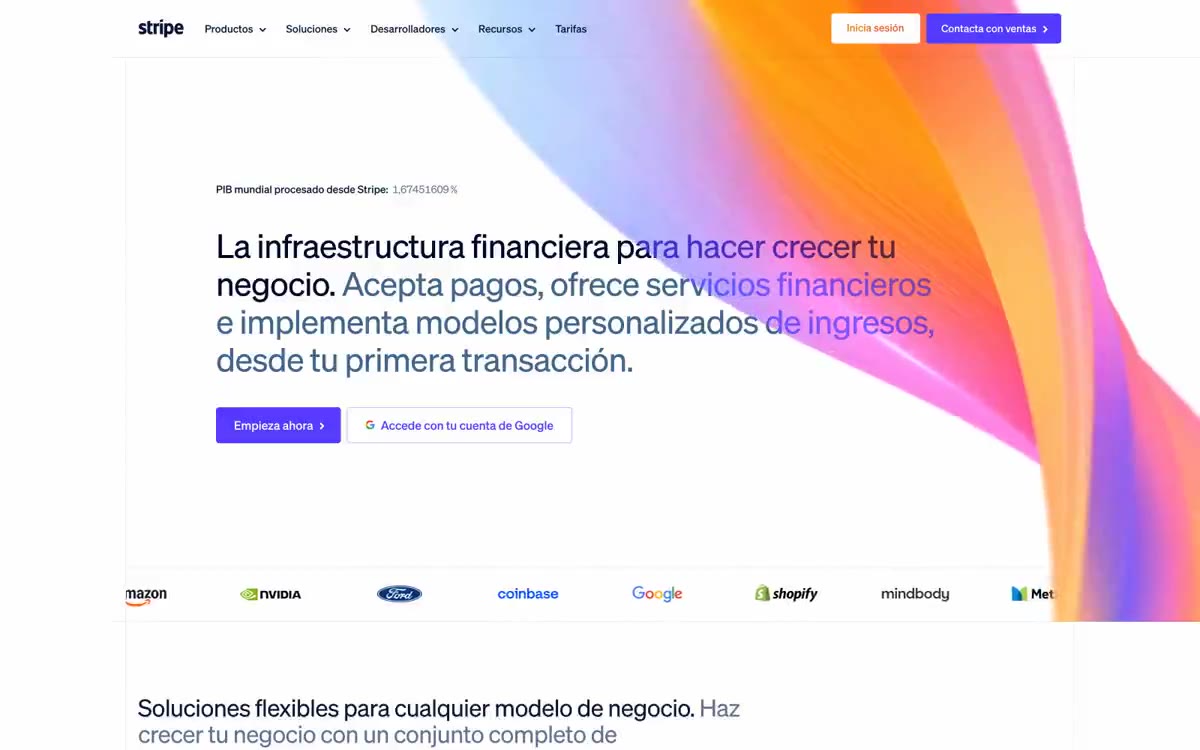
Stripe uses a nearly monochrome language for financial instruments: a soft, cool white canvas with dark blue headings, almost no decorative chrome elements, and a single bright indigo (#533afd) that could legitimately be used as a button, link, or icon outline. The typography is exceptionally thin, with a 300-point weight—even at 56px—which feels confidently understated rather than overtly corporate; the letter spacing decreases sharply with increasing size. Buttons are small, square (4px), and use purple fills or the thinnest purple outlines. The system completely avoids shadows; depth is achieved through changing background hues (white → #f8fafd → #e5edf5 → purple hues), rather than through elevation. The entire interface behaves like an accounting ledger or a terminal: dense information, clear lines, ample space between sections, and color appears only when an action is required.
The maximum width is ~1320px for a centered content column on a white canvas. The hero is a left-aligned text block at full size (56px) with two calls to action below, no hero image—the typography IS the hero. Sections are arranged vertically with equal 96px gutters and 1px #e5edf5 dividers; there are no alternating dark/light stripes. Each section follows a repeating pattern: a small section title in all caps (smoky color, 12px), then a 32-48px heading, then a 22px paragraph, then a grid of product cards (3 columns on desktop) or a 2-column text block with visual art. Client logos appear in a narrow vertical strip, left-aligned. The footer is one wide #f8fafd strip with multi-column lists of links. The overall rhythm is slow, measured, and predominantly textual—information density is low, despite the long scroll length.
The imagery is restrained and documentary-style. Full-page photos appear only in sections featuring case studies (e.g., aerial traffic photography for Hertz), shot from above or at dramatic angles, using natural colors—no duotone or color processing. Screenshots of the product's user interface are used within feature cards, rendered with sharp angles and clear borders, without device frames. Partner logos are displayed in their own colors, without any containers. There are no illustrations, 3D renders, or decorative abstract graphic elements. Icons are uniform: line weight 1, line weight 2 on a white background, with geometric line art (chevrons, arrows, checkmarks, document symbols). The page consists primarily of text and white space; images occupy less than 3% of the total visual area.
Palette
Brand
- Indigo Ink
#533afd— Purple is used for filled buttons, selected navigation states, and focus-driven conversion moments. - Indigo Hover
#7389ff— Purple is used to highlight links, tags, and short phrases. It should not be used as the primary color for calls to action.
Neutral
- Midnight Ink
#061b31— The main heading and body text are a deep, almost black color with a cool blue tint, which serves as the basis for the entire font system. - Slate
#64748d— Gray text highlights links, tags, and short phrases. - Steel
#50617a— Additional text and supporting materials are positioned between the slate and muted purple tones used on sublicenses. - Smoke
#839bc8— For large decorative headings and accompanying text, a muted purple shade is used - never in body paragraphs. - Pure White
#ffffff— The page canvas and raised surfaces of cards; the default background against which everything else is measured. - Mist
#f8fafd— The footer background and section divider are a subtle cool shade that separates areas without a visible border.
Typography
from 12 to 56px · 9 steps
- sohne-var — replacement: Inter Tight (variable · outlines 300, 400 · The only font used in the entire interface is for headings, body text, navigation, buttons, and labels. The 300 weight prevails even at a screen size of 56px, which is a distinctive feature: headings whisper rather than shout, establishing authority through restraint rather than volume. The 400 weight appears only at 14–16px for navigation and button text, where an extra stroke is required for legibility at smaller sizes.
Intervals and form
| Purpose | Meaning |
|---|---|
| Density | spacious |
| Basic step | 8px |
| Button radius | 4px |
| Card radius | 4px |
| Shadows | no - borders instead of shadows |
| Between sections | 96px |
| Page width | 1320px |
AI will build your website in Stripe style and fill it
- Fill with products and posts via the link - Instagram, TikTok, Facebook.
- Transfer content from your old site—just specify the address.
- Modern design on the best engine: React ( Next.js) with server rendering and SEO optimization out of the box.
- Fully automated SEO optimization for search results and neural network recommendations.
Similar styles
- Ui — clinical plan on matte paper
- monopo saigon — A liquid, iridescent glow behind the editorial silence—a monochrome editorial gallery floating on molten light
- Ventriloc — An editorial observatory of data on warm paper - a single orange ember highlighting the monochrome precision
- Hyer Aviation — Dusk in the cockpit over parchment. The pale dawn sky meets the fuselage-sized serif logo, and a single warm clay accent breaks the monochrome restraint.
- Family — A spread from a fairy tale on cream parchment
- OFF+BRAND. — Iridescent sphere on warm parchment
- Geniestudio — A soft daylight notebook—the kind with wide margins and one thick pen stroke
- xAI — Warm Cream Lab with Black Pill
- Seed — a living organism under laboratory glass
- Cosmos — A gallery wall lined with linen and hung with Polaroids
- Cal — Monochrome practicality, a human approach. A system that prioritizes clarity and functionality through a strict black-and-white palette, but softens it with friendly typography and rounded shapes.
- T1 Energy — A drawing of a production facility on warm parchment is a quiet, monochrome scene where industrial scale and subtle typography embody the entire brand.