
Ventriloc
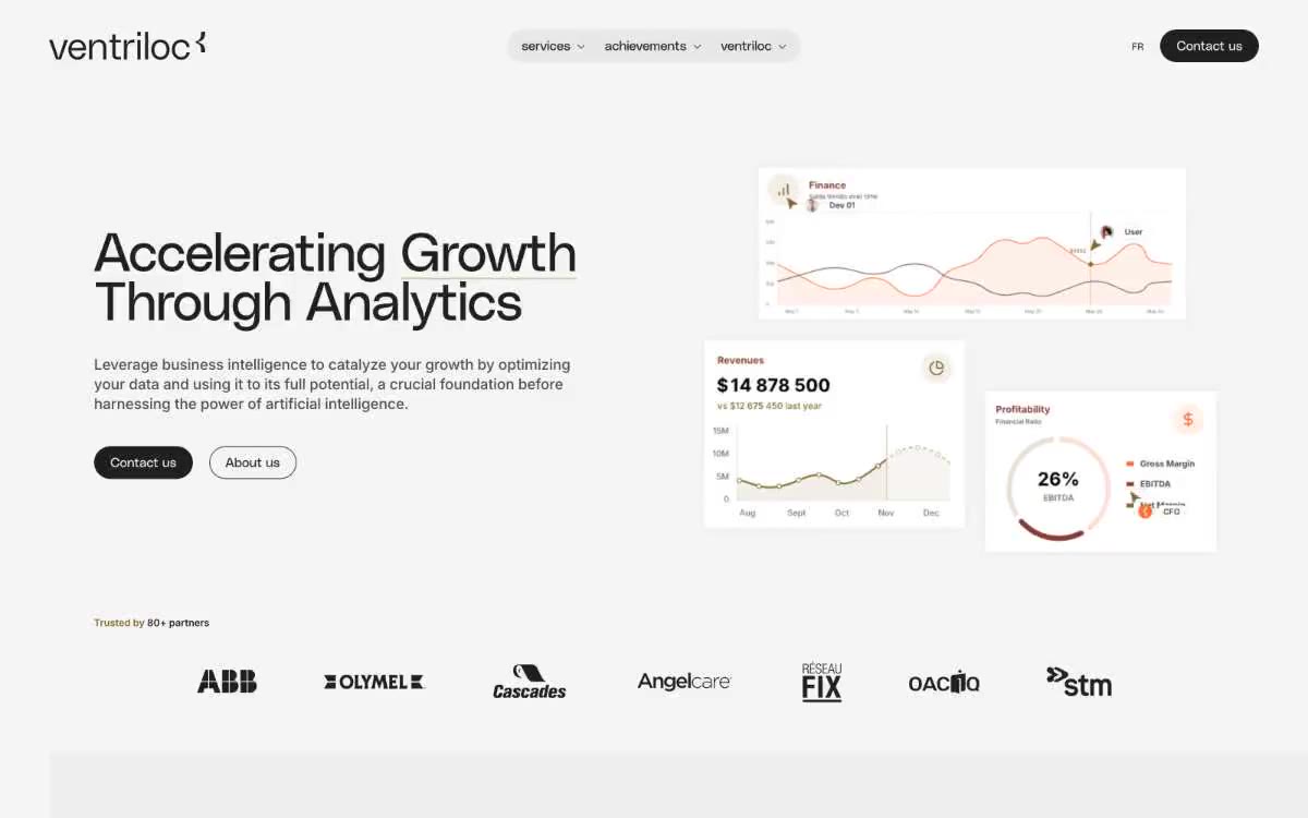
An editorial observatory of data on warm paper - a single orange ember highlighting the monochrome precision
Ventriloc speaks in a quiet, editorial voice: a warm, crisp white canvas, monospaced, high-precision data cards, and a single orange charcoal that punctuates the monochrome like a highlighter on a printed report. The system combines a custom-designed neo-grotesque typeface (PolySans) with a 400-point weight for headings—an unusual restraint that sacrifices authority through volume for authority through precision—with Inter for body copy and interface elements. Surfaces are warm grays and creams rather than a cool, tech blue, cards have asymmetrical corner rounding (sharp upper-right corner, soft elsewhere), and interactive elements are divided into two distinct dialects: sharp-angled text-style buttons and pill-shaped navigation containers. Colours are used sparingly: pages should be designed in an achromatic style 95% of the time, and orange is used only as functional punctuation for highlighting, underlining links and decorative accents of data.
The maximum-width container is 1200px, centered, with generous 80px gutters between sections. The main element is divided into two columns: on the left is the headline, subtext, and a set of two call-to-action buttons; on the right is a group of three overlapping data cards (a financial chart, revenue statistics, a profitability ring) floating on a white canvas. Below the main element is a full-width partner logo stripe on a white background. Subsequent sections alternate between Ash (#efefef) and white stripes. The navigation is a floating pill-shaped container centered on the header, with the brand logo aligned left and a dark "Contact Us" button aligned right. The overall rhythm is spacious and editorial—wide margins, tall sections, and the data cards providing the only visual punctuation besides the typography.
The visual design is almost entirely data-driven: chart widgets (line graphs, circular progress bars, statistics cards) are designed in a flat, minimalist style with thin orange and brass lines on white cardboard surfaces. There are no lifestyle photos, no stock images, no illustrations on the homepage. The only photographic content is partner/client logos, presented in monochrome graphite. The visual language is closer to a printed annual report than a typical SaaS website—the charts ARE images. Icons are thin, monolinear, and graphite-colored, appearing sparingly in the navigation bar and card headers.
Palette
Brand
- Ember Orange
#ff682c— Orange is used to highlight links, tags, and short phrases. It should not be used as the primary color for calls to action.
Neutral
- Graphite
#202020— Main text, headings, navigation links, icon outlines – these are the typographic basis of every interface element. - Canvas White
#ffffff— Page background, card elevation, icon fill—the brightest surface in the system. - Ash
#efefef— The main background of the card and section, the container of the navigation bar is a predominantly warm gray surface. - Fog
#f5f5f5— A subtle background tone for nested surfaces and secondary containers. - Ivory
#ebe6dd— Warm accent background for the main blocks - a papery feel. - Steel
#4d4d4d— Secondary main text, long paragraph text
Typography
from 14 to 66px · 5 steps
- PolySans — replacement: Inter Tight or Space Grotesk at weight 400 · outlines 400 · Headlines and Decorative Text - A custom-designed neo-grotesque typeface, used exclusively at 400 weight and -0.02em letter spacing, creates a subtle editorial authority that no bold headline could replicate.
- Inter — replacement: system-ui or Roboto · outlines 400, 500, 600 · Body text, UI element labels, button text, headings, metadata - a universal sans-serif font for everything that is not a heading.
Intervals and form
| Purpose | Meaning |
|---|---|
| Density | average |
| Basic step | 20px |
| Button radius | 0px |
| Card radius | 8px |
| Shadows | no - borders instead of shadows |
| Between sections | 80px |
| Page width | 1200px |
AI will build your website in Ventriloc style and fill it
- Fill with products and posts via the link - Instagram, TikTok, Facebook.
- Transfer content from your old site—just specify the address.
- Modern design on the best engine: React ( Next.js) with server rendering and SEO optimization out of the box.
- Fully automated SEO optimization for search results and neural network recommendations.
Similar styles
- Ui — clinical plan on matte paper
- Geniestudio — A soft daylight notebook—the kind with wide margins and one thick pen stroke
- xAI — Warm Cream Lab with Black Pill
- Cal — Monochrome practicality, a human approach. A system that prioritizes clarity and functionality through a strict black-and-white palette, but softens it with friendly typography and rounded shapes.
- Scale — A high-quality museum-quality photo lab combined with a technical project
- Contractbook — contracts of cream paper under an ultramarine sky
- AutoSend — A cozy stone studio with a single purple light—where serif headlines and bright indigo calls to action coexist in one quiet, almost white space.
- Air — sculpture "Midnight Sky Through Glass"
- SpatialChat — purple pulse on white parchment
- Squarespace — Cinematic Monochrome Gallery
- Giga — Midnight horizon over frosted obsidian
- Supabase — A code editor at midnight with a phosphorescent green dot—a single chromatic pulse on a sea of coal dust