
monopo saigon
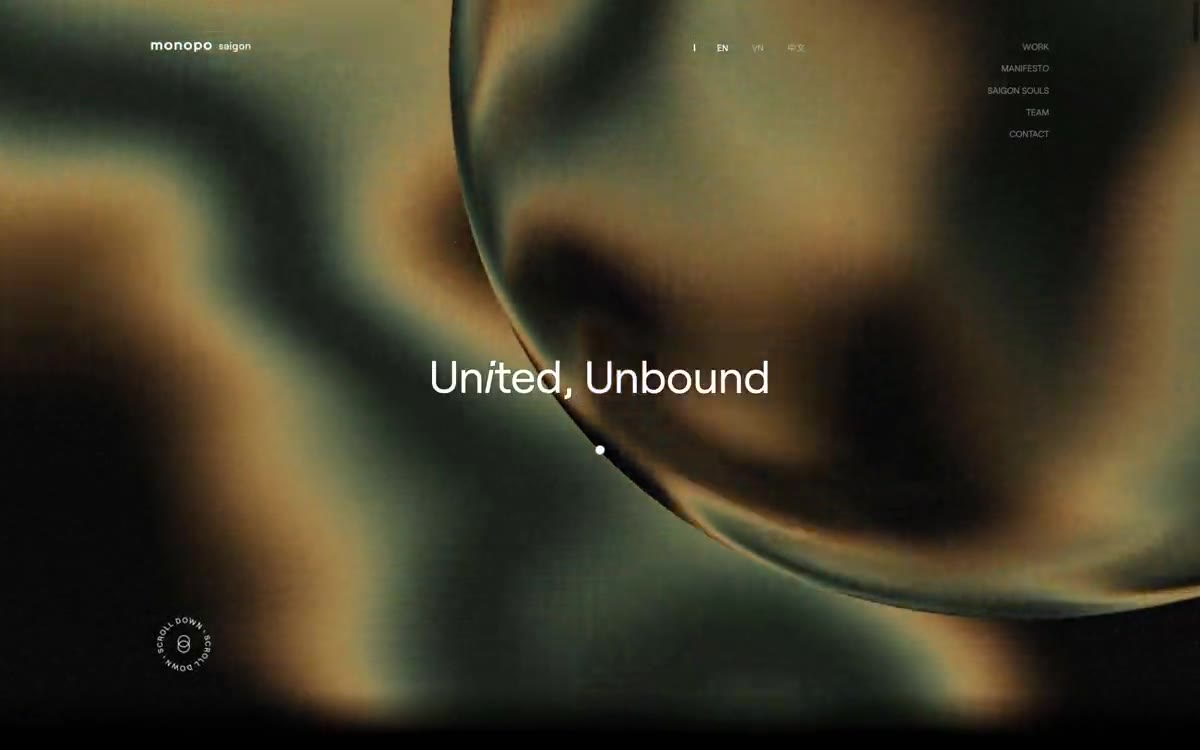
A liquid, iridescent glow behind the editorial silence—a monochrome editorial gallery floating on molten light
Monopo Saigon operates under a radical monochrome discipline: pure black and white with subtle gray tones, wrapped around a massive Roobert typeface that seems to breathe on canvases spanning the entire width of the page. The signature contrast lies in the strict editorial restraint (sharp angles of navigation and text links, abundant white space, a rhythm based on 4px) and a single expressive gesture—75px-radius buttons that float like liquid above the images. The main design elements gravitate toward iridescent, fluid chromatic atmospheres (greens fade to amber and then to deep burgundy), while the interface itself never acquires a single hue, creating the feeling of a black-and-white editorial gallery floating above a river of liquid light. The typeface sets the tone: a 300-line weight at 78px whispers, a 400-line weight at 225px fills the viewport, and a 400-line weight at 11px confidently and minimally defines everything else. The motion is expressive yet patient—cubic-bezier(0.19, 1, 0.22, 1) anti-aliasing curves, stretching to 1.25s, transform transitions, allowing elements to glide rather than stop abruptly.
The layout is centered at a maximum width of 1078px, with dark splash sections spanning the entire width of the page and extending beyond the container. The splash section occupies the entire viewport: a centered, monumental title (Un i ted, Unbound) hovers above shimmering media content, minimalist navigation floats at the top, and a single rotating icon occupies the bottom left. The body copy sections follow a spacious editorial rhythm—large 46px gaps between sections create breathing room between blocks, alternating white and dark (black with white font) stripes. The content layout is asymmetrical: alternating text on the left/image on the right and image on the left/text on the right predominate, with no centered blocks outside the splash section. Card grids are displayed as single-column project lists rather than multi-column—each project occupies the full width with its own image and title. The navigation consists of a transparent top bar with the logo on the left, the localization in the center, and a menu on the right—no permanent color changes, no shadow, just an invisible save button. At the bottom of the page is a compact three-column address block (Tokyo, Saigon, London) with discreet text. Overall, it's the editorial style of a digital magazine.
The visuals are theatrical and unique: the main screen is dominated by a massive, iridescent, fluid texture—organic green hues dissolving through amber and burgundy, like oil on water or molten glass. This feels like atmospheric media content occupying the entire screen, perhaps a video or a canvas created with shaders, and is perceived as a single sensory moment rather than a repeating pattern. The project's demos utilize intimate editorial photography (large-scale product shots, promotional images) presented without frames or borders—the image is the content. There are no illustrations, no icons other than tiny UI glyphs, no decorative shapes. Iconography is minimal or absent; a rotating circular text icon serves as the system's only typographic embellishment. Overall density: text dominates with a single visual gesture at a large size, followed by long, calm editorial stretches of typography and product images.
Palette
Brand
- Iridescent Fade
#a02d25— The chromatic accent appears only within the gradient transition—the molten burgundy hue that forms the basis of the iridescent atmosphere is not used in the interface controls.
Neutral
- Obsidian
#000000— Body text, SVG stroke, fill over body text - pure black contains all foreground information and graphic elements. - Paper
#ffffff— Light text on dark surfaces, inverted captions, and high-contrast headlines. Avoid using light text as the primary color for calls to action. - Inkstone
#181818— The main text in the footer and additional headings are a muted black color for reading long texts. - Felt Gray
#6d6d6d— Auxiliary text, address blocks, legal texts – quiet annotations that recede unnoticed without disappearing completely. - Slate Pill
#636363— The button's neutral background is the only solid fill used for actions like Accept. - Ash Mist
#9a9a9a— A neutral, mid-tone shade for surfaces with low vision or low contrast in a surface set.
Typography
from 12 to 225px · 9 steps
- Roobert — replacement: Inter or Söhne — both share Roobert's geometric-humanist balance and clean aperture · outlines 300, 400, 600 · The main typeface is used for all interface text, navigation, headings, body copy, lists, and footers. This custom-designed sans-serif combines geometric clarity with humanistic warmth; its wide range of weights (from 300 Whisper to 600 Anchor) allows the typeface to breathe—from monumental headlines to notes.
- Raleway — replacement: Montserrat or Jost · outlines 400 · Used only in certain headline contexts where a more elegant, narrow sans-serif provides contrast - rarely used as a counterpoint to a bolder Robert typeface.
- system-ui — replacement: Inter · outlines 400 · Interface micro-labels, cookie banner body text, small font - the browser's default fallback option, ensuring readability in the smallest details without the need for a custom font.
Intervals and form
| Purpose | Meaning |
|---|---|
| Density | dense |
| Basic step | 14px |
| Button radius | 75px |
| Card radius | 0px |
| Shadows | no - borders instead of shadows |
| Between sections | 46px |
| Page width | 1078px |
AI will build your website in monopo saigon style and fill it
- Fill with products and posts via the link - Instagram, TikTok, Facebook.
- Transfer content from your old site—just specify the address.
- Modern design on the best engine: React ( Next.js) with server rendering and SEO optimization out of the box.
- Fully automated SEO optimization for search results and neural network recommendations.
Similar styles
- Hyer Aviation — Dusk in the cockpit over parchment. The pale dawn sky meets the fuselage-sized serif logo, and a single warm clay accent breaks the monochrome restraint.
- OFF+BRAND. — Iridescent sphere on warm parchment
- Seed — a living organism under laboratory glass
- Eindhoven Design District — Editorial brutalism on white paper is a municipal design manifesto, executed in large type, with minimal photography and absolute restraint.
- Subframe — A graphic drawing on warm parchment. Designer paper, where every stroke is either graphite or eraser, never paint—depth is achieved through line thickness and sparse serifs.
- Miranda — Classic wide-format type on a light cream background—a newspaper editorial for the digital age
- Monocle — A high-quality, wide-format newspaper on cream-colored paper. A carefully curated editorial, where every column deserves its place, and only one meaningful color appears on the page.
- Agencja brandingowa — An editorial gallery in white tones with typography done in black ink
- Websmith Studio — Morning light on cream paper
- Aspelin Reitan — Architectural Archive by Candlelight - The page looks like a portfolio of built spaces, pinned to a warm cream wall, with a single line of white text floating above each image across the full width of the page.
- Public — A monochrome editorial on cold marble—almost a monochrome canvas, with a 300-point serif font and a single purple accent doing all the color work.
- Motto — A typographic monolith on paper – a single, confident voice declaring itself on snow-white paper