
Hyer Aviation
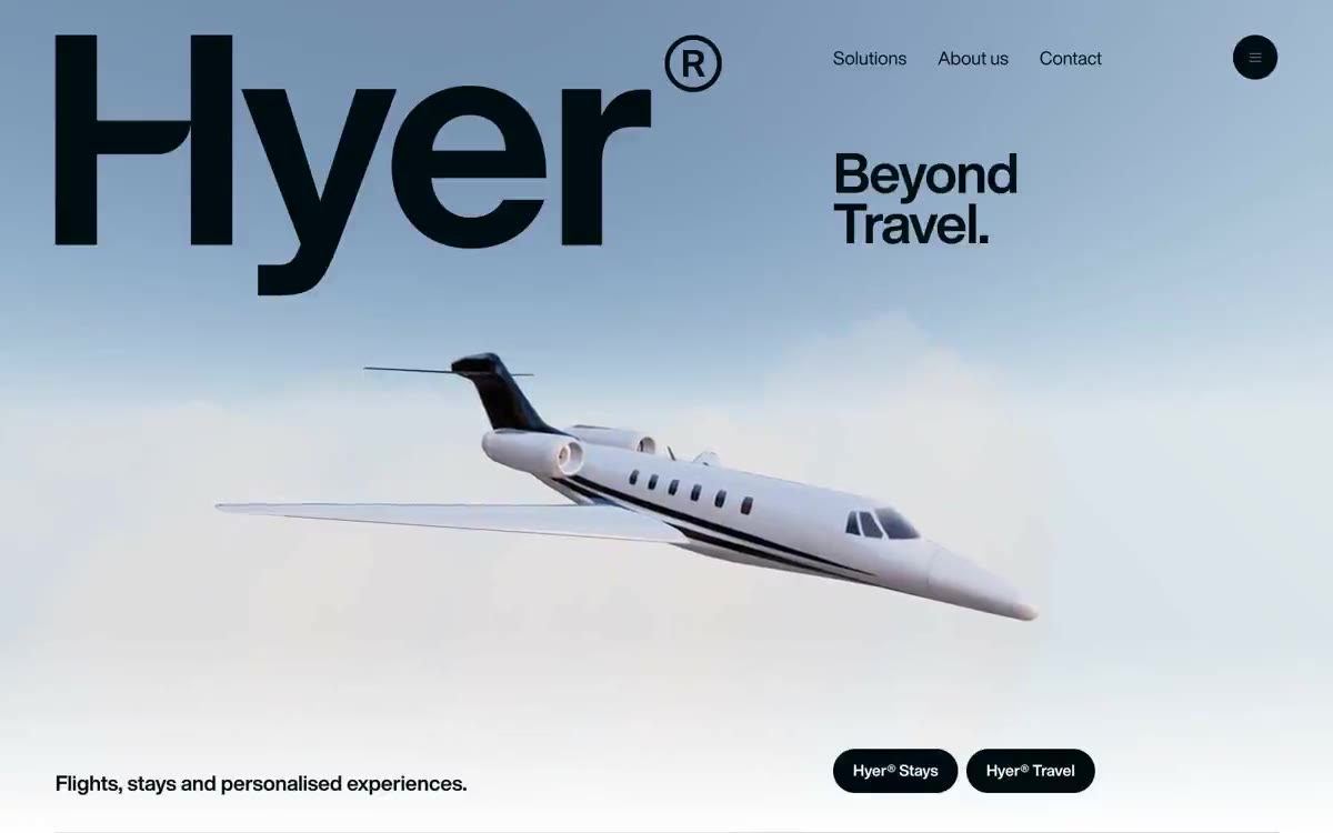
Dusk in the cockpit over parchment. The pale dawn sky meets the fuselage-sized serif logo, and a single warm clay accent breaks the monochrome restraint.
Hyer Aviation's design resembles luxury travel advertising: a pale blue main element featuring an imposing aircraft hovers above a crisp white canvas, complemented by a near-black font so heavy it seems cast from metal. The color palette is deliberately austere—a single warm terracotta accent punctuates the monochrome system, appearing only on decision cards, while the rest of the interface is rendered in dark ink and parchment. Typography is the brand's strongest voice: a single font at 187px and 131px with very tight letter spacing dominates the main sections, while the body copy is positioned at 18px with generous 1.61 line spacing for a calm, fluid rhythm. Each interactive element is either a solid pill (1000px+ radius) or a panel with hard edges, creating tension between the soft, inviting buttons and the architectural boldness of the headlines.
Full-width sections alternate between a light blue header, white content stripes, and dark, midnight-colored sections. The header is the only asymmetrical composition: the text logo is left-aligned at maximum scale, the headline is in two lines to the right, and a 3D airplane hovering in the lower-center negative space. Content sections are right-aligned in a single column (header + 2x2 grid) against a white background, creating a strong rightward flow. The navigation is a single transparent row at the top with three text links and a circular menu button. The footer is dark, full-width, with a large text logo. Vertical rhythm is established by 80px gaps between sections, with no visible dividers between most of the stripes—they are separated by the color shift itself.
The visual language is dominated by photographs and 3D renderings, particularly a single, central 3D rendering of a white private jet with dark accent stripes, photographed/rendered against a soft, gradient sky, fading from pale blue at the top to a warm creamy horizon. The jet is shown in a three-quarters pose, positioned left of center to allow room for the logo and headline. The rendering is executed in an ultra-clean style, like a product showcase—without lifestyle context, no passengers, no airports. The jet is the protagonist. Additional images (when used in content sections) follow the same product framing logic: close-ups, isolated images against a pure white background. The iconography is minimal and always based on #000d10 strokes.
Palette
Brand
- Clay Ember
#bc7155— The background of the card with the proposed solution, a decorative fill, is the only warm accent in a cold system, used sparingly to emphasize that one of the proposals has been selected.
Neutral
- Deep Ink
#000d10— From the body copy, footer background, filled action buttons, and icon outlines, the structural, near-black color reflects the brand's overall style across fonts and calls to action. - Pure White
#ffffff— The page canvas, the card surfaces, the button text on the dark navigation background—a quiet field on which everything else is read. - Cool Ash
#8e8e95— Secondary body text, navigation elements, and bland auxiliary labels are the only neutral element that intentionally recedes into the background compared to the main text. - Pebble
#d5d3d4— Thin borders, dividers, barely noticeable alternation of dark areas - visible only at the edges. - Midnight Hull
#0f0f1c— The background of the dark areas (ride support area) is slightly bluer than Deep Ink to highlight the overlapping dark stripes. - Charcoal Deck
#151623— Raised dark panels and a deep background - the upper part of the dark surface with a barely noticeable indigo tint.
Typography
from 17 to 187px · 9 steps
- HelveticaNowDisplay — replacement: Neue Haas Grotesk Display · outlines 400, 700 · The only font in the entire system. The primary font, with a 700 weight, 187px line spacing, and -0.02em letter spacing, establishes a scale close to architectural, transforming headings into physical objects. All body text uses a 400 weight font, 18px line spacing, and 1.61em letter spacing, creating the most spacious text block in the font system.
- sans-serif — replacement: Inter · outlines 700 · sans-serif - found in the extracted data but not described by the AI.
Intervals and form
| Purpose | Meaning |
|---|---|
| Density | average |
| Basic step | 16px |
| Button radius | 1000px |
| Card radius | 12px |
| Shadows | no - borders instead of shadows |
| Between sections | 80px |
| Page width | 1200px |
AI will build your website in Hyer Aviation style and fill it
- Fill with products and posts via the link - Instagram, TikTok, Facebook.
- Transfer content from your old site—just specify the address.
- Modern design on the best engine: React ( Next.js) with server rendering and SEO optimization out of the box.
- Fully automated SEO optimization for search results and neural network recommendations.
Similar styles
- monopo saigon — A liquid, iridescent glow behind the editorial silence—a monochrome editorial gallery floating on molten light
- OFF+BRAND. — Iridescent sphere on warm parchment
- Seed — a living organism under laboratory glass
- Eindhoven Design District — Editorial brutalism on white paper is a municipal design manifesto, executed in large type, with minimal photography and absolute restraint.
- Subframe — A graphic drawing on warm parchment. Designer paper, where every stroke is either graphite or eraser, never paint—depth is achieved through line thickness and sparse serifs.
- Miranda — Classic wide-format type on a light cream background—a newspaper editorial for the digital age
- Monocle — A high-quality, wide-format newspaper on cream-colored paper. A carefully curated editorial, where every column deserves its place, and only one meaningful color appears on the page.
- Agencja brandingowa — An editorial gallery in white tones with typography done in black ink
- Websmith Studio — Morning light on cream paper
- Aspelin Reitan — Architectural Archive by Candlelight - The page looks like a portfolio of built spaces, pinned to a warm cream wall, with a single line of white text floating above each image across the full width of the page.
- Public — A monochrome editorial on cold marble—almost a monochrome canvas, with a 300-point serif font and a single purple accent doing all the color work.
- Motto — A typographic monolith on paper – a single, confident voice declaring itself on snow-white paper