
Mercury
Alpine banks at dusk
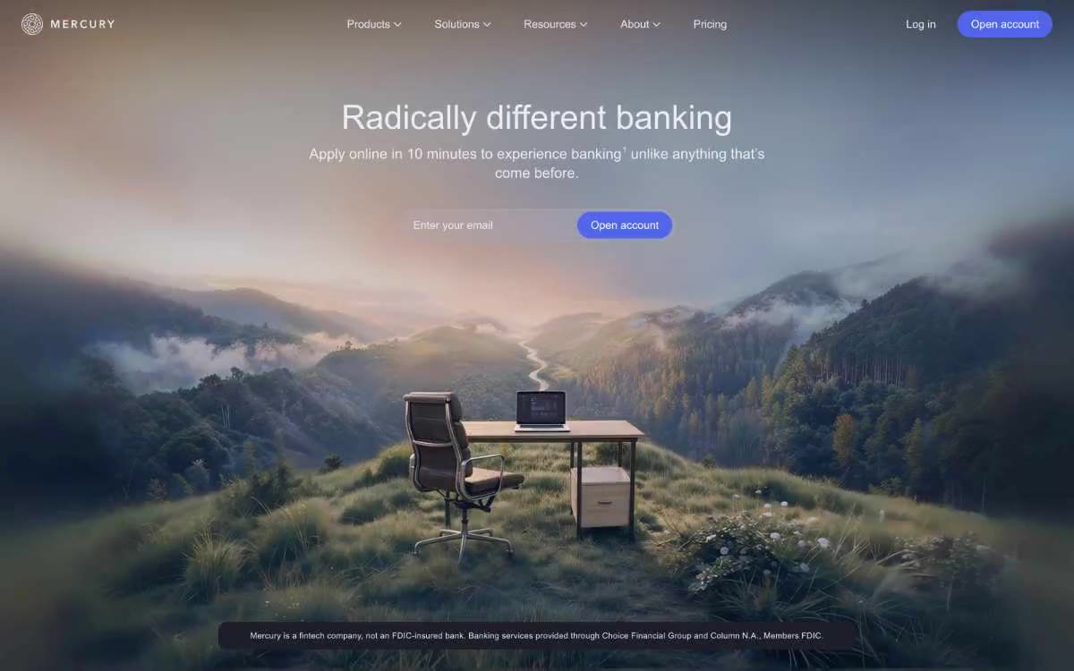
Mercury operates within an Alpine banking aesthetic: a near-black canvas (#171721) creates a cinematic, observatory-like atmosphere, where content surfaces float as slightly lighter graphite cards. The interface is predominantly monochrome—ivory text on onyx, with a single vibrant cobalt (#5266eb) element used exclusively for the core "Open Account" operation. Typography carries the primary expressiveness: a custom display font of 480 (neither bold nor light) paired with a subtle body font of 400 creates a confident but never garish style. Components are flat and frameless, relying on a 12px graphite card radius and capsule-shaped controls to define structure rather than shadows. The main photo element, which takes up the entire surface of the page—misty mountains against a lonely table—sets the tone before the user interface kicks in, and every subsequent element maintains that quiet, premium darkness.
All content is designed in a dark, full-width style. The main screen is a 100px, full-width photo with a centered headline, subtext, and a form block for collecting email contact information (maximum width ~640px). Below the main screen, content is organized in sections of a maximum width of 1200px with 72px vertical margins, alternating between a two-column layout of text on the left and an image on the right, and three-column product description cards. The navigation is a transparent top bar overlaid on the main screen, which, as you scroll, transitions to a solid dark fill reminiscent of frosted glass (background blur). The footer is dark with note text. The vertical rhythm is generous—spacious density with plenty of space between sections. There is no side navigation; all navigation is located in the top bar.
The main section is dominated by full-width cinematic photographs—atmospheric, inspiring landscapes (misty mountains, secluded workspaces in nature)—that position banking as a contemplative, sublime experience. The photographs are high-quality, slightly desaturated, with cool tones and a subtle dark overlay to preserve the readability of the text. Below the main section, the images alternate with screenshots of the product's user interface and abstract, atmospheric backgrounds. There are no illustrations, no icons resembling works of art—the visual elements are either photographic or purely functional. The icon style throughout the user interface is a minimalist, ivory-colored line/glyph style used in navigation, buttons, and form elements.
Palette
Brand
- Cobalt
#5266eb— Purple is used for filled buttons, selected navigation states, and focus-driven conversion moments.
Neutral
- Onyx Canvas
#171721— Main page background, basic overlay for the home screen, canvases for the footer and sections. - Graphite Card
#1e1e2a— The raised surfaces of the cardboard and sections are one step lighter than the canvas, creating a smooth separation. - Obsidian Button
#272735— Additional button fills, embedded form backgrounds, unobtrusive interactive surfaces. - Slate Border
#70707d— Medium-thickness dividers and structural boundaries between content blocks. - Mist Border
#e2e3ed— Thin, barely noticeable borders, barely noticeable button outlines, input field edges - a light border on a dark background. - Ash Text
#c3c3cc— Main text, auxiliary text, additional labels - simplified hierarchy without loss of readability.
Typography
from 12 to 65px · 9 steps
- arcadia — replacement: Inter · outlines 360, 400, 420, 480 · Main and User Interface - A font for navigation, body text, buttons, input fields, labels, and auxiliary text, with a weight of 400 for body text and 480 for emphasis. The intermediate weight scale (360, 420, 480) instead of the standard (300/400/600) gives Mercury text a distinctly balanced look—never bold, never thin, always measured.
- arcadiaDisplay — replacement: Söhne Breit · outlines 360, 480, 530 · The font for headings and decorative elements is used in 480 weight for all heading sizes from 28px to 65px, while 530 is reserved for the largest decorative elements. Low line height (1.1–1.2) and positive letter spacing (0.01–0.02em) give decorative text a wide, architectural look, rather than the compressed structure found in editorial text.
Intervals and form
| Purpose | Meaning |
|---|---|
| Density | average |
| Basic step | 12px |
| Button radius | 32px |
| Card radius | 12px |
| Shadows | no - borders instead of shadows |
| Between sections | 72px |
| Page width | 1200px |
AI will build your website in Mercury style and fill it
- Fill with products and posts via the link - Instagram, TikTok, Facebook.
- Transfer content from your old site—just specify the address.
- Modern design on the best engine: React ( Next.js) with server rendering and SEO optimization out of the box.
- Fully automated SEO optimization for search results and neural network recommendations.
Similar styles
- Origin Financial — A midnight gallery of quiet opulence. A quiet, almost dark room where large serif fonts and a few illuminated colored panels create the feeling that finance is a carefully curated work of art.
- Air — sculpture "Midnight Sky Through Glass"
- Slash — Midnight vault with gilded ledgers
- dope.security — Midnight terminal with purple beacons
- Modal — A phosphorescent terminal in a darkened server room - the only light source is a bright green color
- Giga — Midnight horizon over frosted obsidian
- Dovetail — Blueprint Control Center at Midnight
- Dovetail — A blueprint under a black moon—barely visible graph lines, white font, one purple sparkle
- AgentQL — Northern Lights over the terminal at night
- Supabase — A code editor at midnight with a phosphorescent green dot—a single chromatic pulse on a sea of coal dust
- Changelog — The observatory console behind dark glass
- GitHub — A space command panel with bioluminescent control points—a dark, atmospheric workspace where a single green glow points the way forward.