
Slash
Midnight vault with gilded ledgers
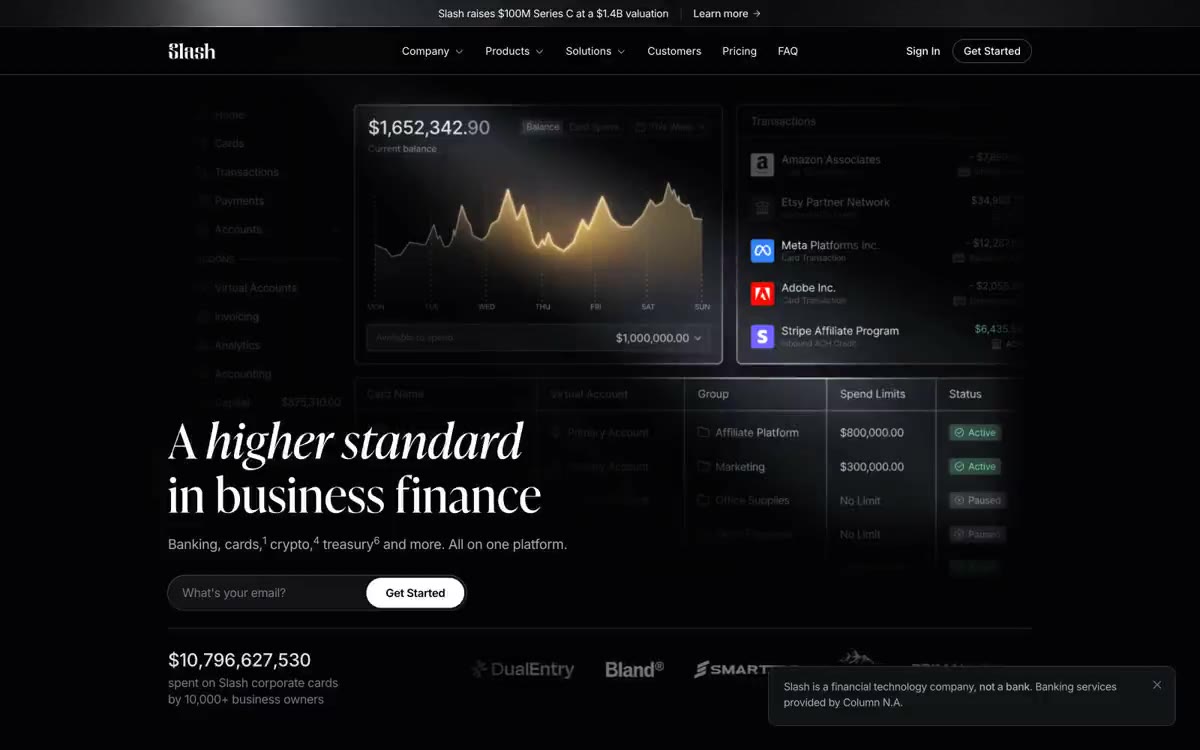
Slash operates in a midnight gallery mode: a nearly black canvas, white type, and a single warm copper accent serving as punctuation. Headlines are displayed in Ivy Presto, a high-contrast didone serif used in extreme sizes (up to 88px)—this clash of serif and sans-serif typefaces is the system's signature, lending it a financial gravitas without the brokerage gravitas of traditional banking. The rest of the user interface is deliberately understated: thin borders, pill-shaped controls, compact 16px body text, and a subtle upsweep to allow the type to breathe. A single gold gradient (chart line, microaccents) adds warmth to the monochrome system, evoking the warm glow of a Bloomberg terminal built for a design audience.
The content is 1216px wide, centered, with 160px vertical gutters. The home screen is a dark, full-width canvas with a split composition: a left-aligned serif header (64–88px wide) with an email address field below, and a large product UI card (a dashboard screenshot) on the right at 50% width. Subsequent sections use a single-column, centered header (serif, 44–64px wide) with a subheading in Inter, followed by three-column grids of cards for feature descriptions/testimonials/blogs. The navigation is a fixed top bar: logo on the left, central menu (Company, Products, Solutions, Clients, Pricing, FAQ), right-aligned login (inconspicuous), and getting started (white filled element). The footer features a dense five-column grid of links with company information and legal notices. The page alternates between content-rich grid sections and full-screen stats—the rhythm is established by the generous white space between the columns rather than by alternating background colors (the entire page is presented as a single, unified canvas).
The photography is editorial and naturalistic: warm portraits of the founders and team members in their real-life work environments (offices, living rooms, construction sites). The images fill the card frames edge to edge, with no padding. A dark gradient is used at the bottom of the testimonial cards to enhance text readability. The aesthetic—"LinkedIn meets editorial magazine"—is casual, human, and slightly muted, never polished with stock photography. Article thumbnails combine photographs with illustrated concepts (a person standing in a maze, a fireplace with bags of money). The product's UI is displayed in dark mode with full opacity, hovering above the page on subtle dark surfaces—a central element. Icons are monochrome with 1px strokes in #2e3038 or #777a88, never filled with the brand color.
Palette
Neutral
- Bone
#e2e3e9— Large font size for primary text, detailed data labels, and a standard text tone across most UI elements. - Obsidian
#08080a— The page canvas, the footer background, the darkest surface is almost black with a subtle blue tint. - Onyx
#040406— The surface of the card, the additional background, is one step deeper than the page for visual effect. - Carbon
#121317— Raised panels, unobtrusive UI fill - the first noticeably lighter step in the evolution of Surface Stack - Graphite
#1c1d22— Borders, dividers, icon containers, control sliders—the subtlest shade of color that defines structure. - Slate
#2e3038— Additional borders, muted icon lines, subtle dividers between content blocks.
Typography
from 13 to 88px · 9 steps
- Ivy Presto — replacement: Playfair Display · outlines 400, 500 · A serif font for headings and subheadings—used exclusively for headings and section titles at 28px and above. High-contrast didone strokes with thin serifs create a sense of editorial luxury; the small positive letter spacing of 0.01em is unusual and gives the font a printed, accounting-like appearance. This serif font is the brand's core calling card—it distinguishes Slash from all other SaaS fintech companies that default to geometric sans-serif fonts.
- Inter — replacement: Inter (self-hosted via Google Fonts) · outlines 300, 400, 500, 600, 700 · UI Sans—main text, navigation, buttons, labels, links, form fields, and subheadings. The main text uses a 300 font for unobtrusive secondary text; 500 is used for medium-emphasis text and button labels; 600 is reserved for category labels written in small caps. Negative letter spacing decreases from 2 (-3) and decreases as the size decreases, which is typical of the optical scaling of the Inter font.
Intervals and form
| Purpose | Meaning |
|---|---|
| Density | spacious |
| Basic step | 8px |
| Button radius | 9999px |
| Card radius | 10px |
| Shadows | no - borders instead of shadows |
| Between sections | 160px |
| Page width | 1216px |
AI will build your website in Slash style and fill it
- Fill with products and posts via the link - Instagram, TikTok, Facebook.
- Transfer content from your old site—just specify the address.
- Modern design on the best engine: React ( Next.js) with server rendering and SEO optimization out of the box.
- Fully automated SEO optimization for search results and neural network recommendations.
Similar styles
- Modal — A phosphorescent terminal in a darkened server room - the only light source is a bright green color
- AgentQL — Northern Lights over the terminal at night
- GitHub — A space command panel with bioluminescent control points—a dark, atmospheric workspace where a single green glow points the way forward.
- Doppler — The vault's purple lighting at midnight. The nearly black canvas glows with a single lavender signal and a green confirmation light, every surface curved enough to be grasped.
- Basedash — A midnight data terminal with matte font. A dark observatory where metrics glow purple and green, serif headlines float above the noise, and white pill-shaped buttons are the only bright objects in a room of soft black surfaces.
- Superwhisper — The northern lights dissolve over the midnight glass
- Better Stack — Midnight SRE Console
- Langbase — Midnight Northern Lights console
- Astro — Deep Space Mission Control with a single purple glow from a nebula
- Wayfinder — A black movie screen with a barely audible title hovering above a live illustration. The interface is a brightness slider rather than a control panel.
- HashiCorp — The control room at midnight with purple neon is a dark technical surface where a glowing hexagonal cube serves as the only color reference.
- Umbrel — A cozy fire pit in the night server room—a dark room where a single peachy glow highlights what's truly important.