
Origin Financial
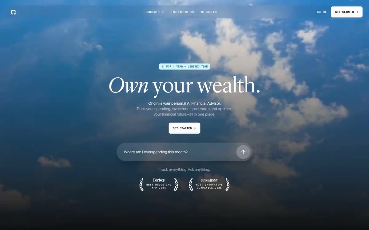
A midnight gallery of quiet opulence. A quiet, almost dark room where large serif fonts and a few illuminated colored panels create the feeling that finance is a carefully curated work of art.
Origin presents personal finance as a night gallery: near-black canvases, subtle serif headlines (80-96px, Lyon Display - 300), and chromatic feature cards hovering like backlit color panels. Most of the surface remains calm and monochrome, with saturated colors appearing only in the form of full-screen category tiles for the spending, investing, and forecasting modules, as well as data signals (graphs, sparklines). The typography is divided into three distinct styles: a high-contrast serif for emotional statements, a neo-grotesque sans-serif for the user interface, and a monospaced font for technical headlines and all-caps data, creating a sense of editorial style and precision. The only primary action is white text on a black background; the rest of the interface fades into darkness.
A dark canvas spans the entire width of the page (the content container is maxed out at 1200px, but sections wrap all the way to the edge). The page rhythm alternates between: (1) a striking splash photo with a centered headline and embedded AI tooltip, (2) full-width modules, (3) light inverted #cacaca stats blocks for contrast, and (4) product layout stripes with 90px padding. Headlines are always centered; feature category cards are laid out in a 3-column grid with 12-15px gaps. The vertical spacing between sections is 24-80px, creating ample space between modules. The navigation is a fixed top bar with a blurred background (background filter (24px)), containing the logo, 3 ghost button navigation elements, a “Login” text link, and a white primary “Get Started” call-to-action aligned to the right.
Atmospheric photography serves as the central element (a full-frame photograph of clouds and sky with a muted, cool treatment feels more like an inspiring open sky than actual weather). Product visualization features tilted renders of the Origin iPhone app against a near-black background—the device is the primary element, with a subtle volumetric glow rather than screen-glare effects. There are no illustrations, abstract graphics, or lifestyle photos. Icons are minimalist, featuring monolinear SVG images of white lines or silhouettes. Overall, text dominates: typography carries approximately 80% of the visual weight, with images reserved for ambiance and product presentation.
Prompt for AI images in the style Origin Financial
Create an image in the visual style of the Origin Financial website
WHAT TO DEPICT: [insert your subject and wishes — for example: "a mug of coffee on a wooden table, morning light"]
STYLE: Midnight gallery of quiet wealth. A quiet, almost dark room where the object creates the feeling of a carefully selected work of art. Atmospheric photographs with muted, cool processing that feel like an inspiring open sky. No illustrations, abstract graphics, or lifestyle-style photographs.
LIGHT AND MATERIALS: Almost black background. Barely noticeable volumetric glow, without glare effects. Soft, diffused light emphasizing the form. A dark theme predominates, boundaries instead of shadows.
PALETTE: Iris Gleam #847dff, Cyan Signal #00b3dd, Pale Iris #d1c9ff, Deep Iris #4b49aa, Orchid Bloom #dd90d8, Periwinkle #90b8f0, Obsidian #0f1011.
FRAME COMPOSITION: Central element, dominating the frame. Full-format photograph. Objects presented as main elements, with ample space around them on a dark background. Wide format.
REQUIREMENTS: photorealistic and clean, light and colors strictly from the palette above. DO NOT add text, inscriptions, numbers, interfaces, or website layouts unless requested in "WHAT TO DEPICT". No watermarks, third-party logos, or brand names.
Palette
Brand
- Iris Gleam
#847dff— The main color accent for category cards is the characteristic purple color, which is most often found on module tiles.
Neutral
- Cyan Signal
#00b3dd— Data-driven focus – chart lines, mini-chart strokes, and forecasting indicators on dark surfaces. - Pale Iris
#d1c9ff— A lighter version of purple for softer color schemes in theme panels and background fills. - Deep Iris
#4b49aa— Dark purple color variant for shaded category and status bars on hover. - Orchid Bloom
#dd90d8— The pink category card for the Lifestyle/Expenses modules provides a warm contrast to the cool color palette. - Periwinkle
#90b8f0— A soft blue category card for counseling modules or couples modules. - Obsidian
#0f1011— The canvas of the page is the dominant dark surface on which everything floats.
Typography
from 12 to 96px · 7 steps
- Suisseintltrial — replacement: Inter · outlines 400 · Suisseintltrial - found in extracted data but not described by AI.
- Lyon Display — replacement: DM Serif Display or Playfair Display (Google Fonts) at weight 400 with manual letter-spacing tightening · outlines 300 · Headings and section titles are a signature style. Only a 300 font (light) is used, creating a soft yet confident feel; the extreme size (38-96px) with a narrow 0.9 line spacing creates a defining tension.
- Suisse Int'l — replacement: Inter or Geist Sans at matching weights · outlines 300, 400 · Body text, card descriptions, link text, and input fields. A weight of 300 is used in 18px card subheadings to provide a subtle echo of the display text; a weight of 400 is the main UI text.
Intervals and form
| Purpose | Meaning |
|---|---|
| Density | average |
| Basic step | 12px |
| Button radius | 8px |
| Card radius | 16px |
| Shadows | no - borders instead of shadows |
| Between sections | 80px |
| Page width | 1200px |
AI will build your website in Origin Financial style and fill it
- Fill with products and posts via the link - Instagram, TikTok, Facebook.
- Transfer content from your old site—just specify the address.
- Modern design on the best engine: React ( Next.js) with server rendering and SEO optimization out of the box.
- Fully automated SEO optimization for search results and neural network recommendations.
Similar styles
- July Fund — A monograph in a dark gallery with color chapter cards
- FLORA — Gallery on black velvet - a clean dark canvas, bright images as the only color
- Mercury — Alpine banks at dusk
- Linear — midnight precision instrument
- Air — sculpture "Midnight Sky Through Glass"
- Raycast — Midnight Command Center, Coral Neon
- dope.security — Midnight terminal with purple beacons
- Dimension — a dusk-lit workstation with frosted glass panels
- Giga — Midnight horizon over frosted obsidian
- Reflect Notes — Starry violet space is a dark observatory where notes float like constellations against a backdrop of almost black indigo emptiness.
- Ameba — The control room at midnight – an electric blue pulse inside frosted glass panels
- Branding — Black gallery wall, blood red accents - Large white fonts float on a dark canvas that resembles a void, interrupted by a single bright red accent and striking decorative elements that look more like gallery signage than a web interface.