
Modal
A phosphorescent terminal in a darkened server room - the only light source is a bright green color
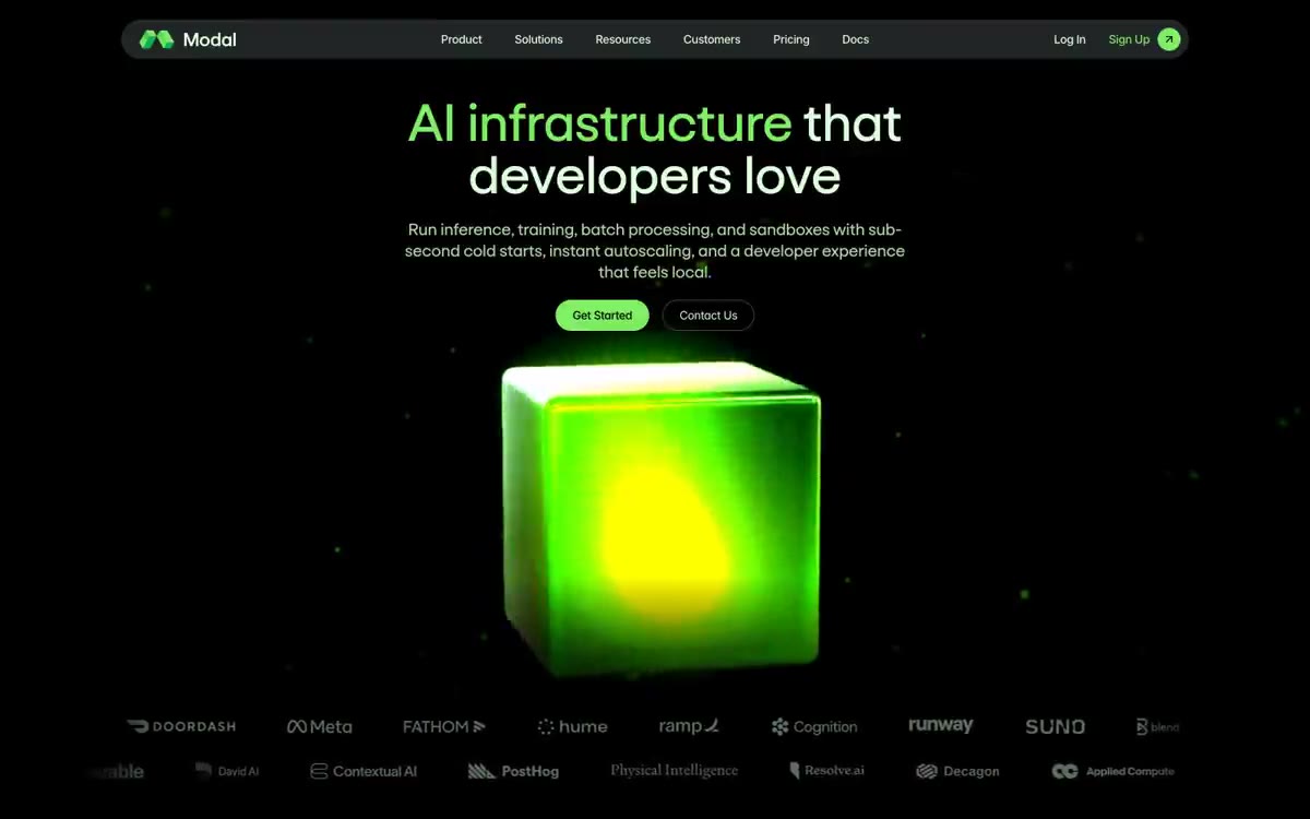
Modal functions like a phosphorescent terminal in a darkened server room: a nearly black canvas, pale green type, and a single bright lime-green accent that acts as an LED status indicator. The design language is developer-focused—monospaced code windows with traffic light dots, isometric 3D icons in the signature green, and plenty of white space, allowing one element in each section to glow. Typography is divided between a custom font (Goga) for headings and a variable font (Inter) for all UI elements, both set with narrow negative tracking. Colors are distributed evenly: most screens are achromatic, and the bright lime-green color appears only on key actions, the logo, 3D illustrations, and moments of emphasis. Components are flat and frameless, with depth created through subtle green borders and background blur rather than shadows.
The modal uses a full-width dark layout with a maximum width of 1280px to accommodate the content. The hero window is centered: the title (the first sentence in lime green), a subheading, two calls to action, and a single 3D object as a visual anchor—without separating the layout from the sidebar. The content sections follow a uniform rhythm: eyebrow tag (capital letters, Moss 70) → Goga title → muted body text, then either a two-column layout with a feature description (text + code/visual card) or a three-column grid of cards. The gutters between sections are generous—80px. The page alternates between deep empty (#000000) and slightly lighter background (#181818) stripes, with one light section (#def0dd) appearing in the middle of the page as a visual breather. The navigation consists of a single, fixed top bar with a blurred background—no sidebar or mega-menu. The footer is compact and dark, with muted green link columns. The text density is comfortable: each section is given ample space, and card grids use no more than three columns.
Modal's visual language is divided into two modes: 3D glowing product renders and dark code window mockups. The focal point is a single 3D cube rendered using a marketing gradient (from lime green to emerald), set within a radial gradient halo that bathes the empty space in green light—the brand's signature visual style. Workload cards contain isometric 3D icons (a wireframe cube, a solid staircase, layers) rendered in the same lime green against a dark background. Code and benchmark results are presented as terminal window cards with traffic light dots, monospaced syntax highlighting in a phosphorescent palette, and a muted green border—they resemble screenshots of a real command-line interface. Client logos are displayed as desaturated green-gray labels in a single, low-contrast row, signaling trust without visual competition. The overall density is low—most pages contain predominantly text, and images are presented as individual focal points rather than grids of photographs. There are no photographs; the entire visual system is rendered, geometric, and radiant.
Palette
Brand
- Lime Pulse
#7fee64— The main elements of the corporate identity are the logo, the main call to action (CTA), tag filling, active states, and the basic color of the illustration.
Neutral
- Phosphor White
#ddffdc— The main text, title color, icon outline, and filled button text are the main readable surface. - Void Black
#000000— Page canvas, the deepest background layer - Ground Iron
#181818— Main button fill, card surfaces in dark areas, base surface of the user interface. - Carbon Veil
#212525— Elevated surfaces, navigation background, slightly lighter than the ground. - Circuit Border
#485346— The outline/ghost action frame, the main interactive thin line, is a muted greenish-gray shade. - Phosphor Blue-Black
#1f2a33— Secondary thin marking lines, dividing strokes between dark stripes.
Typography
from 12 to 64px · 8 steps
- Goga — replacement: Inter Tight or Space Grotesk · outlines 400, 500 · Heading and Subheading Font – Used for all H1–H4 headings and cards. Goga is a custom geometric sans-serif font with narrow apertures and slightly squared terminals. The medium weight (500) is reserved for highlighting card-level headings; the normal weight (400) is used for hero and section headings. To access the alternate glyph shapes that define Modal's identity, its 'ss01' stylistic set must be enabled. Negative letter spacing gradually decreases from -0.007em at 48px to -0.017em at 21px.
- Inter Variable — replacement: Inter · outlines 400, 500 · User interface and body copy – navigation, buttons, body copy, labels, footer. Medium weight (500) is used by default for interactive elements and navigation; normal (400) is used for paragraphs. Letter spacing is noticeably reduced even at small sizes (-0.026em at 14px, -0.022em at 16px), giving the interface a condensed, terminal density. For alternate punctuation, the 'cv11' character variant should be included. All-caps labels at 12px use +0.05em letter spacing to counterbalance the body copy density.
Intervals and form
| Purpose | Meaning |
|---|---|
| Density | average |
| Basic step | 20px |
| Button radius | 12px |
| Card radius | 8px |
| Shadows | no - borders instead of shadows |
| Between sections | 80px |
| Page width | 1280px |
AI will build your website in Modal style and fill it
- Fill with products and posts via the link - Instagram, TikTok, Facebook.
- Transfer content from your old site—just specify the address.
- Modern design on the best engine: React ( Next.js) with server rendering and SEO optimization out of the box.
- Fully automated SEO optimization for search results and neural network recommendations.
Similar styles
- Slash — Midnight vault with gilded ledgers
- AgentQL — Northern Lights over the terminal at night
- GitHub — A space command panel with bioluminescent control points—a dark, atmospheric workspace where a single green glow points the way forward.
- Doppler — The vault's purple lighting at midnight. The nearly black canvas glows with a single lavender signal and a green confirmation light, every surface curved enough to be grasped.
- Basedash — A midnight data terminal with matte font. A dark observatory where metrics glow purple and green, serif headlines float above the noise, and white pill-shaped buttons are the only bright objects in a room of soft black surfaces.
- Superwhisper — The northern lights dissolve over the midnight glass
- Better Stack — Midnight SRE Console
- Langbase — Midnight Northern Lights console
- Astro — Deep Space Mission Control with a single purple glow from a nebula
- Wayfinder — A black movie screen with a barely audible title hovering above a live illustration. The interface is a brightness slider rather than a control panel.
- HashiCorp — The control room at midnight with purple neon is a dark technical surface where a glowing hexagonal cube serves as the only color reference.
- Umbrel — A cozy fire pit in the night server room—a dark room where a single peachy glow highlights what's truly important.