
Subframe
A graphic drawing on warm parchment. Designer paper, where every stroke is either graphite or eraser, never paint—depth is achieved through line thickness and sparse serifs.
Subframe is a monochrome designer's workspace: a warm, creamy canvas, graphite-black ink, and a complete absence of chromatic accents. The entire interface is perceived as a single material—paper, pencil, and shadow—with one bold typographic touch: a refined serif (Instrument Serif) set against a systematic sans-serif (Inter), lending editorial gravity to the headlines. Surfaces are flat and framed rather than raised; depth is achieved through thin dividers in #e5e7eb and inset highlights on dark controls rather than shadows. Density is generous: a wide vertical rhythm (48–64px of gaps between sections), centered, full-width layouts, and generous whitespace around text. The only color is the contrast between near-white and near-black, making the dark button the most striking element on each page, and the strip of partner brand logos in gray tones the only decorative visual element.
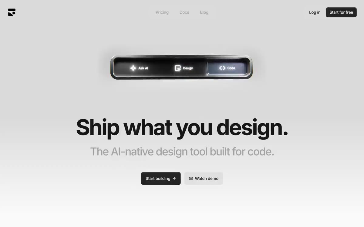
Centered, full-width layouts (1200px) with a generous vertical rhythm. The main element is a single, centered block: a dark, segmented control at the top, a large "Inter" heading, a single-line subheading, and two adjacent buttons (filled + translucent)—no side image, no layout breakup. Below the main element is a centered grayscale logo stripe. Each subsequent section follows the same pattern: a left-aligned title and subheading block, then a full-width product showcase frame with 48–64px of gutter space between sections. Navigation is minimal: a top bar with centered links and right-aligned actions, no sidebar, no mega-menu. The page reads top to bottom as a series of centered statements, each given ample space—the layout feels more like an editorial portfolio than a busy product page.
The visual design is minimalist and functional. The system utilizes two visual modes: (1) framed product screenshots and UI mockups enclosed in 24px-radius frames—they display actual interface components (tables, buttons, forms) rendered in the same monochrome palette, making the screenshots appear seamlessly integrated into the page; (2) a single strip of grayscale partner logos serves as social proof, rendered flat, without color or containers. There are no lifestyle photos, abstract gradients, or 3D renders. The only illustrative element is a dark product "tile," centered on a warm gray background with a brand icon—it is perceived as a product demonstration, not decoration. All images occupy a text-based layout, where the visual weight is carried by the text.
Palette
Neutral
- Page Canvas
#fafafa— The page background, the postcard on canvas, the light text on dark surfaces – a warm white colour that underlies the entire monochrome system. - Hairline Border
#e5e7eb— Dividers, card borders, image frames, icon outlines - the most frequently used type of outline in the system, defines the spatial structure. - Card Surface
#ededed— Raised background for cards, an additional surface - is located one step above the canvas, creating a grouping without shadows. - Divider Mid
#dadada— Midtone dividers and transitions between sections - Graphite
#242424— High-contrast neutral fill for primary buttons on light surfaces. - Ink Black
#171717— Body text, headings, icon outlines - a bit cooler than Graphite, used for typography rather than surfaces.
Typography
from 12 to 128px · 7 steps
- Inter — replacement: Inter (Google Fonts) · outlines 500, 600, 700 · A sans-serif system interface—navigation, body text, buttons, subheadings, and section headings. Weight: 500 for body text and controls, 600 for subheadings and navigation accents, and 700 for section headings. Strong negative letter spacing compresses geometric shapes at any size, giving the interface a condensed, technical look.
- Instrument Serif — replacement: Playfair Display · outlines 400 · A serif typeface designed exclusively for headlines and editorial content. Its 400 weight and -0.025em letter spacing create an elegant, italicized look that contrasts with the industrial geometry of Inter—a signature technique: a single serif word or phrase within a sans-serif page, serving as visual punctuation rather than a headline style.
- Fragment Mono — replacement: JetBrains Mono · outlines 400 · Accent mono for inline code-like elements, tag labels, and technical callouts. Used sparingly, it appears in function lists and inline annotations where the design tool wants to indicate "this is machine output."
Intervals and form
| Purpose | Meaning |
|---|---|
| Density | average |
| Basic step | 8px |
| Button radius | 16px |
| Card radius | 24px |
| Shadows | no - borders instead of shadows |
| Between sections | 64px |
| Page width | 1200px |
AI will build your website in Subframe style and fill it
- Fill with products and posts via the link - Instagram, TikTok, Facebook.
- Transfer content from your old site—just specify the address.
- Modern design on the best engine: React ( Next.js) with server rendering and SEO optimization out of the box.
- Fully automated SEO optimization for search results and neural network recommendations.
Similar styles
- monopo saigon — A liquid, iridescent glow behind the editorial silence—a monochrome editorial gallery floating on molten light
- Hyer Aviation — Dusk in the cockpit over parchment. The pale dawn sky meets the fuselage-sized serif logo, and a single warm clay accent breaks the monochrome restraint.
- OFF+BRAND. — Iridescent sphere on warm parchment
- Seed — a living organism under laboratory glass
- Eindhoven Design District — Editorial brutalism on white paper is a municipal design manifesto, executed in large type, with minimal photography and absolute restraint.
- Miranda — Classic wide-format type on a light cream background—a newspaper editorial for the digital age
- Monocle — A high-quality, wide-format newspaper on cream-colored paper. A carefully curated editorial, where every column deserves its place, and only one meaningful color appears on the page.
- Agencja brandingowa — An editorial gallery in white tones with typography done in black ink
- Websmith Studio — Morning light on cream paper
- Aspelin Reitan — Architectural Archive by Candlelight - The page looks like a portfolio of built spaces, pinned to a warm cream wall, with a single line of white text floating above each image across the full width of the page.
- Public — A monochrome editorial on cold marble—almost a monochrome canvas, with a 300-point serif font and a single purple accent doing all the color work.
- Motto — A typographic monolith on paper – a single, confident voice declaring itself on snow-white paper