
PLATFORM
The White Cube Gallery under the spotlight
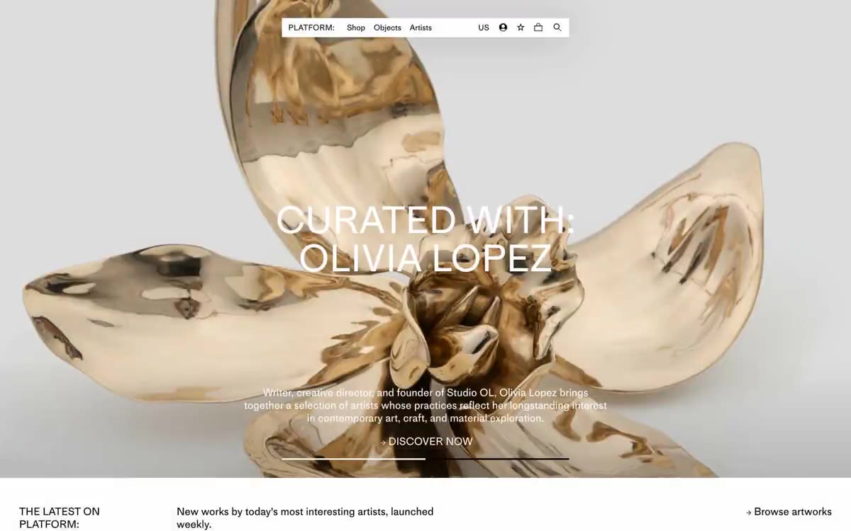
PLATFORM is a monochrome gallery showcase: a pure white canvas, pure black type, and a consistent typographic style that allows the artworks to carry the entire color palette. The interface is editorial rather than commercial—plenty of negative space, thin borders, and a compact 15px font size make the catalog feel rich but not utilitarian. Every element is reduced to its basic geometric form: no shadows, no rounded corners, no decorative gradients. Visual expression is achieved solely through typography: a 72px font size and a restrained 1.00 line height create a slow, measured rhythm for a printed exhibition catalog.
A full-width title section with centered text overlay follows a gray header strip representing each content section, followed by a four-column grid with illustrations. The page occupies a maximum width of approximately 1280px for the grid of cards and text blocks, but the title section and section strips stretch from edge to edge. The section rhythm is consistent: each zone begins with a title strip with a thin border (gray background, left-aligned label, right-aligned description, link), followed by a grid of cards. Navigation is a minimalist top bar with no fixed behavior. There are no sidebars, no breadcrumbs in the main flow—the layout is strictly vertical: navigation → title section → header strip → grid → header strip → grid → footer.
The images featured are purely fine art photography: paintings, sculptures, and mixed-media works, presented as straight product fragments against a white background. There's no context, no staged shots of the room, no models interacting with the artwork. Each piece occupies the entire card frame from edge to edge, perceived as a precious object, isolated for viewing. The main image is an atmospheric, full-width photograph—dark, slightly washed-out, with dramatic lighting—that serves more to establish an editorial mood than to capture the product. There are no illustrations, no icons other than minimal functional glyphs, and no decorative graphics.
Palette
Neutral
- Bone White
#ffffff— Page background, card surfaces, negative space - Lamp Black
#000000— The main text, card and navigation borders, and link color are the only structural colors in the system. - Ash Gray
#dddddd— Thin dividing lines, barely noticeable separation of surfaces. - Concrete Gray
#cccccc— Secondary boundaries, input contours, shutdown states - Smoke Gray
#b3b3b3— Silent auxiliary text, metadata captions, placeholders - Graphite
#808080— Additional captions, timestamps, unselected metadata
Typography
from 12 to 72px · 5 steps
- MediumLLWeb — replacement: Söhne · outlines 400, 500 · All text on the website—the user interface, body copy, and headings—is used. A single neo-grotesque font from Production Type is used for all typographic functions. The default weight for body text and navigation is 400; 500 is reserved for artist names, prices, and highlighting in card metadata. Heading sizes (48–72px) use the same 400 weight with tight line spacing (1.00–1.15) to create a measured rhythm, typical of catalog pages.
Intervals and form
| Purpose | Meaning |
|---|---|
| Density | average |
| Basic step | 10px |
| Button radius | 0px |
| Card radius | 0px |
| Shadows | no - borders instead of shadows |
| Between sections | 72px |
| Page width | 1280px |
AI will build your website in PLATFORM style and fill it
- Fill with products and posts via the link - Instagram, TikTok, Facebook.
- Transfer content from your old site—just specify the address.
- Modern design on the best engine: React ( Next.js) with server rendering and SEO optimization out of the box.
- Fully automated SEO optimization for search results and neural network recommendations.
Similar styles
- Peak Design — Gallery wall, partially illuminated
- Arsenijs Fabrica — The inherent beauty of editorial content is revealed under the gallery lights. The gallery's crisp white walls, a single warm strobe light pulsing orange against the monochrome backdrop, glass-thin type, and an abundance of white space
- 21 TSI — A crimson void, a single silhouette – a high fashion editorial where the user interface dissolves into the atmosphere
- Aevi Wellness — Scandinavian apothecary style, weightless typeface. A muted gray-blue accent breaks the overall achromatic, airy layout of the editorial material, where product photos are superimposed on thinly bordered cards against a warm white background.
- Palmer — A ceramic gallery in soft daylight – the interaction takes place with the wall, and the objects are art
- Assembly Coffee London — Coals in a dark roastery. A nearly black canvas with warm, dimly lit product photos and cursive serif lettering—the feel of a specialty coffee menu printed in a midnight samizdat.
- ARTWORLD — Fashion magazine headline on white linen
- Structured — Renaissance gallery on plasticine-like paper
- Airbnb — A quiet white gallery wall with a single coral red bookmark
- VISIONNAIRE — A streetwear editorial gallery on a crisp white background. The brand behaves like a printed lookbook: a flat white canvas, crisp black ink, and a single warm cream panel used as a color block to showcase a product or logo.
- Letter — A private gallery featuring shimmering artifacts from storage. A black-walled exhibition space where serifed headlines float above chrome sculptures on the gallery's tinted walls.
- Ramp — The editorial finance department, black and white pages with a single neon marker. The publication's practically monochrome surface, where a single bright lime-green stroke transforms every interaction into a monetary signal.