
Peak Design
Gallery wall, partially illuminated
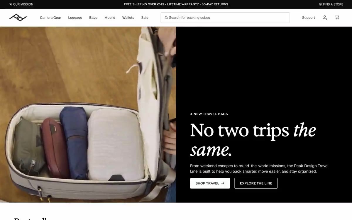
Peak Design is a gallery-quality commercial experience: a nearly monochrome canvas where editorial typography and product photography do all the work. The system alternates crisp white surfaces with deep, near-black panels, creating striking split layouts where a serif headline in an italic typeface is placed on one side and a full-screen product or lifestyle image on the other. The typography is the core voice of the brand: a tall, condensed, decorative serif typeface (in the style of Exposure) for the headlines, paired with a neutral grotesque typeface (Geist) for the user interface, and a condensed sans-serif typeface (bryant) for the lettering, eyebrows, and buttons. The interface remains clean: no chromatic UI elements, no decorative gradients, no shadows—only subtle borders, two corner radii (4 and 8), and a single red accent used only occasionally for emphasis. The components appear more thoughtful than decorative: thin dividers, flat product cards, pill-shaped filters, and invisible buttons that feel like architectural annotations.
Full-width page sections alternate between white and near-black; each section occupies the entire viewport width, with no maximum width limit at the section level. Content within sections has a maximum width of ~1440px and is centered. The dominant header pattern is a 50/50 split: a text block (browsing + headline + subtext + buttons) on one side, and a full-width product or lifestyle image on the other. Below the fold, the product grid uses four columns of equal-width product cards with generous gutters of 24-32px. Category filter panels are positioned directly below the main navigation in a horizontal row of "pills." The rhythm of the sections is defined by alternating light/dark stripes with 80px vertical indentation between sections, creating an editorial-magazine rhythm. The navigation is a fixed top bar with a thin ad strip above it.
The visual language is dominated by product photography: bags, belts, and camera equipment are photographed against a pure white background, without the context of everyday life, with lighting highlighting the texture of the material and the details of the hardware. Everyday images appear only in full-screen editorial sections (for example, hands holding cameras in a circle) and occupy the entire width of the viewport on one side of the split panel. Images have no corner radius in the main image (they are flush with the edges), and no corner radius in the card image. There are no illustrations, no abstract graphics, no icon illustrations other than functional UI icons. The product IS the focus—studio-quality photographs, with consistent angles, consistent lighting, and a consistent white background—while the UI fades into the background, allowing the objects to speak for themselves.
Palette
Neutral
- Carbon Ink
#1a211e— Body text, dark sidebars, body text, icons, frames on light surfaces - a near-black color that serves as the base for each heading and forms the dark background panels of the divided sections. - Paper White
#ffffff— A light supporting surface for creating an unobtrusive background and separating sections. It shouldn't be used as the primary color for the call to action. - True Black
#000000— Elements with maximum contrast—header fill on a white background, announcement bar, footer design, solid icon outlines—are placed where the design requires the clearest lines. - Obsidian
#0c0c0c— Deep panel surfaces and image overlays - slightly softer than true black, used for dark areas that take up the entire screen surface and should feel solid but not harsh like flat black. - Fog
#eef1f0— A light supporting surface for creating an unobtrusive background and separating sections. It shouldn't be used as the primary color for the call to action. - Mist
#e0e0e0— Dividing lines, disabled states, subtle structural dividers - a medium-light gray color defining the boundaries between sections on a white canvas.
Typography
from 14 to 80px · 6 steps
- Geist — replacement: Inter · outlines 400, 600, 700 · Main text, product titles, descriptions, form fields, link text, and footer content. Font weight: 400 for main text, 600 for highlights, and 700 for product titles and important inline notes. The neutral Grotesque font allows Display Serif and Condensed Sans fonts to reflect the brand style, while Geist provides functionality and legibility.
- Exposure-style serif (Exposure-10) — replacement: Playfair Display · outlines 400 · Headlines and main headings. A single weight (400) in an italic serif font creates editorial authority—these words set the brand tone, used sparingly on dark panels that span the entire width of the page and at the beginning of key sections. Tight letter spacing (-0.025em) allows the large letters to appear restrained rather than lightweight.
- Bryant-style condensed sans (bryant) — replacement: Druk Wide · outlines 700 · Navigation labels, category filter buttons, button text, "eyebrows," section tags, and additional headings. Compressed capital letters with positive letter spacing create an industrial, label-like style—these words identify and instruct, but never describe.
Intervals and form
| Purpose | Meaning |
|---|---|
| Density | average |
| Basic step | 24px |
| Button radius | 4px |
| Card radius | 8px |
| Shadows | no - borders instead of shadows |
| Between sections | 80px |
| Page width | 1440px |
AI will build your website in Peak Design style and fill it
- Fill with products and posts via the link - Instagram, TikTok, Facebook.
- Transfer content from your old site—just specify the address.
- Modern design on the best engine: React ( Next.js) with server rendering and SEO optimization out of the box.
- Fully automated SEO optimization for search results and neural network recommendations.
Similar styles
- Arsenijs Fabrica — The inherent beauty of editorial content is revealed under the gallery lights. The gallery's crisp white walls, a single warm strobe light pulsing orange against the monochrome backdrop, glass-thin type, and an abundance of white space
- 21 TSI — A crimson void, a single silhouette – a high fashion editorial where the user interface dissolves into the atmosphere
- Aevi Wellness — Scandinavian apothecary style, weightless typeface. A muted gray-blue accent breaks the overall achromatic, airy layout of the editorial material, where product photos are superimposed on thinly bordered cards against a warm white background.
- Palmer — A ceramic gallery in soft daylight – the interaction takes place with the wall, and the objects are art
- PLATFORM — The White Cube Gallery under the spotlight
- Assembly Coffee London — Coals in a dark roastery. A nearly black canvas with warm, dimly lit product photos and cursive serif lettering—the feel of a specialty coffee menu printed in a midnight samizdat.
- ARTWORLD — Fashion magazine headline on white linen
- Structured — Renaissance gallery on plasticine-like paper
- Airbnb — A quiet white gallery wall with a single coral red bookmark
- VISIONNAIRE — A streetwear editorial gallery on a crisp white background. The brand behaves like a printed lookbook: a flat white canvas, crisp black ink, and a single warm cream panel used as a color block to showcase a product or logo.
- Letter — A private gallery featuring shimmering artifacts from storage. A black-walled exhibition space where serifed headlines float above chrome sculptures on the gallery's tinted walls.
- Ramp — The editorial finance department, black and white pages with a single neon marker. The publication's practically monochrome surface, where a single bright lime-green stroke transforms every interaction into a monetary signal.