
Palmer
A ceramic gallery in soft daylight – the interaction takes place with the wall, and the objects are art
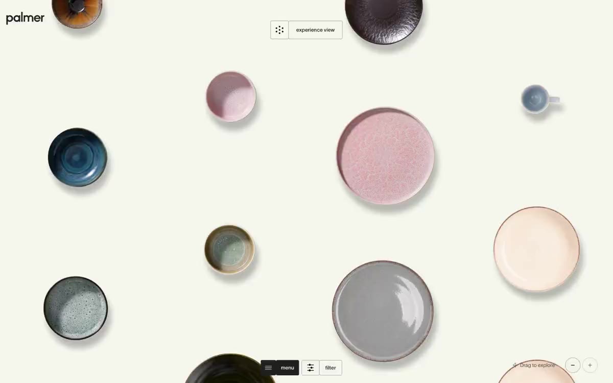
Palmer treats the tableware like a museum piece on a warm, creamy canvas (#f5f6ee). The interface dissolves—no shadows, no chrome, no rich accents—so the hand-glazed ceramics become the only color in the room. The typography is minimalist: the TWK Lausanne typeface is almost monotone (300–500) with aggressive negative letter spacing that draws the letters together, including a huge 120px display layer that functions more as an editorial statement than an interface marker. Interactive elements are reduced to thin borders and pill-shaped toggles positioned at the edges of the viewport to keep the center completely clear. Everything below the fold follows the same gallery logic: small text, thin lines, generous spacing between objects.
A full-screen interface with no maximum width restrictions. The primary element is scattered elements across the screen: individual fragments arranged in carefully chosen locations, rather than in a grid. Navigation elements are relegated to the corners (wordmark at the top left, toggle at the top center, control panel at the bottom center), leaving the central area entirely for images. This is a single-screen interface—the scattered elements are the primary element, and all secondary interface elements (menu, filter, zoom) are displayed under specific conditions. The rhythm of the sections is minimal: one screen, one scattered composition, minimal text. There are no traditional alternating stripes.
Photography focuses exclusively on figurative products—shots of individual ceramic pieces (plates, bowls) from above or at a 3/4 angle against a clear or cream background. There's no context, no hands, no table settings. Each piece is cropped with a slight shadow to create the impression of contact with the surface. The images are the only source of color on the website: glazed blues, olive greens, mottled whites, and amber browns. The density is high, yet breathable—pieces are scattered with intentional empty space between them, more of a curatorial than a catalog approach.
Palette
Neutral
- Gallery Cream
#f5f6ee— The surface of the canvas and base is a warm creamy shade, which is better suited for glazed ceramics than pure white. - Ink
#222222— The main text, thin borders, card outlines, icon outlines—the entire structural framework is done in this almost black color. - Bone
#ffffff— Product background images, sometimes with an inverted surface where the card is to be placed in front of a cream canvas. - Fog
#a1a19c— Subdued secondary borders and low priority text - used when the ink is too thick for a structural divider. - Lampblack
#000000— This color is reserved for rare filled elements (active navigation background, weight anchors) and is used sparingly to ensure that Ink remains the primary text color.
Typography
from 11 to 120px · 4 steps
- TWK Lausanne — replacement: Inter Tight or Neue Haas Grotesk Display Pro at matching weights · outlines 300, 400, 500, 600, 700 · A single font suitable for everything from micro-tags to editorial typography. 300 weight is used for headings and larger titles (a thin Swiss sans serif, allowing the ceramic letters to dominate), 400–500 for body copy and the user interface, and 600–700 for active states and filter labels. A distinctive feature is the tight letter spacing (-0.04em in headings, -0.02em in body copy): characters are placed close together, giving even 11px headings a sense of condensation and thoughtfulness, rather than the airiness of standard characters.
Intervals and form
| Purpose | Meaning |
|---|---|
| Density | average |
| Basic step | 12px |
| Button radius | 8px |
| Card radius | 12px |
| Shadows | no - borders instead of shadows |
| Between sections | 80px |
AI will build your website in Palmer style and fill it
- Fill with products and posts via the link - Instagram, TikTok, Facebook.
- Transfer content from your old site—just specify the address.
- Modern design on the best engine: React ( Next.js) with server rendering and SEO optimization out of the box.
- Fully automated SEO optimization for search results and neural network recommendations.
Similar styles
- Peak Design — Gallery wall, partially illuminated
- Arsenijs Fabrica — The inherent beauty of editorial content is revealed under the gallery lights. The gallery's crisp white walls, a single warm strobe light pulsing orange against the monochrome backdrop, glass-thin type, and an abundance of white space
- 21 TSI — A crimson void, a single silhouette – a high fashion editorial where the user interface dissolves into the atmosphere
- Aevi Wellness — Scandinavian apothecary style, weightless typeface. A muted gray-blue accent breaks the overall achromatic, airy layout of the editorial material, where product photos are superimposed on thinly bordered cards against a warm white background.
- PLATFORM — The White Cube Gallery under the spotlight
- Assembly Coffee London — Coals in a dark roastery. A nearly black canvas with warm, dimly lit product photos and cursive serif lettering—the feel of a specialty coffee menu printed in a midnight samizdat.
- ARTWORLD — Fashion magazine headline on white linen
- Structured — Renaissance gallery on plasticine-like paper
- Airbnb — A quiet white gallery wall with a single coral red bookmark
- VISIONNAIRE — A streetwear editorial gallery on a crisp white background. The brand behaves like a printed lookbook: a flat white canvas, crisp black ink, and a single warm cream panel used as a color block to showcase a product or logo.
- Letter — A private gallery featuring shimmering artifacts from storage. A black-walled exhibition space where serifed headlines float above chrome sculptures on the gallery's tinted walls.
- Ramp — The editorial finance department, black and white pages with a single neon marker. The publication's practically monochrome surface, where a single bright lime-green stroke transforms every interaction into a monetary signal.