
Nike
A monochrome gallery of sporting achievements – white walls, the product as a work of art, chrome dissolved into the background
Nike.com functions as a monochrome, product-first gallery: the user interface is virtually invisible, allowing product photos to occupy every screen. The entire interface is constructed from black, white, and three shades of gray—no accent colors, no decorative gradients, no warm, signature chrome. Nike's signature style lives in the gallery logo and the photos, but never in the user interface itself. The typography is compact and utilitarian, relying on a custom-designed Helvetica Now font family at 12-20px, with a single, oversized Nike Futura ND logo at 76px for headings. Components are minimalist: pill-shaped buttons with a 30px radius, flat product cards, thin borders, and virtually zero height differences. The page alternates between pure white product surfaces and striking, dark editorial sections, creating rhythm through contrast rather than ornamentation.
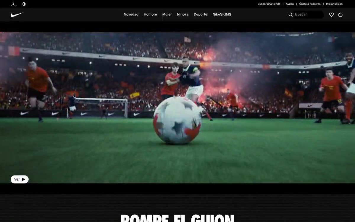
The page follows a robust editorial rhythm: a striking, full-width, dark header featuring a single product and a large title, followed by a full-width, 2x2 category grid, a horizontally scrolling grid of product cards in 3 columns, and finally a dense, multi-column footer. All content blocks occupy the full viewport width with no maximum container width; a maximum width limitation applies only to the navigation and footer link grid. The transitions between sections are sharp: black header → white category grid → white product grid → white footer, with narrow gray borders serving as the only visual seam. The navigation is a minimalist, two-tiered bar (auxiliary links at the top, primary categories centered) with no pinning, no background fill, and no shadow. Content density is compact in the product grids (tight card spacing) and spacious in the header (full-width viewport).
Photography is the dominant visual element and defines the brand's entire identity. The system utilizes high-quality, full-frame product photos: athletic shoes photographed individually against a dark or gradient background, cropped to fill the frame, without lifestyle context. Lifestyle images appear within categories, showcasing the feet and legs of athletes in motion. A high-contrast, saturated color scheme is used—red shoes against a black background, neon accents on white soles, and warm and cool lighting to dramatize the materials. No illustrations, abstract graphics, or 3D renderings are used. Images always have clean edges (no rounded corners in photo containers), always occupy the entire space within their blocks, and are always accompanied by minimal text overlay. The iconography is purely functional: outline icons for search, wishlist, cart, and account in Obsidian or Steel colors.
Palette
Neutral
- Obsidian
#111111— Dark color complements neutral text and icons and creates strong contrast. Avoid using it as the primary color for calls to action. - Paper White
#ffffff— Page background, card surface, button text on a dark background, icon outline—the default canvas for product grids and category sections. - Concrete Gray
#e5e5e5— Borders, dividers, thin lines separating grid sections, subtle outlines of input fields. - Soft Mist
#f5f5f5— Subtle background color for secondary surfaces, search field fill in navigation, tag background. - Steel
#707072— Secondary text, muted helper text, reduced icon outlines, breadcrumb labels, footer link separators. - Faint Gray
#9e9ea0— Icon outlines, minor UI elements, and borders with minimal highlighting are disabled.
Typography
from 12 to 76px · 6 steps
- Helvetica Now Text Medium — replacement: Inter · outlines 500 · Helvetica Now Text Medium font - found in the scraped data but not described by the AI.
- Helvetica Now Text — replacement: Inter or Helvetica Neue · outlines 400, 500 · The main text of the user interface - navigation links, button labels, card titles, product names, footer lists, all body text.
- Helvetica Now Display Medium — replacement: Inter Medium or Helvetica Neue Medium · outlines 500 · Section headings, card category labels, medium-sized headings - Medium font (20-24px) is a hallmark of Nike headings that aren't large design elements: never bold, always concise.
Intervals and form
| Purpose | Meaning |
|---|---|
| Density | dense |
| Basic step | 8px |
| Button radius | 30px |
| Card radius | 0px |
| Shadows | no - borders instead of shadows |
| Between sections | 48px |
| Page width | 1440px |
AI will build your website in Nike style and fill it
- Fill with products and posts via the link - Instagram, TikTok, Facebook.
- Transfer content from your old site—just specify the address.
- Modern design on the best engine: React ( Next.js) with server rendering and SEO optimization out of the box.
- Fully automated SEO optimization for search results and neural network recommendations.
Similar styles
- Airbnb — A quiet white gallery wall with a single coral red bookmark
- Apple (España) — white gallery display case
- Silencio — A white room with floating artifacts. A gallery display made of warm paper, where each element occupies its place against a background of negative volume, and the silence is an intentional design decision.
- Oakâme — A sun-drenched Provençal workshop carved from warm stone
- Arc — industrial white gallery over midnight water
- Rivian — An electric monolith on the gallery's concrete wall. Rivian presents each vehicle as a sculpture against a vast white space, with typography so large it becomes an architectural element, and a single warm yellow that breaks the monochromatic atmosphere, like sunlight on a matte surface.
- Analogue — Black gallery display case – goods hover in the void
- ddna — warm museum display case on untreated linen
- Zellerfeld — A sculptor's workshop on white marble—the monolithic surfaces of the pedestal, a single spark of cobalt, a whisper of lowercase letters from floor to ceiling
- UY Studio — The monastery's stone gallery is a quiet space with concrete walls, where perfume bottles stand on white plinths, illuminated by one 400-watt lamp and four warm gray bulbs.
- Basic.Space — curatorial gallery on white marble
- COS — a trendy gallery with white walls