
COS
a trendy gallery with white walls
COS utilizes the visual grammar of a contemporary art gallery: vast white walls, large-format monochrome photographs, and typography that doesn't interfere with the models. The interface is virtually colorless—achromatic—using near-black (#080808) on pure white (#ffffff) as the only structural contrast, with a single touch of red (#c80000) reserved as a subtle accent for moments that should feel urgent but not overt. Spacing is generous and editorially appropriate, with section indents reaching 135px, and components dissolve into the page: thin borders on #dadada, no shadows, no gradients, no rounded corners. The typography (SuisseIntl) is the only ornament—a single grotesque font family that remains consistent from the 12px micro-labels to the 35px category descriptions, shifting slightly toward the positive to evoke the gallery's typefaces.
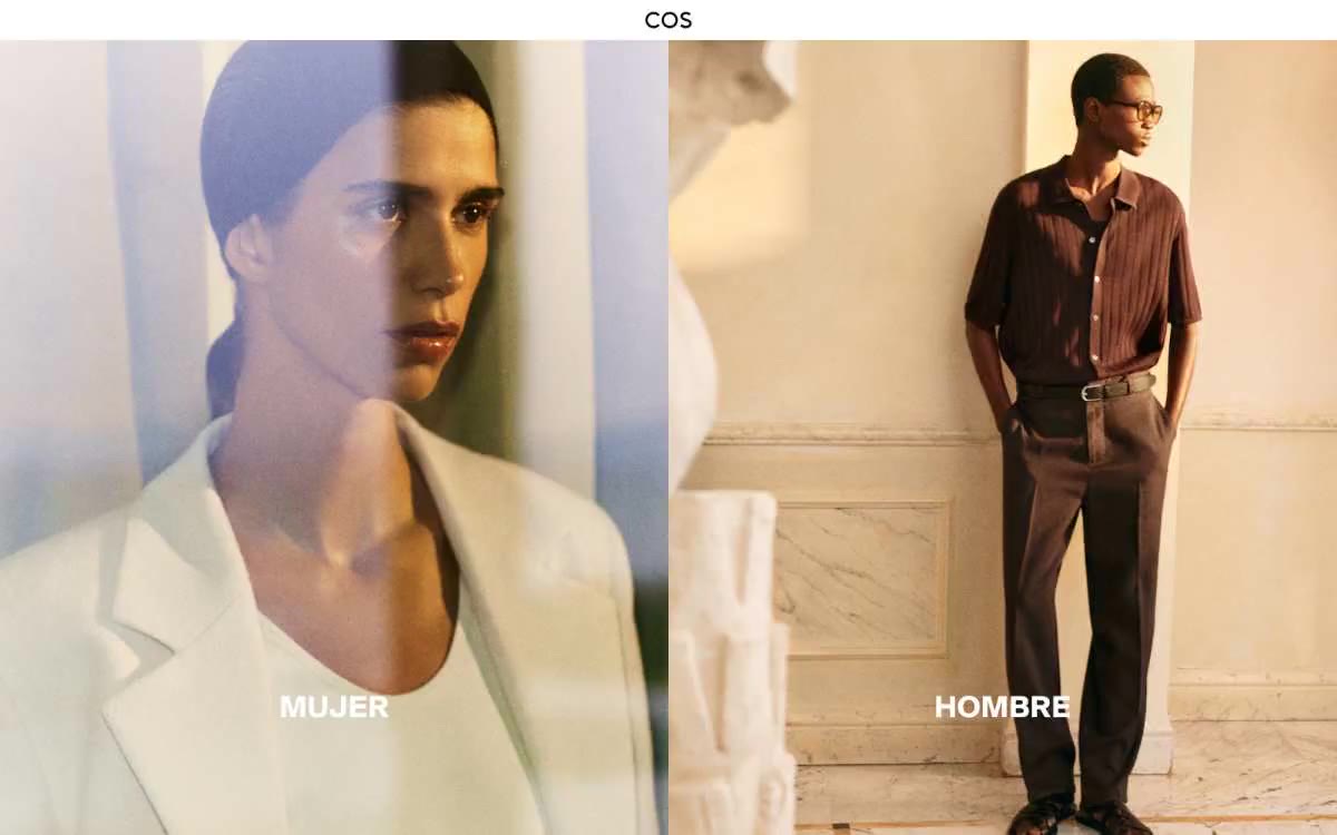
The full-height page model—the canvas extends edge to edge without a maximum-width container, and content is anchored by dividing images and white space rather than a centered column. The hero is a 50/50 vertical split of two full-width editorial portraits, so dominant that it serves as the brand's structural calling card. Below the hero, sections alternate between text blocks on a white background (centered, in a single column) and additional full-height images. The vertical rhythm is spacious: the gaps between sections create a sense of space between the stripes, like on a museum wall. The navigation is a single thin white strip with a centered logo and a right-aligned locale selector—there is no horizontal category bar, no mega-menu visible in the main frame. Information density is low: one statement per section, one image per idea.
Large-format editorial fashion photographs dominate the page—full-width portraits and three-quarter-length shots of models, under controlled studio lighting, predominantly neutral and subdued with warm tones. The images are tightly packed, filling the space from edge to edge, without rounded corners, decorative masks, or superimposed frames. A signature technique is the "two portraits side by side" (MUJER / HOMBRE) frame: two equally important portraits placed side by side, each labeled with a single category tag in the lower left corner. The photographs are framed like gallery prints—the subject is prominent, context is absent, human scale is absent, and the palette is monochrome. No scenes from life, no props, no textured backgrounds.
Palette
Neutral
- Canvas White
#ffffff— A light supporting surface for creating an unobtrusive background and separating sections. It shouldn't be used as the primary color for the call to action. - Ink Black
#080808— Body text, icons, links, navigation type, button borders, logo, footer text - a softer color than pure black to prevent photos from appearing too sharp against it. - True Black
#000000— Overlaying the main text on dark images, body text, button labels - pure black is used only for the most contrasting typographic elements. - Mist Gray
#dadada— Subtle borders, underlined input fields, subtle separators, outlines when disabled—the quietest neutral shade, visible only by what it separates. - Signal Red
#c80000— The red color serves as an additional accent for decorative details and to emphasize low frequencies.
Typography
from 12 to 35px · 3 steps
- SuisseIntl — replacement: Neue Haas Grotesk Display · outlines 400, 500, 700 · A single font is used throughout the interface for navigation, body text, headings, buttons, and product descriptions. Positive letter spacing (0.01–0.04em) is unusual for a screen font and enhances the feel of a printed catalog; 700 weight is reserved for category descriptions, 500 for navigation and buttons, and 400 for everything else. The branding is consistent with a single font family and a very narrow size range (12–35px)—the font never overpowers.
Intervals and form
| Purpose | Meaning |
|---|---|
| Density | spacious |
| Basic step | 8px |
| Button radius | 0px |
| Card radius | 0px |
| Shadows | no - borders instead of shadows |
| Between sections | 135px |
AI will build your website in COS style and fill it
- Fill with products and posts via the link - Instagram, TikTok, Facebook.
- Transfer content from your old site—just specify the address.
- Modern design on the best engine: React ( Next.js) with server rendering and SEO optimization out of the box.
- Fully automated SEO optimization for search results and neural network recommendations.
Similar styles
- Airbnb — A quiet white gallery wall with a single coral red bookmark
- Apple (España) — white gallery display case
- Silencio — A white room with floating artifacts. A gallery display made of warm paper, where each element occupies its place against a background of negative volume, and the silence is an intentional design decision.
- Oakâme — A sun-drenched Provençal workshop carved from warm stone
- Nike — A monochrome gallery of sporting achievements – white walls, the product as a work of art, chrome dissolved into the background
- Arc — industrial white gallery over midnight water
- Rivian — An electric monolith on the gallery's concrete wall. Rivian presents each vehicle as a sculpture against a vast white space, with typography so large it becomes an architectural element, and a single warm yellow that breaks the monochromatic atmosphere, like sunlight on a matte surface.
- Analogue — Black gallery display case – goods hover in the void
- ddna — warm museum display case on untreated linen
- Zellerfeld — A sculptor's workshop on white marble—the monolithic surfaces of the pedestal, a single spark of cobalt, a whisper of lowercase letters from floor to ceiling
- UY Studio — The monastery's stone gallery is a quiet space with concrete walls, where perfume bottles stand on white plinths, illuminated by one 400-watt lamp and four warm gray bulbs.
- Basic.Space — curatorial gallery on white marble