
MAKR
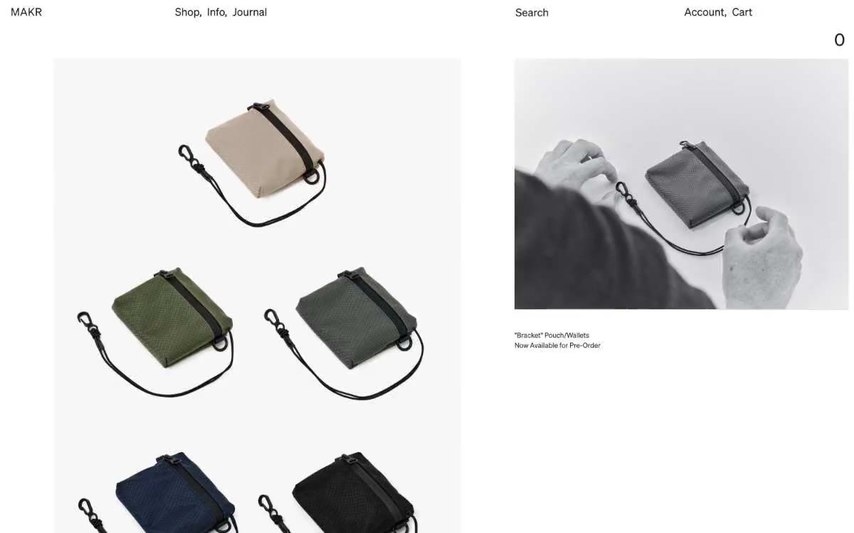
A museum display case for handcrafted leather goods. A quiet, all-white room where labels in warm black ink float beneath large photographs of leather goods held in hand or against landscapes, the only color contrast a muted stripe of sage.
MAKR is an online editorial gallery dedicated to handcrafted leather goods, built on a nearly entirely achromatic palette where photography is the dominant element. A single, almost gray banner tone (with a subtle hint of sage) accents the top ad strip, while everything else—surfaces, text, dividers, links—is rendered in deep, warm black ink on a white background. The typography is Sohne neo-grotesque at its most restrained: small fonts, generous line spacing, and positive letter spacing for capital letters in the captions feel like text on a gallery wall, not like a web interface. The layout is image-dominated, asymmetrical, and minimalist, like a museum: objects are photographed in hand, in landscapes, in natural light, with tiny link-like captions beneath them. The components are virtually invisible—underlined text links, hidden input fields, no shadows, no rounded buttons—letting the skin and photography play a central role in shaping the brand.
An edge-to-edge layout with no maximum content width limit—images fill the entire viewport. The top banner ad occupies the full width, followed by full-width header navigation. The main content area uses a multi-column image grid (2–3 columns on desktop) with zero or minimal gutters, allowing the photographs to create their own visual structure. Text and links are positioned in white spaces below the images, never overlapping. Editorial sections alternate between product grids and full-width, lifestyle-style photographs. The vertical rhythm is generous (80–1.5 gutters between sections), creating the feeling of strolling through a gallery. The newsletter subscription modal is a fixed, lower-left panel; a closable subscription panel is positioned at the very bottom of the viewport. The overall impression is one of a museum catalog or editorial spread, rather than a typical e-commerce layout.
Photography is the core content and language of the brand. Two registers coexist: (1) large black-and-white shots of the product in hand, square or cropped in a 3:4 ratio, with high contrast, the object fills the frame without lifestyle context; (2) full-color lifestyle photos in warm natural light, landscapes in earthy tones, models on the move with bags, shot from low angles with a shallow depth of field. The alternation of grayscale and full-color images creates a single visual rhythm on the page. No illustrations, no 3D renders, no abstract graphics. Images occupy the entire page or span the entire width of the page, in grid cells with zero radius and no borders. Icons are absent or minimal—a simple cross to close, and nothing more.
Palette
Neutral
- Obsidian Ink
#1c1717— The main text, all text links, body text, headings, icon outlines, and subtle border lines throughout the user interface. This is the primary color—a 17.7:1 ratio on a white background, used in over 5,000 instances. Its very subtle warm tone (not pure black) gives the entire interface the feel of a printed catalog rather than a screen. - Paper
#ffffff— Thin borders, dividers, input field outlines, and card edges on light surfaces. Avoid using this color as the primary color for call-to-action buttons. - Bone
#f0f0f0— A secondary surface for alternating sections, creating subtle panel backgrounds, and internal borders/dividers. It creates a subtle warm gray hue between the white of the paper and the light green of the ad. - Eucalyptus Mist
#a9aea9— The banner ad background at the top of the page, muted color transitions between sections, and a tertiary frame. On its own, it appears almost gray, but when used across the full width, it takes on a subtle sage hue—the only color accent in the monochrome scheme.
Typography
from 11 to 32px · 5 steps
- Sohne Web — replacement: Inter · outlines 400 · The entire interface style—the main text, navigation, links, headings, buttons, input fields, icons, and image captions—is used. The 400-weight Sohne font (no bold variants were found) gives MAKR its quiet yet confident expressiveness: information is conveyed through size and letter spacing, not through weight contrast. Alternatives: Inter, Söhne, or Untitled Sans.
- CircularXXMonoWeb — replacement: JetBrains Mono · outlines 400 · Used only for occasional technical instructions or product specifications—a monospaced whisper that breaks the neo-grotesque rhythm. Use sparingly: product code, material specifications, nothing more. Replace with: JetBrains Mono or IBM Plex Mono.
Intervals and form
| Purpose | Meaning |
|---|---|
| Density | dense |
| Basic step | 5-8px |
| Button radius | 0px |
| Card radius | 0px |
| Shadows | no - borders instead of shadows |
| Between sections | 80-120px |
AI will build your website in MAKR style and fill it
- Fill with products and posts via the link - Instagram, TikTok, Facebook.
- Transfer content from your old site—just specify the address.
- Modern design on the best engine: React ( Next.js) with server rendering and SEO optimization out of the box.
- Fully automated SEO optimization for search results and neural network recommendations.
Similar styles
- FARFETCH España — A fashion gallery in the "white cube" style. Imagine a high-end retail space where the walls, floors, and fixtures are bleached white, and only the clothes and the people who wear them create every hue, texture, and visual expression.
- Franco Maria Ricci Editore — Art Deco Gallery Catalogue - Polished gold lines on crisp white parchment
- Laura Monin — Editorial gallery wall, white marble, ink stamp
- OhDada — Editorial gallery wall
- Cursor — A cozy parchment workshop, lit by smoldering coals
- Structured — Renaissance gallery on plasticine-like paper
- MindMarket — A cozy fairytale book on cream paper - a friendly editorial canvas where large Inter headlines and cut-out paper characters coexist on a sun-drenched, sticker-soft surface.
- Airbnb — A quiet white gallery wall with a single coral red bookmark
- Apple (España) — The museum gallery, in soft daylight, is a single, captivating, weightless white space, with each exhibit illuminated by a spotlight against a lightly tinted wall.
- Lamborghini — Black body color in the showroom, under the spotlights - one yellow car
- Amplemarket — A sun-drenched workplace strewn with confetti
- Getharvest — A desk at golden hour – a warm cream canvas, white postcards hung on the canvas, and a single bright orange flame