
FARFETCH España
A fashion gallery in the "white cube" style. Imagine a high-end retail space where the walls, floors, and fixtures are bleached white, and only the clothes and the people who wear them create every hue, texture, and visual expression.
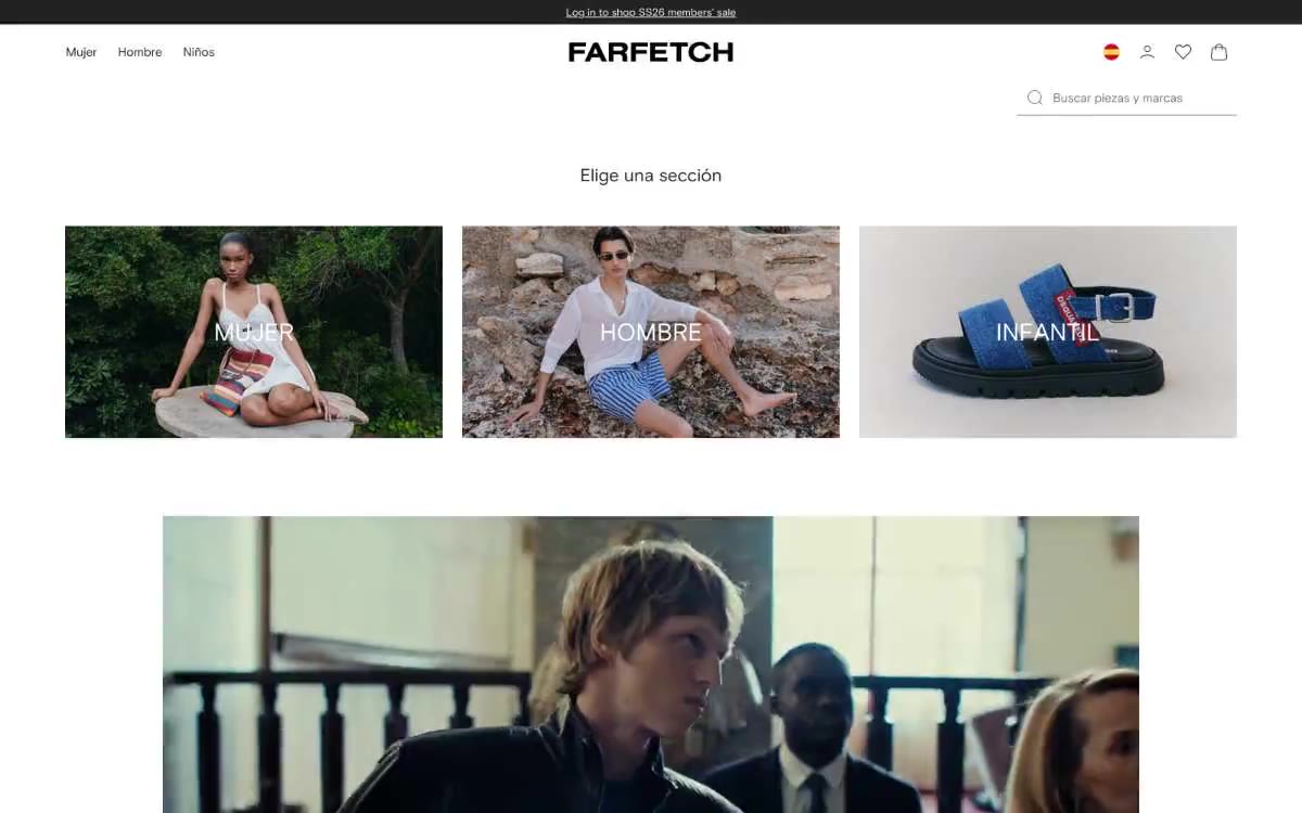
Farfetch functions as a "white cube" fashion gallery: the interface is almost completely devoid of color, allowing editorial photography to dictate all visual decisions. Typography provides all the structural work—a custom-designed geometric sans-serif font (Farfetch Basis) is used in weights 400 and 700, while section headings and the logo are rendered in a serif font that treats text as composition. The layout is architectural: centered, full-width content, rigid 3- and 4-column product grids, ample space for section placement (48–72px), and a complete lack of decorative elements. Components are stripped of embellishment—subtle underlines for search, hidden navigation links, capitalized category names beneath images, flat product tiles without shadows or borders. The only color in the system is the photographs themselves; the interface is a frame, not the image itself.
The page features a centered, full-width composition with a maximum content width of ~1280px. The header is a thin, three-zone panel (category navigation on the left, centered text sign, and auxiliary icons on the right), beneath which is a search field on the right. The first section is a three-column grid of full-width category tiles (MUJER, HOMBRE, INFANTIL), each with an overlay label. Below each category section is a four-column grid of product category cards (NOVEDADES, ROPA, BOLSOS, ZAPATOS) with titles in all caps. The section titles are centered and written in a font with a vertical indent of ~48px at the top and bottom. There are no alternating background stripes—the entire page is one solid white field. The footer is inverted to #222222 as a single dark stripe. The navigation is a minimalist top bar with no fixed elements, no mega menu, and no sidebar.
The visual system is dominated by editorial fashion photography—large, high-resolution images that fill the entire page, featuring models in architectural interiors and close-ups of products. The photography itself is executed in a muted, desaturated palette: concrete walls, natural stone, neutral interiors, soft, directional daylight. Models are shot mid- and full-length, with editorial poses, not the strict poses of e-commerce catalogs. Product images (bags, shoes) are isolated against a neutral gray or stone background, without any lifestyle context—the subject IS the protagonist. The interface adds no visual elements: no icons, no promotional stickers, no decorative frames. All the visual richness comes from the photography department, not the design system.
Palette
Neutral
- Carbon
#222222— Body text, page text, navigation links, icons, logo, footer, and an almost black color tone for the entire monochrome system. - Paper
#ffffff— The page canvas, card background images, product tile surfaces, input fields, and the dominant background, which makes the photograph the only color accent. - Ash Gray
#b6b6b6— Subtle icon strokes, extra borders, search underlining in the background, ghost text placeholder in input fields—the quietest option, not text-neutral. - Stone
#f5f5f5— Hover transition effect for navigation bars, secondary surface tone for sub-panels and ad backgrounds, the softest transition effect in the stack. - Graphite
#727272— Muted helper text, inactive form borders, and disabled icon outlines—a medium gray that signals a reduction in emphasis without sacrificing readability. - Smoke
#e6e6e6— Subtle dividers between rows of products, a barely noticeable structural line in an otherwise seamless layout.
Typography
from 13 to 30px · 3 steps
- Farfetch Basis — replacement: Söhne (paid) or Inter (free) — both share the geometric humanist proportions; Inter as the practical open-source fallback · outlines 400, 700 · A custom-designed geometric sans-serif font is used for everything displayed to the user: navigation links at 13–15px/400, body text and product descriptions at 15px/400, section headings at 22–30px/400, and the FARFETCH logo at 700. The 400-only headings are a deliberate move away from bold: section headings have a regular, confident, but not overly bold weight, while 700 is reserved for the logo and the most expressive category names. This special geometry ensures even stroke contrast and a subtle, humanistic warmth that the standard Helvetica font would not achieve.
Intervals and form
| Purpose | Meaning |
|---|---|
| Density | dense |
| Basic step | 24px |
| Button radius | 0px |
| Card radius | 0px |
| Shadows | no - borders instead of shadows |
| Between sections | 48-72px |
| Page width | 1280px |
AI will build your website in FARFETCH España style and fill it
- Fill with products and posts via the link - Instagram, TikTok, Facebook.
- Transfer content from your old site—just specify the address.
- Modern design on the best engine: React ( Next.js) with server rendering and SEO optimization out of the box.
- Fully automated SEO optimization for search results and neural network recommendations.
Similar styles
- MAKR — A museum display case for handcrafted leather goods. A quiet, all-white room where labels in warm black ink float beneath large photographs of leather goods held in hand or against landscapes, the only color contrast a muted stripe of sage.
- Franco Maria Ricci Editore — Art Deco Gallery Catalogue - Polished gold lines on crisp white parchment
- Laura Monin — Editorial gallery wall, white marble, ink stamp
- OhDada — Editorial gallery wall
- Cursor — A cozy parchment workshop, lit by smoldering coals
- Structured — Renaissance gallery on plasticine-like paper
- MindMarket — A cozy fairytale book on cream paper - a friendly editorial canvas where large Inter headlines and cut-out paper characters coexist on a sun-drenched, sticker-soft surface.
- Airbnb — A quiet white gallery wall with a single coral red bookmark
- Apple (España) — The museum gallery, in soft daylight, is a single, captivating, weightless white space, with each exhibit illuminated by a spotlight against a lightly tinted wall.
- Lamborghini — Black body color in the showroom, under the spotlights - one yellow car
- Amplemarket — A sun-drenched workplace strewn with confetti
- Getharvest — A desk at golden hour – a warm cream canvas, white postcards hung on the canvas, and a single bright orange flame