
Cursor
A cozy parchment workshop, lit by smoldering coals
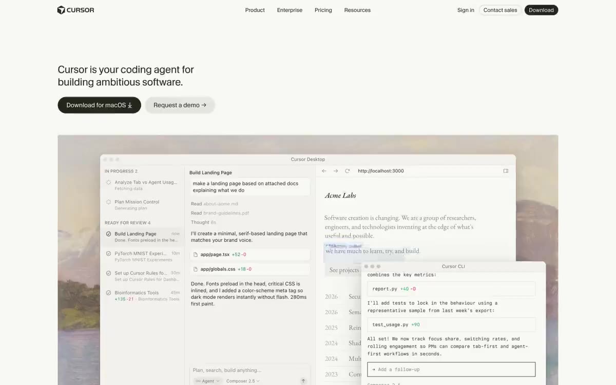
Cursor uses a warm, parchment-like typography: a creamy canvas, inky black text, and a single fiery orange accent that activates links and selections rather than filling buttons. Headings, set in CursorGothic at 400 weight, have gradually decreasing letter spacing as they increase in size—authority is achieved through restraint and thin letter weights rather than boldness. Surfaces are kept flat and paper-like, with thin borders and soft, warm gray shadows; corners remain crisp at 4px weight throughout the text. EB Garamond is used selectively for subheadings and prose, while berkeleyMono handles code, tags, and metadata, giving the system a typographic personality that feels more like a literary magazine than a SaaS dashboard.
Maximum width: 1300px centered, 24px margin. Top navigation: 52px tall transparent header with logo and text mark on the left, 4 centered navigation links, "Login / Contact / Download" cluster aligned to the right. Hero: Left-aligned header + double call-to-action block with text running from the top left, then a full-width product mockup card that spans the entire width of the page. Trust stripe: One horizontal row of 8 logo tiles in a single line across the section width. Feature sections alternate text on the left and a screenshot on the right in a two-column layout, each 50/50, with a vertical rhythm of 64-96px between sections. All feature screenshots are window mockups with identical macOS styling. Footer: Four-column grid of links with the brand mark on the left. The sections are separated by ample breathing space rather than dividers - the cream canvas itself provides the separation.
The product screenshots take center stage: large macOS window mockups showcasing the Cursor IDE in action: file tabs, diff views, agent plans, terminal panels, and Slack/chat integration. Each window mockup is framed with a #f2f1ed card with a soft, warm contrast. A muted landscape photo (mountains/desert horizon) extends beyond the main section, adding warmth without competing with the UI. Client logos ( Stripe, OpenAI, Linear, Datadog, NVIDIA, Figma, Ramp, Adobe) are presented as monochrome lettering within pill-shaped Linen tiles. There are no photographs of people, illustrations, or abstract decorative graphic elements—all the visual weight is focused on the product's UI and branding. Icons are thin, monolinear glyphs filled with #7a7974 Ash, never chromatic.
Palette
Neutral
- Ink
#26251e— Primary text, primary action button background, navigation text - a warm, almost black shade, never pure #000 - Parchment
#f7f7f4— The page background, the main canvas, is a warm cream shade that softens the contrast and creates the feeling of ink printing rather than digital printing. - Bone
#f2f1ed— Cardboard surfaces and raised containers, one tone darker than the canvas, create a layered, borderless "paper-on-paper" effect. - Linen
#e6e5e0— Light neutral fill for buttons on dark surfaces. - Stone
#cdcdc9— Thin borders, dividers, subtle partitions – 1px lines in warm tones - Mist
#a1a19f— Third-level auxiliary text, captions - between the muted and secondary text.
Typography
from 12 to 72px · 6 steps
- CursorGothic — replacement: Inter · outlines 400, 500 · The primary font for the user interface, headings, navigation, body copy, and product design. Headings with a 400-point weight and gradually decreasing letter spacing (-0.005em at 22px → -0.03em at 72px) are a distinctive feature of the font: headings are never bold. Font functions ss08, ss09, and tnum activate stylistic alternates and tabular figures.
- EB Garamond — replacement: Iowan Old Style · outlines 400, 500 · An editorial serif typeface for individual subheadings, body text, and tabular data, CursorGothic adds a literary touch to the interface.
- berkeleyMono — replacement: ui-monospace · outlines 400, 500 · Monospace - for code blocks, command line snippets, metadata, file paths, and developer labels - a technical language.
Intervals and form
| Purpose | Meaning |
|---|---|
| Density | dense |
| Basic step | 8px |
| Button radius | 4px |
| Card radius | 4px |
| Shadows | no - borders instead of shadows |
| Between sections | 64-96px |
| Page width | 1300px |
AI will build your website in Cursor style and fill it
- Fill with products and posts via the link - Instagram, TikTok, Facebook.
- Transfer content from your old site—just specify the address.
- Modern design on the best engine: React ( Next.js) with server rendering and SEO optimization out of the box.
- Fully automated SEO optimization for search results and neural network recommendations.
Similar styles
- Amplemarket — A sun-drenched workplace strewn with confetti
- Getharvest — A desk at golden hour – a warm cream canvas, white postcards hung on the canvas, and a single bright orange flame
- Drive Capital — Retro road trip poster on warm paper
- Wealthsimple — Cashmere-lined warehouse with gallery lighting
- Huddle — Pastel inventory cards on cream paper
- Fuser — Scattered Polaroids on a designer's work wall
- Campsite — A sunlit editor's workstation - warm cream paper with a single orange intent stamp
- Redis Agency — The editorial workshop, open after hours, is a pitch-black place where all the branding work is done by serif fonts and a single red radish.
- AI Product Generation — Editorial photography studio on white paper - title as cover, orange color for editorial highlighting
- Getanchor — Warm terracotta hue on a sun-faded cream background
- Flatfile — A quiet data diary on warm parchment
- Inthememory — An architectural drawing on white marble with a single warm light. A quiet, editorial data room where deep turquoise ink and pill-shaped controls float above crisp white surfaces, broken only by a single splash of orange.