
Letters
A morning appointment at an open-air clinic—a sterile white table under a soft blue ceiling, strewn with surgical blue instruments
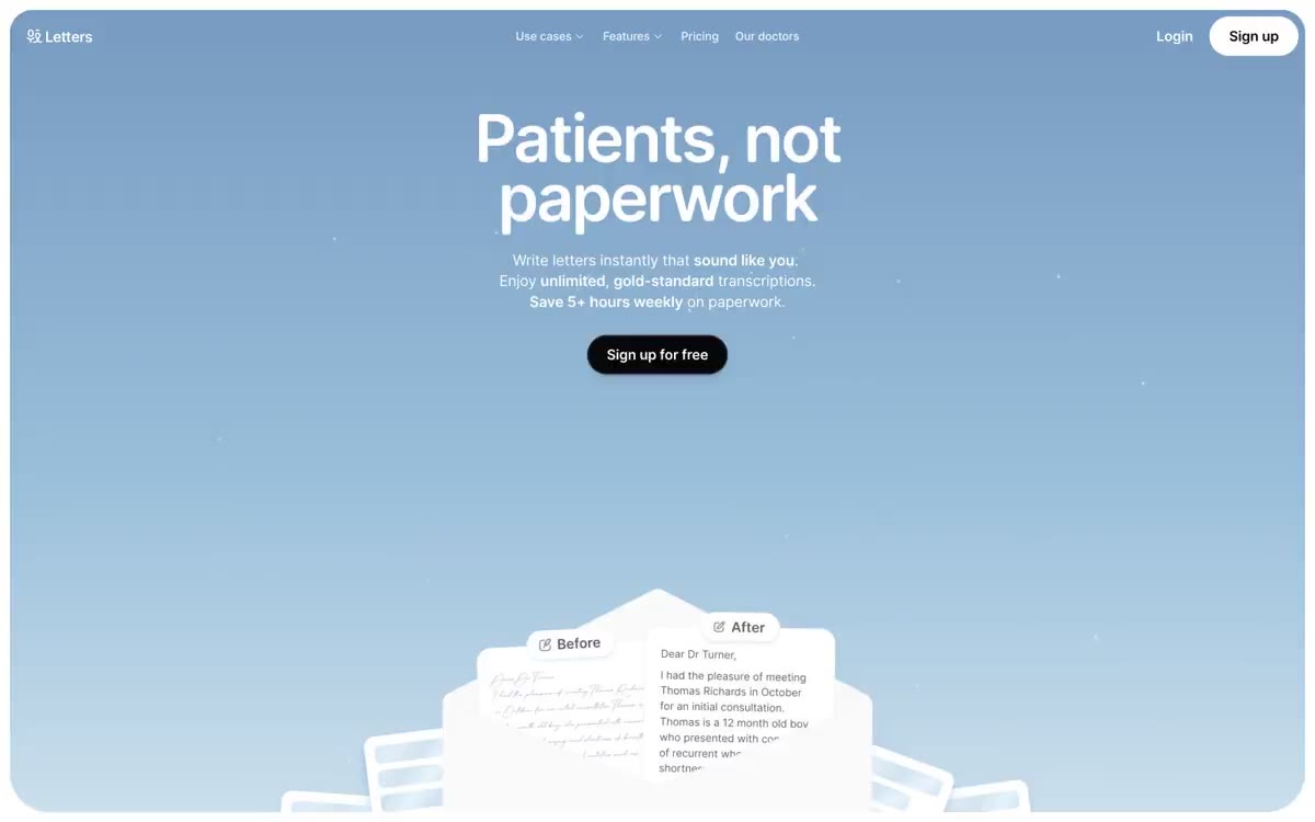
Letters is a medical letter writing tool that begins with a gradient open-sky header—a soft, atmospheric blue stripe creating a calm, clinical atmosphere—before transitioning to a clean white workspace. The system is designed in a monochrome style: a clean white canvas, near-black text (#070709), dark pill-shaped calls to action, and rounded cards floating on the subtlest shadows. A single bright blue (#2597d0) is reserved for functional punctuation—icons, micrographics, waveform players—never used for buttons or large fills. The typography uses Open Runde, a geometric humanist sans-serif with aggressive negative letter spacing at larger screen sizes (-0.04em at 80px), which compresses the headers into confident blocks. The components feel light, like a medical instrument: thin bezels, generous card spacing, pill-shaped buttons, and a discreet use of elevation that allows the sky-shaped header to do the emotional work.
A sky-blue gradient homepage spans the entire width of the page, with a centered title and subtext, and a call-to-action button below. It transitions smoothly into a white content area with generous spacing between sections (80-120px). Feature sections use a two-column grid of large, rounded cards (18-32px radius) of equal proportions. Section headings are always centered, in a single column, above the card grid. Navigation is a fixed white top bar with a centered cluster of links and right-aligned login actions. The overall rhythm is a single, atmospheric main stripe, then alternating white and #f5f5f5 sections with consistent vertical breathing space. There is no sidebar, no mega-menu, no asymmetrical layouts—the page feels like a calm, symmetrical column.
The visual design is almost entirely focused on the product's user interface—no lifestyle photos, no abstract 3D renders. The visual language is built around product cards showcasing the app's native interface: a "Before" and "After" comparison of documents, a loading area with a dotted border, and an audio player in the form of a waveform. The only atmospheric visual element is the sky gradient in the main image. The icons are flat, single-color #2597d0 line icons (envelope, microphone, checkmark) with uniform line weights, without filled variations. The illustration style is restrained: product mockups are displayed on a white background, slightly rotated to create depth, never sharply tilted. A handwritten font (The Doctor) is the only organic/handcrafted element, used solely to evoke the clinical handwriting on the "Before" card.
Palette
Brand
- Surgical Blue
#2597d0— Icons, a microphone icon, a sound wave player, and small functional accents create a single chromatic note throughout the interface.
Neutral
- Obsidian
#070709— The body copy, filled call-to-action buttons, and dark UI elements—near-black is chosen instead of pure #000 to soften the contrast against the white background. - Paper White
#ffffff— The page background, card surfaces, and button text are the main canvas for all sections below the main element. - Cloud Gray
#f5f5f5— Additional card surfaces and section backgrounds separate functional blocks from the main canvas. - Sky Tint
#d7e6f5— The shade of the cardboard frame and the barely noticeable blue tone of the surface create a feeling of atmosphere, rather than grayness. - Charcoal
#60606c— Primary text, secondary text, and muted borders - a dominant neutral color for non-heading content. - Slate
#8b8b8b— Minor text and inactive border states - used to indicate locations and ensure accessibility for people with disabilities.
Typography
from 12 to 80px · 8 steps
- sans-serif — replacement: Inter · outlines 400, 700 · sans-serif - found in the extracted data but not described by the AI.
- Open Runde — replacement: Inter Tight · outlines 400, 500, 600, 700, 900 · The primary font for headings and navigation is a geometric humanist, with tight letter spacing at large sizes; -0.04em at 80px compresses the heading into a single, confident block. Use for all headings, navigation, and large text.
- Inter — replacement: system-ui · outlines 400, 500 · Secondary body and UI text – used for small headings, navigation elements, and inline links where a more neutral reading rhythm is desired. Pairs with Open Runde to create hierarchical contrast.
Intervals and form
| Purpose | Meaning |
|---|---|
| Density | dense |
| Basic step | 12-16px |
| Button radius | 100px |
| Card radius | 18px |
| Shadows | no - borders instead of shadows |
| Between sections | 80-120px |
| Page width | 1200px |
AI will build your website in Letters style and fill it
- Fill with products and posts via the link - Instagram, TikTok, Facebook.
- Transfer content from your old site—just specify the address.
- Modern design on the best engine: React ( Next.js) with server rendering and SEO optimization out of the box.
- Fully automated SEO optimization for search results and neural network recommendations.
Similar styles
- Integrated Biosciences — bioluminescence lab at midnight
- Mintlify — A cloud garden above a glass table. The hand-drawn sky and documentary are framed together—the only place where color and concept collide before the page fades into monastic white.
- Gleap — A workspace decorated in warm cream tones with graphite accents—a studio where matte black ink dots seem to float above the linen architecture.
- Render — The design is on brushed aluminum. The interface feels like a clean, geometric engineering document—white space, thin lines, and a single purple line that draws attention to the action.
- Grafbase — engineering drawing on cold marble
- Slash — Midnight vault with gilded ledgers
- Modal — A phosphorescent terminal in a darkened server room - the only light source is a bright green color
- Whimsical — Rich plum ink on a lavender background—a creative studio notebook that doubles as a technical whiteboard.
- AgentQL — Northern Lights over the terminal at night
- Alveos One — A cozy refuge made of river stones – a quiet, creamy-lit meditation room where a single graphite object rests in a soft amber glow
- GitHub — A space command panel with bioluminescent control points—a dark, atmospheric workspace where a single green glow points the way forward.
- Buddy — An engineering drawing on graph paper. The white drawing surface is marked with a barely visible grid, applied in near-black ink, with fluorescent lime-green markings and iridescent gradient strokes.