
Le Puzz
Sunny Sunday Circular is a tabloid full of mysteries.
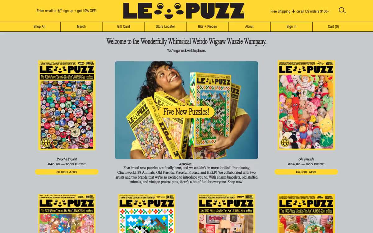
Le Puzz is a maximalist e-commerce system for boutique stores, built on a two-tone foundation: rich, honeycomb-like yellow paired with pure black, set against a cool, pearl-gray background. Its style is a cross between vintage newspaper and jigsaw puzzle: the body copy is in serif Times, while the headlines are in a custom font, Times Now, deliberately breaking with traditional e-commerce conventions that rely on sans-serif fonts. The interface itself is kept simple and grid-based, allowing the visual impact to be conveyed by the product packaging (dense, illustrated compositions filled with toys). The interface controls are quite robust: buttons with a black border on a yellow background, pill-shaped icons, cards with a 12px radius, and generous letter spacing for small caps, which lends even the "QUICK ADD" button an editorial flair.
A classic e-commerce grid with a distinctive editorial design. The header is a yellow honeycomb strip with a 1-width black border, housing a centered logo and an additional row of navigation buttons. Below, above a three-column grid of products on a gray background, is a centered welcome header in the Times Now font. The main element is a centered photo block with rounded corners (40), flanked by two product cards. The rhythm of the sections is maintained: ample vertical space (30), alternating yellow and gray surfaces, and a maximum width of approximately 4.5 cm, centered on the page. Product cards are the same size and arranged in a neat three-column grid with 5 cm gaps. The layout is symmetrical and tied to the grid—no asymmetrical compositions or overlapping elements.
The visual element is product photography. The puzzle boxes are photographed full-on against a white/neutral background, then placed against a warm blue or natural studio backdrop. The main image features a person holding several puzzle boxes—a lifestyle object, captured with effortless energy. The packaging itself is rich, illustrative, and maximalist: a multitude of toys, food products, and characters in bright primary colors with thick black outlines, designed to look like a children's book illustration scattered across a 500-piece puzzle. No abstract graphics, no 3D renders, no iconography other than a single magnifying glass—the puzzles themselves are the visual language.
Palette
Brand
- Honeycomb Yellow
#ffd931— The primary brand color, the title bar, the primary action buttons, the active state of the navigation, the link underline color, the accent fill—the single color note around which everything else revolves.
Neutral
- Carbon Black
#000000— The main text, thick borders, button outlines, icon outlines, navigation text are the structural basis of the entire system. - Ink Black
#231f20— Secondary text, primary text, button borders, input field borders - a slightly warmer, almost black color for a softer feel. - Pearl Gray
#c8cbcd— Page canvas, product card backgrounds, a striking stage where yellow and black colors appear. - Fog Gray
#a6a8aa— Subdued badge surfaces, secondary chip backgrounds, and subtle user interface fills. - Smoke Line
#d6d6d6— Slim dividers, discreet table/card dividers.
Typography
from 11 to 47px · 6 steps
- Times Now — replacement: Playfair Display · outlines 100, 400 · A serif font for headlines and subheadings—used for main headings, product names, and section titles. The ultra-light 100-point font with a 47-pixel pitch creates a tall, almost condensed editorial feel; the condensed letterforms (line heights of 0.87–0.90) allow large headlines to be positioned close to the accompanying text, mimicking a printed poster.
- Times — replacement: Times New Roman · outlines 400 · The serif body text is an unexpected choice for an online store, lending the entire site a literary, catalog-like feel. The small line spacing (1.15) makes paragraphs compact and readable.
- Helvetica Neue — replacement: Helvetica · outlines 100, 400 · Small text in the user interface, text on buttons, and microtext are set in 11px font with a large letter spacing (0.0730em), which creates the feeling of writing in capital letters even at a comfortable body temperature.
Intervals and form
| Purpose | Meaning |
|---|---|
| Density | dense |
| Basic step | 15px |
| Button radius | 12px |
| Card radius | 12px |
| Shadows | no - borders instead of shadows |
| Between sections | 30-40px |
| Page width | 1200px |
AI will build your website in Le Puzz style and fill it
- Fill with products and posts via the link - Instagram, TikTok, Facebook.
- Transfer content from your old site—just specify the address.
- Modern design on the best engine: React ( Next.js) with server rendering and SEO optimization out of the box.
- Fully automated SEO optimization for search results and neural network recommendations.
Similar styles
- Agence Foudre — The magazine's cover page is a soft pink color reminiscent of lipstick.
- INVERSA — A topographic field terminal at midnight. A dark command panel, where massive editorial font and a single layer of neon-green markers are superimposed on satellite images of Earth, each label monochrome, as if reading mission coordinates.
- Acne Studios — A minimalist gallery space filled with vibrant photographs—a fashion magazine laid out on marble
- GTE — Trading terminal behind gallery lighting
- Diabla — A Mediterranean courtyard at midday – sun-faded pink walls, one bright red canvas awning, and serifed editorial headlines stretching across the sky.
- Subset — Editorial boutique made from raw linen
- Cursor — A cozy parchment workshop, lit by smoldering coals
- MindMarket — A cozy fairytale book on cream paper - a friendly editorial canvas where large Inter headlines and cut-out paper characters coexist on a sun-drenched, sticker-soft surface.
- Lamborghini — Black body color in the showroom, under the spotlights - one yellow car
- Amplemarket — A sun-drenched workplace strewn with confetti
- Getharvest — A desk at golden hour – a warm cream canvas, white postcards hung on the canvas, and a single bright orange flame
- Drive Capital — Retro road trip poster on warm paper