
Acne Studios
A minimalist gallery space filled with vibrant photographs—a fashion magazine laid out on marble
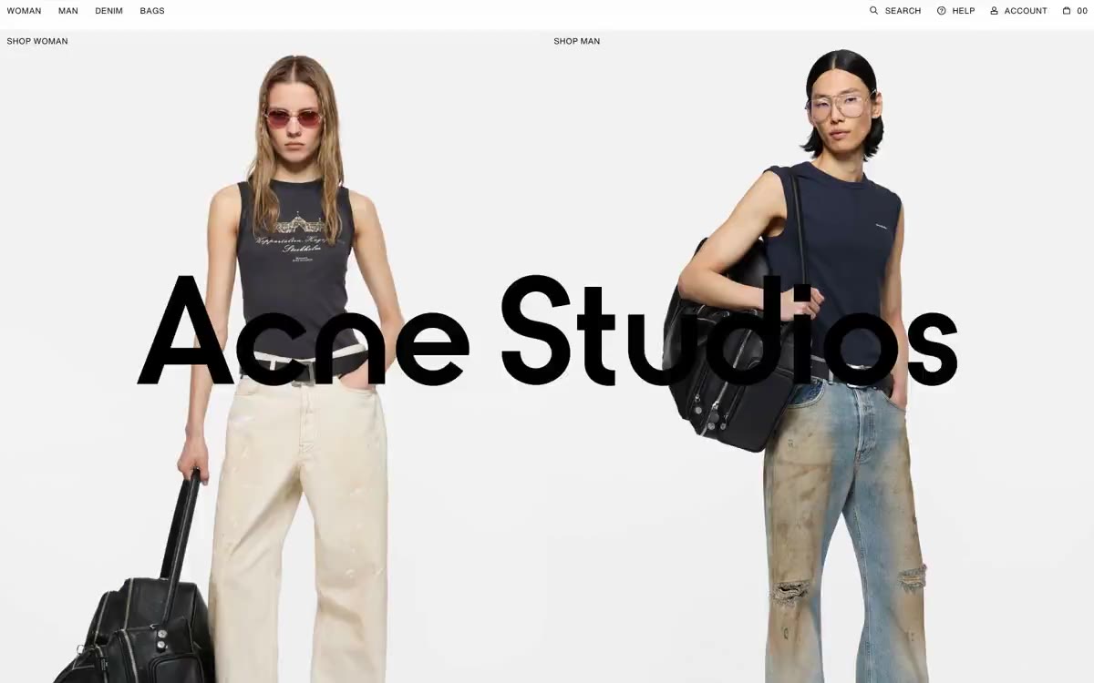
Acne Studios functions more like a digital fashion magazine than a traditional store: a white canvas, full-page editorial photography, and a near-total absence of interface elements. The entire page feels like a carefully crafted art design—product images are arranged in a tight, edge-to-edge grid, and the only typographic punctuation is tiny, well-spaced capital letters. The signature electric cobalt color (#0018a8) is used sparingly on links and interactive elements, never as a filled-in button, allowing the photos to command attention. Components are intentionally weightless: no shadows, no cardboard surfaces, no rounded containers, no decorative frames. The space between elements serves a structural function that elevation performs elsewhere.
A full-width page layout with no maximum width restrictions. The page follows a strict editorial rhythm: (1) fixed top navigation with text links and a cart counter, (2) a 50/50 split header with an overlay logo, (3) a 4-column grid of products with no gaps between them, (4) a 5-column row of editorial blocks with no gaps between them. All sections are arranged vertically with equal gaps. The grid is always straight—no asymmetrical or mosaic compositions. Navigation is minimalist, with only a top bar, no sidebar or mega-menu. The layout reads left to right, top to bottom, like a spread of a printed fashion magazine.
Photography is the entire product. Fashion editorial photography is dominated by full-frame images: models in avant-garde style against a neutral studio backdrop (gray, striped fabric, muted interiors). Products are shot against a pure white background, without any lifestyle context. Secondary images include brand packaging (pink Acne Studios boxes), storefronts, and architectural shots. No illustrations, no icons other than simple linear glyphs, no gradients, no 3D renders. Images are always rectangular with sharp corners—no masking, no rounded corners, no overlays. The role of images is not to create a decorative atmosphere, but to provide the core content; they occupy approximately 90% of the visible pixel area.
Palette
Brand
- Electric Cobalt
#0018a8— Purple is used as a secondary accent for decorative details and to emphasize low frequencies. It should not be used as the primary color for a call to action.
Neutral
- Ink Black
#000000— Main text, logo, icon outlines, navigation labels, and footer text. A 21:1 contrast ratio is used on a white background for absolute legibility. - Graphite
#6b6b6b— Neutral color support for secondary UI, dividers, and muted labels. - Paper White
#ffffff— The page canvas, product card background, and navigation bar surface. The primary foundation that allows editorial photography to "breathe." - Bone
#f2f2f2— Subtle shadow toning and fine edging create dramatic overlays. Used sparingly, the system favors empty space over tinted surfaces.
Typography
from 120 to 120px · 1 step
- Helvetica Monospaced Pro — replacement: Inter · outlines 400 · Helvetica Monospaced Pro font - found in the extracted data but not described by the AI.
- Acne Studios (custom wordmark) — replacement: GT Walsheim or Manrope at matching optical size and weight · outlines 400-500 · The large-scale brand logo is superimposed on the main photo. The typeface has a geometric structure with humanist endings; no system font can reproduce it, but its character is closest to a geometric sans-serif with a wide aperture.
- Helvetica Neue / system sans — replacement: Helvetica or Inter · outlines 400 · All functional text in the user interface: navigation links, section headings, product descriptions, and footers. It is always displayed in capital letters with wide letter spacing—this typographic design is the most recognizable non-photographic element on the website.
Intervals and form
| Purpose | Meaning |
|---|---|
| Density | average |
| Basic step | 10px |
| Button radius | 0px |
| Card radius | 0px |
| Shadows | no - borders instead of shadows |
| Between sections | 60px |
AI will build your website in Acne Studios style and fill it
- Fill with products and posts via the link - Instagram, TikTok, Facebook.
- Transfer content from your old site—just specify the address.
- Modern design on the best engine: React ( Next.js) with server rendering and SEO optimization out of the box.
- Fully automated SEO optimization for search results and neural network recommendations.
Similar styles
- Agence Foudre — The magazine's cover page is a soft pink color reminiscent of lipstick.
- INVERSA — A topographic field terminal at midnight. A dark command panel, where massive editorial font and a single layer of neon-green markers are superimposed on satellite images of Earth, each label monochrome, as if reading mission coordinates.
- GTE — Trading terminal behind gallery lighting
- Diabla — A Mediterranean courtyard at midday – sun-faded pink walls, one bright red canvas awning, and serifed editorial headlines stretching across the sky.
- Le Puzz — Sunny Sunday Circular is a tabloid full of mysteries.
- Subset — Editorial boutique made from raw linen
- Cursor — A cozy parchment workshop, lit by smoldering coals
- MindMarket — A cozy fairytale book on cream paper - a friendly editorial canvas where large Inter headlines and cut-out paper characters coexist on a sun-drenched, sticker-soft surface.
- Lamborghini — Black body color in the showroom, under the spotlights - one yellow car
- Amplemarket — A sun-drenched workplace strewn with confetti
- Getharvest — A desk at golden hour – a warm cream canvas, white postcards hung on the canvas, and a single bright orange flame
- Drive Capital — Retro road trip poster on warm paper