
INO
A museum display case in silence – each exhibit floats in a white space, like a single object behind glass, framed by an almost black, barely audible font
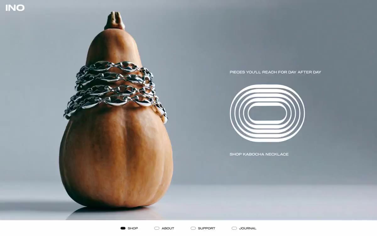
INO functions as a nearly monochrome jewelry gallery: a crisp white canvas, a single, warm, almost black ink, and a near-total absence of color. The visual system treats each ring like a museum piece—clinical product photographs floating in expansive negative space, with hierarchy constructed through position, letter spacing, and the volume of white rather than through font scale or color. Navigation is located at the bottom of the page, consisting of four dots with labels (filled or empty), a deliberate reversal of the traditional e-commerce top bar. The brand mark itself is a set of concentric ring contours, echoing the shape of the product and serving as a typographic sculpture rather than a logo.
A full-width canvas with no maximum content width limit. The main screen takes up the entire width of the page, with photography and graphics split evenly (50/50). Product grids are displayed as three-column rows with a generous horizontal margin from the edge of the viewport. Bottom navigation is centered and anchored to the page footer, rather than pinned. Section breaks use either full-screen editorial photography or pure white space—never a color bar, dividing line, or gradient. The vertical rhythm is free: 80/1/1 between major sections, allowing the page to breathe rather than be filled with content. There is no sidebar, no mega-menu, no top header bar—the "INO" logo is located solely in the upper left corner of the main screen.
Two distinct image display modes coexist: clinical product photography on a flat, light-gray, seamless background (each ring is photographed centered, without hands, stylized props, or surface shadows—the object is the protagonist) and narrative editorial images (a ring in a grass-lined box, a hand holding a chain), rendered as desaturated, full-screen editorial fragments. Product images serve as product cards; the editorial images convey the brand's mood. Both are monochrome or near-monochrome—the grass in the main image is the only hint of green, and even that is muted to a forest hue. Icons are not used in the interface—a concentric ring symbol replaces all iconography.
Palette
Neutral
- Obsidian Ink
#212123— Neutral form states, icon text, and discreet UI feedback where color schemes should remain unobtrusive. - Bone
#ffffff— Canvas pages, cardboard surfaces, inverted text on a dark background. The dominant surface; almost the entire website is located here. - Carbon
#000000— Icon fill, decorative graphic outlines, and active state fill for the navigation point indicator. Used sparingly for maximum tonal contrast with the "bone" color. - Ash
#999999— Medium contrast borders, control contours and structural dividers. - Pebble
#a6a6a7— Subdued supporting text, thin separators for the main text, and secondary metadata. The lightest functional gray is used for price tags and accompanying text that should recede into the background.
Typography
from 11 to 18px · 4 steps
- Sequel100Wide — replacement: Jost (400 · outlines 400 · The only corporate typeface used exclusively in the 400 weight across all contexts—navigation, body text, headings, titles, pricing, and captions. The widely spaced geometric symbol with generous letter spacing reflects the entire corporate style. The lack of a bold weight is intentional: hierarchy is achieved through capitalization, letter spacing, and positioning, rather than through varying font weight.
- Arial — replacement: system-ui · outlines 400 · A system-wide fallback for rendering buttons in legacy contexts. It's not part of the branding—it only appears if Sequel100Wide fails to load.
Intervals and form
| Purpose | Meaning |
|---|---|
| Density | dense |
| Basic step | 23px |
| Button radius | 50px |
| Card radius | 8px |
| Shadows | no - borders instead of shadows |
| Between sections | 80-120px |
AI will build your website in INO style and fill it
- Fill with products and posts via the link - Instagram, TikTok, Facebook.
- Transfer content from your old site—just specify the address.
- Modern design on the best engine: React ( Next.js) with server rendering and SEO optimization out of the box.
- Fully automated SEO optimization for search results and neural network recommendations.
Similar styles
- Airbnb — A quiet white gallery wall with a single coral red bookmark
- Peak Design — Gallery wall, partially illuminated
- 099 SUPPLY — A gallery wall filled with black and white objects
- Apple (España) — white gallery display case
- Apple (España) — A gallery window in the morning fog
- Custo — A gunmetal-colored gallery with a monolithic font. A showroom in muted gray-green tones, where a single dark object and 57px font speak for themselves.
- Silencio — A white room with floating artifacts. A gallery display made of warm paper, where each element occupies its place against a background of negative volume, and the silence is an intentional design decision.
- Oakâme — A sun-drenched Provençal workshop carved from warm stone
- Nike — A monochrome gallery of sporting achievements – white walls, the product as a work of art, chrome dissolved into the background
- Sociotype — A typical museum specimen on white paper
- Arc — industrial white gallery over midnight water
- Rivian — An electric monolith on the gallery's concrete wall. Rivian presents each vehicle as a sculpture against a vast white space, with typography so large it becomes an architectural element, and a single warm yellow that breaks the monochromatic atmosphere, like sunlight on a matte surface.