
Framer
neon gallery in the void
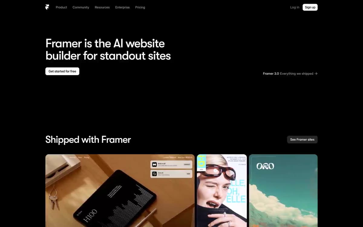
Framer operates as near-total darkness—a black canvas where content hovers like a neon sign at a gallery opening. Headlines, set in GT Walsheim Medium with tight line spacing of 0.8–1.1 and aggressive negative letter spacing (-0.04em at 54px), create a condensed, decorative typeface that pushes forward rather than sits neatly on the page. A single electric blue (#0099ff) provides all the functional accents—borders, glow, icons, active states—while the rest of the interface remains achromatic, relying on subtle gray transitions (#111, #171717, #242424) to create depth from pure black. Components feel considered rather than decorative: rounded radii of 8–25px, thin 1px borders, minimal drop shadows, and translucent surfaces that allow the void to shine through.
Full-width sections extend beyond the black canvas, with content limited to a maximum width of ~1200px and centered within. The main section features a left-aligned header and a single call-to-action (CTA) button, with the right side intentionally left blank—asymmetrically, not centered. Sections alternate between text-only layouts (large header + subtext) and product screenshots. The "Comes with Framer" section utilizes a logo wall in a 4-column grid. In the community section, a product screenshot is placed within a centered, full-width container with rounded corners. Navigation is minimal—a thin top bar with the logo on the left and links aligned to the right, with no visible controls. Section rhythm: significant 80px vertical gaps between sections, creating distinct islands of content floating in the void.
Screenshots of the product's user interface dominate—framed by a chrome-like window with traffic light dots, embedded screenshots of the app become the main image. Logos, serving as proof of quality, are presented in white lettering on a black background with wide spacing. No photographs, illustrations, or abstract graphics are used—the visual language is the product itself, displayed as a living interface. Icon style: minimalist, outlined, monochrome and white in small sizes. Text density: predominantly text, with occasional large fragments in the form of product screenshots. The visual balance of space clearly favors typography over images.
Palette
Brand
- Vivid Violet
#0066ff— The primary action button is the only place in the interface where a solid colored button background is displayed.
Neutral
- Bone
#ffffff— Main headings, main text on a dark background, button background is the only source of light. - Void
#000000— The page canvas, navigation background, card surfaces, icon fill—all are an endless black color that absorbs all non-essential content. - Graphite
#111111— Raised card surfaces are a step above the void—large, functional cards and modal containers. - Obsidian
#171717— Intermediate surface for buttons, additional cards, UI fills - separates interactive elements from the canvas. - Slate
#242424— On hover, input fields and indented panels are the brightest neutral shade before switching to text format. - Ash
#333333— Deep fill for inactive background images and structural elements.
Typography
from 12 to 68px · 8 steps
- sans-serif — replacement: Inter · outlines 400 · sans-serif - found in the extracted data but not described by the AI.
- GT Walsheim — replacement: Inter Tight · outlines 500 · The font for headings and titles is the brand font. It's aggressively condensed, with line spacing of 0.8–1.1 and letter spacing of -0.04em to -0.05em in the 44–68px range. It's not a decorative element; the geometric warmth of GT Walsheim, combined with strict metrics, creates the system's voice—confident, compact, and slightly futuristic. For similar geometric expression, consider Inter Tight or Space Grotesk Bold.
- Inter Variable — replacement: Inter · outlines 400 · The main text, navigation, and secondary headings are the workhorse. The Inter Variable axis allows for smooth interpolation of weights. Tracking narrows as the size increases: from -0.001em to 18px and to -0.027em to 22px. The variable version allows for smooth micro-animations of the site. Replacement: Inter ( Google) – a virtually identical fallback.
Intervals and form
| Purpose | Meaning |
|---|---|
| Density | average |
| Basic step | 10px |
| Button radius | 9999px |
| Card radius | 20px |
| Shadows | no - borders instead of shadows |
| Between sections | 80px |
| Page width | 1200px |
AI will build your website in Framer style and fill it
- Fill with products and posts via the link - Instagram, TikTok, Facebook.
- Transfer content from your old site—just specify the address.
- Modern design on the best engine: React ( Next.js) with server rendering and SEO optimization out of the box.
- Fully automated SEO optimization for search results and neural network recommendations.
Similar styles
- Auros — Abyssal terminal with bioluminescent data balls
- Origin Financial — A midnight gallery of quiet opulence. A quiet, almost dark room where large serif fonts and a few illuminated colored panels create the feeling that finance is a carefully curated work of art.
- Raycast — Midnight Command Center, Coral Neon
- Dimension — a dusk-lit workstation with frosted glass panels
- Reflect Notes — Starry violet space is a dark observatory where notes float like constellations against a backdrop of almost black indigo emptiness.
- Ameba — The control room at midnight – an electric blue pulse inside frosted glass panels
- Branding — Black gallery wall, blood red accents - Large white fonts float on a dark canvas that resembles a void, interrupted by a single bright red accent and striking decorative elements that look more like gallery signage than a web interface.
- Harness — Mission Control at midnight with phosphorescent green accents
- Koto — The Obsidian Gallery at midnight. A nearly pitch-black stage, where the only warm light source is a single yellow marker, and condensed type floats in the vast negative space like exhibition posters.
- Ohzi — A glowing cube suspended in a dark gallery
- Depot — A dark server terminal. A nearly black developer console, with a single green LED signaling the start of work, and the rest of the user interface displayed in graphite.
- Maciej Zadykowicz — The Midnight Gallery with its kaleidoscopic mural is a nearly black studio wall where one vibrant, colorful typographic piece of art commands attention while everything else remains quiet and deliberate.