
Auros
Abyssal terminal with bioluminescent data balls
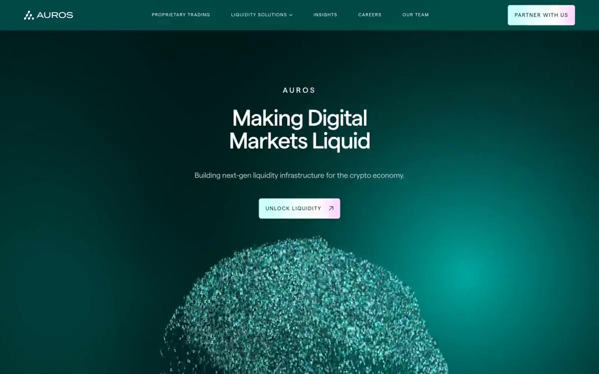
Auros functions as a fintech terminal nestled in the abyss: a near-black turquoise canvas with bioluminescent data orbs and light gradients from turquoise to pink, creating a sense of depth, fluidity, and flow. The interface is minimalist and cinematic, relying on a single user display (Matter) of medium thickness with aggressive negative tracking to create scale without being overly garish. Colors are evenly distributed—achromatic whites and silvers are used for almost all content, while the chromatic palette is reserved for atmospheric gradients, distinguishing card surfaces, and a single signature pill-shaped button that changes color from turquoise-blue to lavender-pink. Cards float on subtle turquoise surface ridges (16px radius, no shadows) rather than height, so hierarchy is perceived as the depth of water rather than a shadow on paper. The components look thoughtful and instrument-like: uppercase tracking marks, thin geometric arrow icons, large numeric readouts in pale pink.
A dark, full-width canvas with content at a maximum width of 1440px. The main element is a centered text block (brow → headline → subtext → call to action) that spans the entire viewport height, with a particle as a background element. Sections are full-width strips separated by large 68px+ vertical spaces, alternating between canvas and slightly recessed surfaces. The "Explore" section uses an asymmetrical two-column layout: the left column contains stacked feature cards, while the right column features a geometric molecular illustration. Content is centered in narrow columns (maximum ~600px) for easy reading, rather than stretching from edge to edge. The footer is a recessed pit (#011d1c) with a 120px vertical margin, creating the effect of a deep pool. The navigation is a thin, transparent panel with elements spaced 16–24px apart. The overall rhythm is cinematic and spacious—every section breathes, and the deep, water-like color scheme creates the feeling of falling deeper with each passage.
The visual style is minimalist and atmospheric. The homepage features a three-dimensional particle sphere—thousands of tiny turquoise-blue and white dots forming a rotating sphere that echoes the canvas and lavender-pink accents along the edges, creating a bioluminescent effect reminiscent of an information object. Flat geometric molecular diagrams (white circles and thin connecting lines on a dark canvas) serve as decorative elements in the right column. No photographs, no lifestyle images, no people—the visual language is based on clean data graphics and abstract forms. The particle sphere is the defining visual element of the brand identity; it must appear at least once on every important page to reinforce the deep-sea metaphor.
Palette
Brand
- Liquid Abyss
#012624— The main background is the page's base, header, main element, and dominant dark turquoise field. It creates a deep-sea atmosphere. - Liquid Deep
#011d1c— The recessed surface level is the footer background and deeper cardboard panels. It is perceived as a half-tone darker than the canvas, creating a subtle downward gradient of depth. - Liquid Kelp
#003734— Raised card surface and button fill—a raised surface positioned one step above the chasm. Used for feature cards, content panels, and the starting point of a gradient button.
Neutral
- Liquid Mist
#edfffe— A cool shade of white highlights the body copy, section headings, and warm, light typography. A subtle blue tint ties the body copy into the turquoise color scheme. - Platinum
#ffffff— Pure white is used for headings, navigation elements, icon outlines, and high-contrast text. It is the primary text color in all heading levels and the primary navigation. - Silver Mist
#bbc7c6— Secondary text, muted descriptions, and link color in their original state. They have a slight greenish tint, complementing the turquoise background. - Ash
#f2f2f2— Additional text for quotes and reviews. A neutral, cool gray shade for when the turquoise undertone of Silver Mist feels too bright. - Slate Deep
#707777— A subtle surface tint for inactive or low-visibility backgrounds. It sits between the canvas and the cardboard, providing a very subtle height difference. - Lavender Phosphor
#fde9ff— Backlight color for large statistics, counter numbers, and important metrics. The pink shade in the signature gradient is used sparingly as a luminous accent on dark surfaces.
Typography
from 10 to 96px · 6 steps
- Matter — replacement: Inter · outlines 400, 500 · The primary font for headings and body copy is used with a weight of 500 for all headings (H1–H3) and large kinetic text (86–295px). A weight of 400 is used for body copy and UI text. It features aggressive negative letter spacing at large sizes (-0.04em at 61px, -0.046em at 86px) and wide positive letter spacing in title caps (0.08em at 20px, 0.12em at 12px, 0.15em at 10px). The strategy of using only a medium weight for headings is a distinctive feature—no bold or light font—which gives the font a uniform, mechanical confidence.
- Arial — replacement: system-ui · outlines 400 · A secondary fallback for interactive UI elements (navigation, buttons, header microcopy, footer). Appears only at 14px – used as a safe, universal fallback when Matter isn't loaded, and covers form labels, button text, and small helper text.
Intervals and form
| Purpose | Meaning |
|---|---|
| Density | average |
| Basic step | 20px |
| Button radius | 6px |
| Card radius | 16px |
| Shadows | no - borders instead of shadows |
| Between sections | 68px |
| Page width | 1440px |
AI will build your website in Auros style and fill it
- Fill with products and posts via the link - Instagram, TikTok, Facebook.
- Transfer content from your old site—just specify the address.
- Modern design on the best engine: React ( Next.js) with server rendering and SEO optimization out of the box.
- Fully automated SEO optimization for search results and neural network recommendations.
Similar styles
- Design Full-Time — a studio cinema with one warm spotlight
- Air — sculpture "Midnight Sky Through Glass"
- Slash — Midnight vault with gilded ledgers
- Raycast — Midnight Command Center, Coral Neon
- Dimension — a dusk-lit workstation with frosted glass panels
- Modal — A phosphorescent terminal in a darkened server room - the only light source is a bright green color
- Giga — Midnight horizon over frosted obsidian
- Reflect Notes — Starry violet space is a dark observatory where notes float like constellations against a backdrop of almost black indigo emptiness.
- Ameba — The control room at midnight – an electric blue pulse inside frosted glass panels
- AgentQL — Northern Lights over the terminal at night
- Frame — A cinema for late-night movie screenings. A dark room where a single blue spotlight does all the work, and the user interface fades into the background, allowing creative content to be projected forward.
- Harness — Mission Control at midnight with phosphorescent green accents