
Foodnoms
Sunny fruit market on white porcelain - warm oranges, fresh greens and voluminous rounded shapes
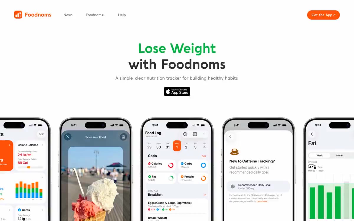
Foodnoms features a light-hearted marketing language for nutrition tracking: a clean white canvas, oversized phone mockups as visual anchors, and a playful color vocabulary where colors represent nutrients and progress. A two-color header scheme (one color for the keyword, dark graphite for the rest) allows for a quick assessment of the value proposition. The system relies on a single user display (Aquawax Pro) with distinctly rounded geometric features that soften the data-heavy app screens. Most surfaces are flat and shadowless; the uniform corner radius gives buttons, cards, and labels a friendly, soft feel, making health tracking feel more accessible than clinical.
The page features a single-column, centered, full-width layout (~1200px) with generous vertical rhythm. The header is a thin top bar with the logo on the left, navigation centered, and a filled-in orange action button on the right. The hero section is a centered stack: a two-color title, a single-line subheader, an App Store icon, and then a row of 3-5 phone mockups fanned out across the width. Below the hero section is a centered "As Recommended" press logo section in a 2x3 grid. The feature sections follow a repeating pattern: two-column text + phone mockup, alternating sides, with accent section headings in orange/green. The last element before the footer is a full-width downloadable CTA card. The gutters between sections are generous (96px), creating a spacious, gallery-like feel. The navigation is a minimalist top bar - no sidebar or mega menu.
The app's visual language is dominated by high-quality iPhone frame mockups showcasing the app's working interface—these are the primary elements, not stock photos. The mockups are displayed with near-total transparency, fanned out with a slight overlap and smooth rotation, and positioned directly on a white background. Within the mockups, the visual component is provided by the app's own interface: nutritional information, product photos, macro rings, and colorful category tags. The only photographic content is user-submitted food images visible on the Scan Your Food app's camera screen. There are no lifestyle photos, no abstract illustrations, no decorative graphics. The branding is entirely defined by the custom font, the orange/green/dark color scheme, and the app's own interface.
Palette
Brand
- Ember Orange
#ff5406— Orange is used as a secondary accent for decorative details and to highlight infrequent cues. It should not be used as the primary color for calls to action.
Neutral
- Graphite
#2f2f2f— Primary text, dark buttons (App Store icon), and icon outlines. A predominant non-white color in headings and body text. - Verdant Green
#00b33f— The green color serves as an additional accent for decorative details and to emphasize low frequencies. - Signal Red-Orange
#ff3400— A secondary warm accent, visible in app screen UI elements and related branding. One tone warmer than Ember Orange, it emphasizes selected or active app states. - Sky Blue
#00a9dd— A pleasant contrast for the app's internal data categories (carbohydrates/proteins/other nutrient groups). Balances the warm, dominant color palette in the phone layouts. - Mist Blue
#72a2c5— Muted Cool Accent - Softens the Sky blue color for additional data labels and chart backgrounds within the app. - Sunset Orange
#ff6d00— A warm accent for secondary headings and highlighted text on marketing pages.
Typography
from 12 to 60px · 7 steps
- Aquawax Pro Medium — replacement: Inter · outlines 500 · Aquawax Pro Medium - Found in the extracted data but not described by the AI.
- Aquawax Pro — replacement: Nunito Sans · outlines 700, 500, 600 · The primary brand font used in all contexts, including headings and body copy. This custom-designed font features wide letter heights, rounded geometric shapes, and comfortable proportions. Bold (700) is used for headings and sections—the system's typographic landmarks. Semibold (600) is used for subheadings and button labels at 14–1.8 mm. Medium (500) is used for body copy at 17–1.8 mm, with sufficient line spacing of 1.6–1.8 mm for comfortable reading.
- System sans-serif — replacement: Inter · outlines 400, 700 · A fallback option is used for very small text and icon text in the user interface. Aquawax Pro is not used at micro sizes; the system font handles these to reduce rendering weight.
Intervals and form
| Purpose | Meaning |
|---|---|
| Density | spacious |
| Basic step | 20px |
| Button radius | 26px |
| Card radius | 26px |
| Shadows | no - borders instead of shadows |
| Between sections | 96px |
| Page width | 1200px |
AI will build your website in Foodnoms style and fill it
- Fill with products and posts via the link - Instagram, TikTok, Facebook.
- Transfer content from your old site—just specify the address.
- Modern design on the best engine: React ( Next.js) with server rendering and SEO optimization out of the box.
- Fully automated SEO optimization for search results and neural network recommendations.
Similar styles
- Slite — A warm parchment notebook with a terracotta handle—every surface is creamy paper, every accent a subtle touch of orange.
- Adora — The Museum of Impressionism behind frosted glass
- Bento — A bento lunchbox on sunlit linoleum. A grid of rounded, sticker-like cards in lime, lavender, cobalt, and burgundy, each outlined in thick black ink, lies on a warm, creamy linen beneath a bold, geometric title.
- Payments — A vibrant citrus hue against a royal purple backdrop. The deep electric purple evokes the night sky, while lemon yellow accents sparkle like fresh citrus zest against a clean white surface.
- Textla — Sunny Retro Botanical Almanac - Creamy yellow page printed in dark green with illustrations of cacti rendered in sharp, offset shadows
- AI for Business — Brutalist editorial showroom in warm grey tones
- Superhuman — golden hour editorial panel
- Visitors — white engineering drawing
- Vercel — Terminal printed on white paper
- Jeton — An editorial about fintech on warm marble
- Say Briefly — Creative agency sketchbook on cream paper
- ClickUp — A powerful dashboard on white marble. The page is a product brochure for a productivity tool, so the visual language is borrowed from the product itself: dense lists, status indicators, groups of avatars, and bold typographic statements that look like a product specification on display.