
Vercel
Terminal printed on white paper
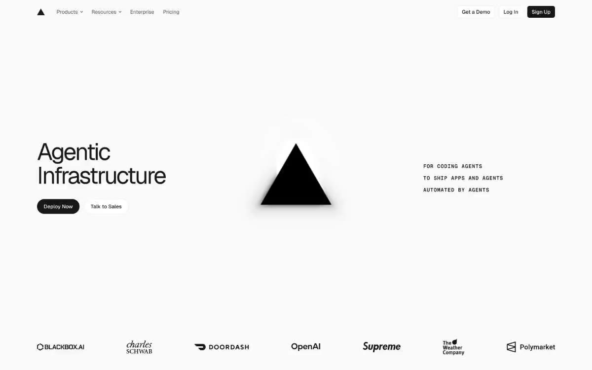
The Vercel design system is an exercise in disciplined monochrome: a near-white canvas (#fafafa), black type, thin borders, and a complete absence of decorative color. The visual language evokes a developer's terminal rendered in print—Geist Sans is barely legible at the "heroic" scale with a weight of 400-450 and a letter spacing of -0.06em, while Geist Mono applies labels, metadata, and code samples in 11-13px caps. Buttons are sharp 6px radii or rectangles of pure black on white or white on black. The system relies on contrast and typographic hierarchy rather than color, using the triangular sign (▲) and a two-line wordmark as the only branding elements. Surfaces are stacked on top of each other in the order #fafafa → #ebebeb → #171717, creating depth through changing tonal values rather than shadow or color. Each element is built on a 4px grid with a compact density, resulting in an interface reminiscent of an engineer's notebook—precise, functional, and unafraid of white space.
The container is 1280px wide, centered, with generous horizontal padding (24-48px). The main block uses an asymmetrical three-zone composition: a large headline on the left, a brand glyph centered, and an "eyebrow" block on the right. Below the main block, content is arranged in alternating stripes: a full-width stripe with the client's logo, followed by a two-column "Agent Creators" section with the headline on the left and a product layout on the right, followed by a grid of three cards with features. Sections are separated by vertical gutters of 96-128px without dividers or background offsets. The navigation is a single fixed 64px panel with a blurred background. Card grids consistently use a two- or three-column layout with 16-24px gutters. The overall density is compact—the text is easy to read, there is ample white space, but the font size and component sizes prevent the page from feeling airy.
The images are sparse and always functional. The main visual element is the black triangle (▲)—a geometric brand mark that appears as a hovering silhouette at the "capital" scale. Client logos on the proof-of-concept strip use each brand's actual wordmarks in grayscale. Product mockups (Notion's chat interface, CLI terminal output, passport card) are embedded as light-mode screenshots within framed cards. There are no photographs, illustrations, or 3D elements—the system is pure typography and geometric shapes on white paper.
Palette
Neutral
- Obsidian
#171717— Main headings, navigation borders, dark button fill, and list markers are all almost black, avoiding harshness and garish saturation. - Paper White
#fafafa— The page canvas, the card surfaces, the light fills of the buttons—this is the standard background on which everything else is located. - Pure White
#ffffff— Raised card surfaces, inserts, input fields. - Hairline
#ebebeb— 1px borders on buttons, links, and cards are visible at high zoom levels, but invisible at low zoom levels. - Ash
#c9c9c9— Disabled text, muted labels, brand name watermarks in client logos. - Smoke
#a8a8a8— Secondary text, placeholder text, subtle icon fill.
Typography
from 11 to 64px · 6 steps
- Geist Sans — replacement: Inter · outlines 400, 450, 500 · The primary font for the interface and headings is a custom-designed geometric sans-serif from Vercel with tight letter spacing at large sizes (-0.06em at 56-64px, -0.05em at 30px). For the headings at the top of the page, a 450 weight was chosen: thicker than Light but lighter than Semi-Bold, creating a confident, yet not overbearing, tone.
- Geist Mono — replacement: JetBrains Mono · outlines 400, 500, 600 · A monospaced secondary font for captions, code blocks, CLI output panels, metadata, and uppercase text. The 8px/600px/uppercase combination allows for precise placement of tiny wordmarks. Wide letter spacing (0.071em) in the monospaced version provides ample space for uppercase text.
Intervals and form
| Purpose | Meaning |
|---|---|
| Density | dense |
| Basic step | 12px |
| Button radius | 6px |
| Card radius | 6px |
| Shadows | no - borders instead of shadows |
| Between sections | 96-128px |
| Page width | 1280px |
AI will build your website in Vercel style and fill it
- Fill with products and posts via the link - Instagram, TikTok, Facebook.
- Transfer content from your old site—just specify the address.
- Modern design on the best engine: React ( Next.js) with server rendering and SEO optimization out of the box.
- Fully automated SEO optimization for search results and neural network recommendations.
Similar styles
- Headspace — A sunny wellness corner on warm paper
- WHOOP — Performance lab at midnight - white clinical lab tables under a black theatrical void, a single purple pulse of electricity
- Together AI — Research console on glacial paper
- v0 by Vercel — Lathe drawing. Precision and functionality are paramount, with each element serving a clear purpose on a clean, technically perfect surface.
- Dovetail — A blueprint under a black moon—barely visible graph lines, white font, one purple sparkle
- Glideapps — monochrome drafting table with one electric turquoise sparkle
- Timescale — Engineering drawing on warm graph paper
- UGLYCASH — A sticker-covered notebook on cream-colored paper exudes the ambiance of a bold, maximalist fintech that proudly displays its chaos.
- Sprout Social — A green sprout on black slate. One bright accent on a strict monochrome canvas, the color of which is used only for action, with a confident geometric font serving as signposts.
- Krea — gallery noir at midnight
- Evergreen — Solar greenhouse on linen paper
- Factory — The "war room" terminal at midnight. The "factory" is a stark black control panel where a single white card lands like a flashlight-lit dispatch—the only object in the room is the work itself.