
Superhuman
golden hour editorial panel
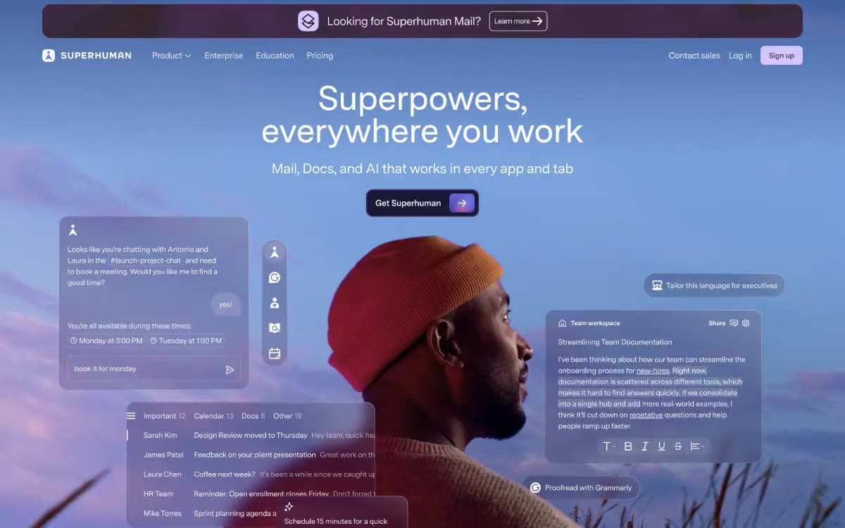
Superhuman straddles the intersection of editorial photography and software UI—a warm, parchment-like canvas (never pure white) frames maroon branding elements and vibrant purple accents. Headlines, set in 460 font, whisper rather than shout, allowing full-page cinematic photography to do the heavy lifting, while translucent product UI cards float like glass above the imagery. The palette remains calm and editorial most of the time: cream surfaces, charcoal text, subtle warm-gray borders, and generous spacing between elements, with color reserved for deliberate brand punctuation—a single maroon call-to-action, purple links, a light lilac add-on button. The system deliberately avoids strong shadows and gradients on UI surfaces; The depth is achieved through layered photography and subtle background blur in the title, rather than through a stacking effect.
The main element is a full-width photograph with a centered headline (48-64px/460) and a single call to action filled with an image of wine, with floating translucent product UI cards overlaid on the left and right edges. Below the main element is a white stripe logo strip (6 cells per row, maximum width limited), then a tab section with white card surfaces on parchment canvas. A dark turquoise stripe breaks the rhythm about two-thirds of the way through the page—full-width, two columns (image on the left, text on the right)—creating the only tonal contrast as you scroll. A gradient atmospheric stripe follows. The vertical spacing between sections is 64-96px. The maximum content width is ~1200px centered, with the main element and dark stripe spanning the full width of the viewport. The navigation is a single fixed header with a blurred background; no sidebar, no mega menu. The footer is a full-width burgundy page with a multi-column layout of links. The overall rhythm is: main frame → calm white/cream content → dark stripe with the main image → atmospheric gradient → burgundy footer, alternating light and dark stripes to create an editorial tempo.
The primary visual element is cinematic photography: a full-width portrait against an open sky serves as the focal point, with a second atmospheric stripe positioned lower down the page. The image is warmly toned, subtly muted, and shot in profile, reminiscent of a golden hour, creating a more editorial than corporate feel. A dark stripe with translucent geometric rectangles and handwritten inscriptions is superimposed over a photograph of a man lost in thought—a collage of surfaces rather than a single image. The user interface is presented as floating glass cards superimposed directly on the photograph, rather than as separate screenshots. There are no stock illustrations, no 3D renders, and no abstract decorative forms, save for the gradient atmospheric stripe. The icons are minimalist monochrome line icons, ~16-20px wide, with a single width corresponding to the 460 point text weight.
Palette
Brand
- Midnight Wine
#421d24— The main action buttons, ad banner, and footer are a warm, almost black burgundy that feels more like ink than red, anchoring the color palette without being overpowering. - Royal Violet
#714cb6— Purple is used to highlight links, tags, and short phrases. It should not be used as the primary color for calls to action.
Neutral
- Lilac Mist
#d4c7ff— The secondary surface fill, light icons, and ghost button backgrounds all feature a muted purple color that hints at the brand's style without drawing undue attention to itself. - Deep Lagoon
#0c4243— The dark background for the strip, used as the main narrative element, is the only dark surface in the system, combined with an overlaid geometric pattern. - Warm Parchment
#f2f0eb— The page's working surface is the dominant element; a warm cream color replaces white as the base, lending the entire system an editorial warmth. - Soft Mist
#e3e3e2— Fine borders, card outlines, dividing lines—a warm, light gray that blends with the parchment but clearly defines the edges. - Ink Charcoal
#292827— Body text, headings, icon outlines - a warm, almost black color with enough brown to feel like ink on paper, never cold #000 - Stone Gray
#666666— Secondary body text, supporting texts, discreet descriptions - a single medium gray, used sparingly so as never to compete with the main text.
Typography
from 12 to 64px · 8 steps
- Super Sans VF — replacement: Inter (closest open equivalent for variable weight range) · outlines 460, 500, 540, 600, 700 · A single font in the entire system. Axis variables span the range from 460 (a signature, slightly cropped font for all large heading text) to 540 (emphasized body text) and 700 (small, bold captions). A specially designed VF makes 460-weight headings appear more deliberate than haphazard—at 48-64px with tight letter spacing, the "slightly cropped" effect is perceived as confident rather than thin.
Intervals and form
| Purpose | Meaning |
|---|---|
| Density | dense |
| Basic step | 8px |
| Button radius | 16px |
| Card radius | 16px |
| Shadows | no - borders instead of shadows |
| Between sections | 64-96px |
| Page width | 1200px |
AI will build your website in Superhuman style and fill it
- Fill with products and posts via the link - Instagram, TikTok, Facebook.
- Transfer content from your old site—just specify the address.
- Modern design on the best engine: React ( Next.js) with server rendering and SEO optimization out of the box.
- Fully automated SEO optimization for search results and neural network recommendations.
Similar styles
- AI for Business — Brutalist editorial showroom in warm grey tones
- Jeton — An editorial about fintech on warm marble
- Airtable — A cozy seminar with chapters marked in different colors
- Osmo — The Developers' Museum on Gray Concrete
- Linktr — Editorial posters are stacked like candy. The website is designed in color blocks, with bright green headlines set against cobalt-blue walls, and white pill-shaped navigation elements floating above burgundy fields.
- Outsource Consultants — A large-format architectural sheet on bone paper. A monographic aesthetic, where a single bright patch of indigo interrupts the otherwise warm, typographically maximalist grid.
- Streamtime — Tactile Creative Mood Board - Designer Scrapbooking Table
- Switch-Lit — Editorial grid printed in ink on cream paper
- HubSpot — A warm cream paper color with a single orange accent. HubSpot resembles a designer magazine printed on heavyweight paper—serif headlines, warm cream pages, and a single fiery orange accent highlighting only the most important points.
- Granola — Field notes on warm vellum—Granola reads like a well-worn Moleskine notebook opened on a sunlit desk: serif headings lend a sense of solidity, organic green accents like plant-based ink, and fine lines in the margins of the cards that resemble handwritten notes.
- Secure — A conversation in a European cafe in soft daylight is a warm, stylish take on video calling, where serif headlines read like a thoughtful magazine article rather than a tech product page.
- Mockups made easy — Editorial design studio on white paper