
Creative Giants
Large format editorial poster on cream paper
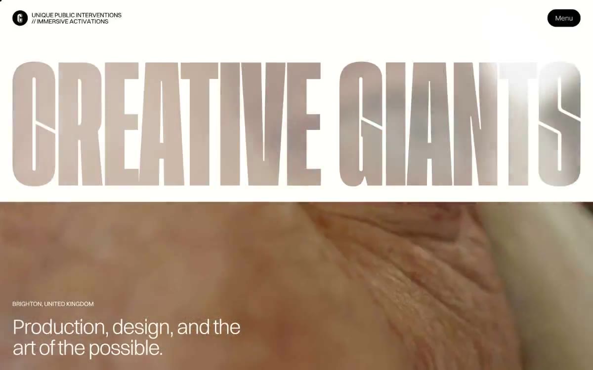
Creative Giants looks like an oversized artbook spread, rendered in code: a warm, creamy canvas, thin margins, and type so large it feels more like a poster than a headline. The entire system operates on negative space and a single, lightweight size (300)—headlines are barely audible at 64–84px, rather than standing out in bold, and the letter spacing decreases sharply (-0.04em) as the type size increases, so the words appear chiseled rather than peeled off. The color scheme is distributed in small, saturated brushstrokes: vibrant purple, deep turquoise, light blue, hot pink, mint, and navy appear as card surfaces or accents, rather than background fills. The interactive elements are black shapes on a cream background with fully rounded (1440px) radii, while the chrome elements are almost invisible—a single round logo and the "Menu" button float in the white space. The visual concept is a production studio's contact sheet: one huge headline, one full-width photo, one quiet line of metatext. Every other page should follow the same laconic style.
Full-fill page layout: There is no max-width container; content takes up the entire width of the page with equal margins on the left and right (16–32px on mobile, 32px+ on desktop). The main heading is a single, large headline (“CREATIVE GIANTS” at 84px) taking up approximately 40% of the viewport, immediately followed by a full-fill photo with a meta tag in the lower-left corner and a title overlay. The section rhythm is monolithic: each new section begins with a small amount of all-caps copy and an explanation, separated by 48–64px of white space—there are no alternating dark/light bands except for one inverted Navy Ink accent card. Content is left-aligned; there are no centered blocks except for the main heading. The news/case studies section uses a three-column grid of cards with a floating arrow block on the right. Navigation is accomplished through a single top header—without a sidebar or any anchored elements beyond the header itself. The overall layout is spacious and consistent with the editorial style: each section breathes, and white space is the primary structural element.
Editorial photography dominates the design: images occupy the entire width of the page, with sharp angles, and no overlaps or rounded masks. The style leans toward documentary and atmospheric—wrinkled hands, public installations, and casual shots of people—without ever using staged product photography. Images are always presented at large scale (full-width viewport or filling the entire card), so the design unit is the photograph, not the user interface. There are no illustrations, 3D models, or product mockups. Iconography is minimal: a single small circular logo, outline chevrons on carousel controls, and lightweight UI icons with a 1px outline. Image density is determined by the image itself, and text serves as a discreet annotation layer beneath or above the photograph.
Palette
Brand
- Magenta Bloom
#8a0467— Pink is used as a secondary accent for decorative details and to highlight less frequently used search queries. It should not be used as the primary color for a call to action. - Forest Teal
#03624c— A rich brand accent color for card frames and decorative touches; pairs with Magenta Bloom for a two-tone finish.
Neutral
- Bone White
#fffef7— The page canvas, cardboard surfaces, and text on dark accents are a warm, creamy shade that replaces the pure #ffffff and gives the entire system a papery, printed feel. - Ink Black
#000000— Dark color complements neutral text and icons and creates strong contrast. Avoid using it as the primary color for calls to action. - Graphite
#666666— Secondary body text, captions, metadata, and supporting text are pushed into the background to allow the main text to dominate. - Ash
#aaaaaa— Input field borders, inactive link color, tertiary separators - a soft structural gray color that disappears when not needed. - Charcoal Scale
#4d4c4a— A medium neutral for the list borders, with a subtle contrast boost on the dark gradient path - warm gray rather than blue-gray. - Powder Blue
#a5c8eb— A soft color accent—postcard backgrounds, blurred backgrounds, muted illustration fills—cools down a warm background without creating competition.
Typography
from 12 to 84px · 7 steps
- Switzer — replacement: Inter (300 · outlines 300, 400 · A single-font system: 300 weight for all display elements and headings (12–84px), 400 weight for body text, metadata, and UI controls. The preferred option is to use 300 weight at 64–84px sizes—most systems use a 700–800 bold font here; the light-toned Switzer font maintains thin lines, creating the impression of airbrushed type on a cream canvas. Tighter letter spacing as the size increases (-0.04em at 84px, -0.018em at 14px) keeps the inner spaces open, without creating a sparse feel.
Intervals and form
| Purpose | Meaning |
|---|---|
| Density | average |
| Basic step | 8px |
| Button radius | 1440px |
| Card radius | 0px |
| Shadows | no - borders instead of shadows |
| Between sections | 64px |
AI will build your website in Creative Giants style and fill it
- Fill with products and posts via the link - Instagram, TikTok, Facebook.
- Transfer content from your old site—just specify the address.
- Modern design on the best engine: React ( Next.js) with server rendering and SEO optimization out of the box.
- Fully automated SEO optimization for search results and neural network recommendations.
Similar styles
- ElevenLabs — A photo essay in warm cream tones with subtle headlines. A Bauhaus-style notebook—eggshell-colored paper, black ink, and a single purple and orange accent for product display.
- monopo saigon — A liquid, iridescent glow behind the editorial silence—a monochrome editorial gallery floating on molten light
- Awesomic — Editorial zinc mesh with orange punctuation marks reminiscent of confetti
- Monad — editorial technical journal on warm parchment
- Dub — Link's matte rice paper control panel
- Seline Analytics — A quiet analytical table on warm paper
- Notion — A warm paper notebook in the midday sun
- Hyer Aviation — Dusk in the cockpit over parchment. The pale dawn sky meets the fuselage-sized serif logo, and a single warm clay accent breaks the monochrome restraint.
- Anthropic — A scientific field journal on warm vellum—calm ivory surfaces, serifed editorial headings, and a single clay accent that appears only when action is needed.
- Calendly — Dark blue ink on cold marble
- Augen Pro — Apple's white presentation features a clinical, weightless, electric blue as the sole accent in a monochrome space.
- OFF+BRAND. — Iridescent sphere on warm parchment