
Vivid+Co
prismatic light through obsidian
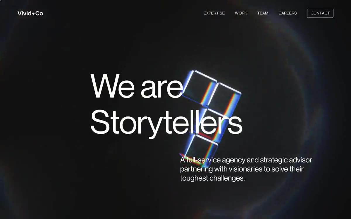
Vivid+Co operates in a cinematic, dark void: a near-black canvas of #101010–#495764, interrupted by a single, near-white hue (#fffdf9) used for nearly all typefaces and interface elements. Typography is primarily rendered in Neue Montreal at 400 weight—a deliberate rejection of bold, where authority is achieved through scale (136px and 105px) rather than weight. A signature technique is the chromatic prism: blocks of saturated red/green/blue light, separated by RGB, filter through glass cubes, disrupting the monochrome surface. The layout is centered and spacious; navigation, body copy, and links are all in a single #fffdf9 color, with no separate accent buttons, fills, or shadows—differentiation is achieved through spacing, scale, and a rainbow artifact that serves as the brand's sole color accent.
A dark, full-width canvas with a single column of content measuring ~1440px maximum. The primary element is a centered prismatic artifact with an overlapping title (text intersecting the cubes) and a left-aligned subtitle. Navigation is located in a thin top bar: the logo on the left, four invisible links on the right, and a dedicated "Contact" button at the end of the row. The section rhythm alternates between full-height hero panels and narrower content strips with ~108px gaps. The content layout is asymmetrical: the prismatic artifact serves as the visual center, and the titles wrap around it. Single-column text blocks have a maximum width of approximately 440px; multi-column grids, card matrices, and pricing tables are absent. The footer is a thin strip, divided by a thin line, with two columns of metadata.
The main design element is an abstract 3D image of glass cubes with chromatic aberration at the edges, separated by RGB color. No photographs, no images of people, no product shots. The prism is the brand's image; everything else is monochrome typography on a dark canvas. The iconography is minimal: subtle navigation labels and a small cursor/glyph accent (area 142765) at the end of one of the headings hint at a single, monolinear 16px icon. No illustrations, no decorative patterns, no textures.
Palette
Neutral
- Bone White
#fffdf9— The main text, navigation labels, link color, and heading fill are all near-white, occupying all typographic surfaces on a dark canvas. - Obsidian
#101010— The page canvas, background fill for the main and dividing stripes, is a deep black color with a prismatic artifact inside. - Graphite Veil
#495764— Behind the headings and content blocks, a cool, dark slate dominates, giving the canvas depth without the use of flat black. - Ash Border
#403f3f— A subtle dividing line and card outline are used at 1px to separate lines without competing with the text. - Fog Blue
#6f879c— Subdued secondary text and subtle button labels (3.7:1 contrast) – service category designations such as “Strategy,” “Creative,” “Communications + Marketing” are perceived as unhighlighted metadata. - Pure Black
#000000— Decorative fill for SVG icons and illustrations—used in the prism image and icon glyphs; not a background.
Typography
from 15 to 136px · 9 steps
- Neue Montreal — replacement: Söhne · outlines 400, 700 · The exclusive font is used throughout the user interface—headings, body copy, navigation, buttons, links, and the footer. A 400 weight is the default; a 700 weight is reserved for subheadings only. Headings with a 105px and 136px weight have a line spacing of 1.00–1.01em and a letter spacing of -0.02em, creating cinematic, stacked headlines that feel more sculptural than typographic.
Intervals and form
| Purpose | Meaning |
|---|---|
| Density | spacious |
| Basic step | 7px |
| Button radius | 0px |
| Card radius | 15px |
| Shadows | no - borders instead of shadows |
| Between sections | 108px |
| Page width | 1440px |
AI will build your website in Vivid+Co style and fill it
- Fill with products and posts via the link - Instagram, TikTok, Facebook.
- Transfer content from your old site—just specify the address.
- Modern design on the best engine: React ( Next.js) with server rendering and SEO optimization out of the box.
- Fully automated SEO optimization for search results and neural network recommendations.
Similar styles
- Sequel — A private screening after dark is the only warm light in an otherwise dark cinema.
- ThoughtLab — An obsidian monument with a crimson signal. A canvas of black emptiness, where the only saturated red object in the cathedral, printed in large white letters, is a single chromatic figure.
- Dovetail — A blueprint under a black moon—barely visible graph lines, white font, one purple sparkle
- MekaVerse — A monochrome gallery of digital artifacts—a solid black void where the rendered world hangs like a museum exhibit, and the entire user interface is white ink on matte black glass.
- Krea — gallery noir at midnight
- Factory — The "war room" terminal at midnight. The "factory" is a stark black control panel where a single white card lands like a flashlight-lit dispatch—the only object in the room is the work itself.
- basement — An empty printing press at 3am – huge, compressed fonts splaying across the pitch black, a single glimmer of orange light on the navigation bar, everything else white or ghostly grey.
- Stink Studios — A film studio at midnight - the projector hums, the room is dark, only the film is lit
- Apple (España) — black theater with illuminated fittings
- Charlie — Typography carved from monastery stone onto obsidian. A portfolio in which a single red wall creates a deafening silence.
- Rive — High-precision night vision. The interface features a special lens that penetrates darkness to focus on technical details with absolute clarity.
- Datalands — A black cathedral with a single neon pulse. The logo fills the nave; everything else is barely audible text underneath.