
Slush
inflatable universe of stickers on pastel paper
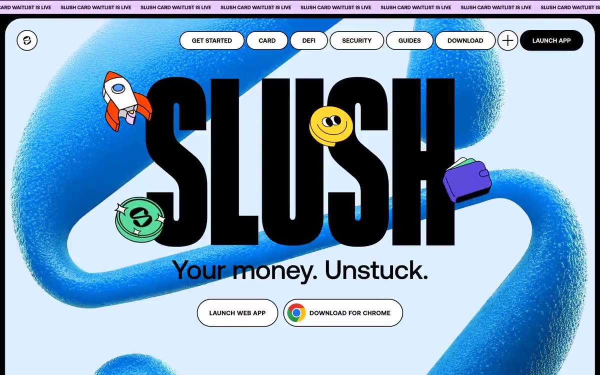
Slush operates like a sticker album: a pastel paper canvas, huge, voluminous ribbons of bright blue, and a rainbow of vibrant sticker accents scattered like confetti. The typeface is huge and condensed (Lateral 800 by 200–640px, line spacing 0.75–0.80), so that words become sculptural objects rather than sentences. Six rich, signature colors function as a general sticker palette—each color appears as a filled sticker, card surface, or decorative layer, never as a discreet accent. Components are softly rounded (20–40px on cards, pill-shaped on navigation) and outlined in black for a handcrafted effect. The result is less a fintech landing page and more a physical collage pinned to a light-colored wall.
The layout features a full-width scrolling page, with no sidebar or persistent container. The scrolling text and minimalist top navigation (logo on the left, navbar in the center, filled call-to-action on the right) remain at the top. Each section is a full-width color strip (#dceeff → #ffffff → #cccccc) with enlarged side text, centered or left-aligned, framed by 3D blue ribbons. The content layout is intentionally loose and collage-like, rather than grid-based: stickers overlap the text, ribbons intersect behind the text, and a QR card is positioned off-center in a secondary section. The vertical rhythm is fairly wide (48px gaps between sections), but the horizontal composition is intentionally asymmetrical. The page reads top to bottom as three large color stripes, each a stand-alone poster.
The visual language is dominated by three-dimensional blue ribbons—a unified brand motif consisting of grainy, inflatable tubular shapes in electric blue that wrap around or obscure the headline text in each section. Decorative two-dimensional stickers (a rocket, a gold coin, a green checkmark, a purple wallet) float around the headlines like paper cutouts pinned to a board, each with a black outline (1px). There are no photographs anywhere. There are no traditional illustrative grids—everything is collaged and arranged asymmetrically. The three-dimensional ribbons create the main atmosphere; the stickers add a playful touch; the rest is type and color.
Palette
Brand
- Electric Blue
#4da2ff— The dominant brand color—thick ribbon sculptures, image backgrounds, blurred patterns on cards—is a visual signature that serves as the foundation for each screen.
Neutral
- Carbon
#000000— The main text, card frames, filled background for the call to action, and logo create the effect of a hand-cut sticker outline on pastel surfaces. - Paper White
#ffffff— Canvas page, cardboard surfaces, button outline fill, text on dark background. - Sky Wash
#dceeff— Main section background, light blue pastel background. - Concrete Gray
#cccccc— Secondary section background, neutral intermediate surface - Soft Mist
#e9e9e9— Subtle button and surface tones, disabled states - Mint Pop
#55db9c— Green fill to highlight the background, decorative stripes, and soft accent behind the content.
Typography
from 12 to 640px · 7 steps
- Lateral — replacement: Druk · outlines 800 · Only the headlines—the "SLUSH" logo and section banners like "ALL THINGS SUI"—are displayed in a 200-640px font with a reduced line height of 0.75-0.80, so the letters form sculpted blocks. This is an anti-traditional display method: no other website uses an 800-point font with a line height of less than 0.85, and this effect makes the text behave like a physical object wrapped in three-dimensional ribbons.
- Aeonik Pro — replacement: Inter · outlines 500, 700 · The entire user interface, including body copy, navigation, buttons, and subheadings. Weight 500 for body copy and metadata (12–16px), weight 700 for subheadings and navigation labels (24–30px), and a 64px increment of 700 for large secondary headings. Tight letter spacing (-0.010em) narrows the body copy (14–16px); slight expansion (0.030–0.032em) in navigation labels/buttons gives controls "white space."
Intervals and form
| Purpose | Meaning |
|---|---|
| Density | dense |
| Basic step | 4-12px |
| Button radius | 1600px |
| Card radius | 20px |
| Shadows | no - borders instead of shadows |
| Between sections | 48px |
| Page width | 1440px |
AI will build your website in Slush style and fill it
- Fill with products and posts via the link - Instagram, TikTok, Facebook.
- Transfer content from your old site—just specify the address.
- Modern design on the best engine: React ( Next.js) with server rendering and SEO optimization out of the box.
- Fully automated SEO optimization for search results and neural network recommendations.
Similar styles
- Cursor — A cozy parchment workshop, lit by smoldering coals
- MindMarket — A cozy fairytale book on cream paper - a friendly editorial canvas where large Inter headlines and cut-out paper characters coexist on a sun-drenched, sticker-soft surface.
- Shop — A floating trading constellation on white marble
- Airbnb — A quiet white gallery wall with a single coral red bookmark
- Superr — A warm school notebook in the soft afternoon light. A cream-colored page, an orange marker without a cap, and a stack of laminated name stickers waiting to be peeled off.
- Apple (España) — The museum gallery, in soft daylight, is a single, captivating, weightless white space, with each exhibit illuminated by a spotlight against a lightly tinted wall.
- Lamborghini — Black body color in the showroom, under the spotlights - one yellow car
- Amplemarket — A sun-drenched workplace strewn with confetti
- Getharvest — A desk at golden hour – a warm cream canvas, white postcards hung on the canvas, and a single bright orange flame
- Agence Foudre — The magazine's cover page is a soft pink color reminiscent of lipstick.
- Drive Capital — Retro road trip poster on warm paper
- Apple (España) — white gallery display case