
Medium
creamy white newspaper at golden hour
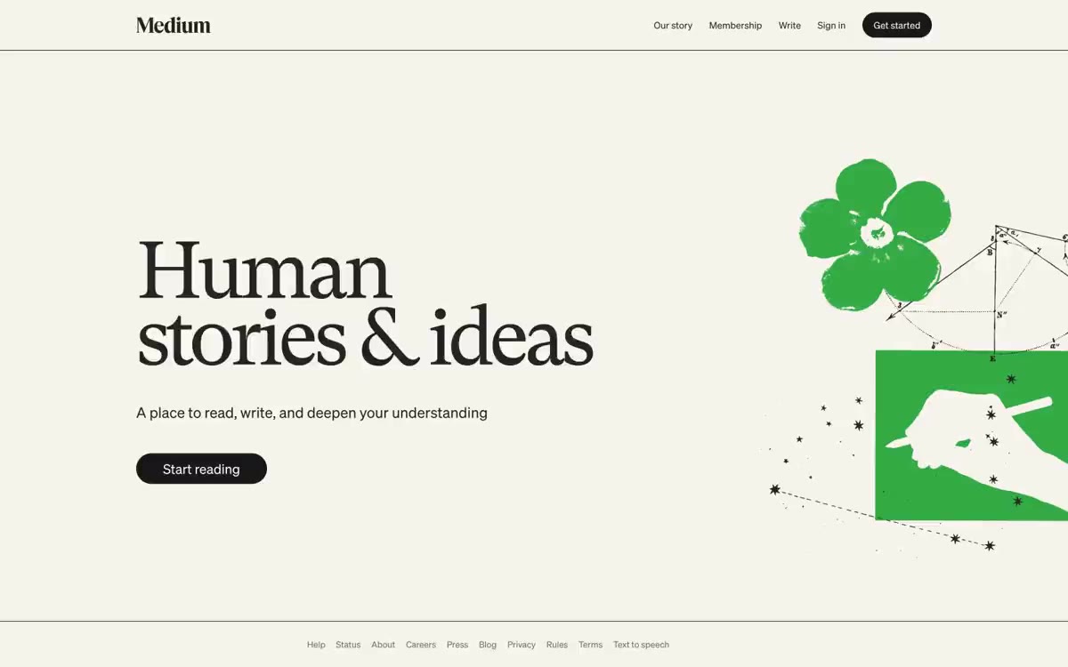
Medium functions like a literary reading room transplanted to the web: a warm, creamy background (#f7f4ed) replaces the sterile white typical of SaaS, making long texts feel like a printed page. The visual system is aggressively monochrome—almost all UI surfaces, text, and borders are in a narrow band of warm grays ranging from #242424 to #6b6b6b—so the reader's attention is completely focused on the content. The only signature gesture is the serif headline (GT Super, 120px, weight 400, letter spacing -0.055em), a deliberate anti-trend choice: a transitional book serif font scaled for display, barely noticeable rather than a bold geometric sans-serif, signals: "We publish books, not software." The buttons are full "pills" of almost black color - the only solid ink on the page.
The homepage has two columns: the left side takes up ~55% of the page's space, with the headline, subtext, and call to action arranged vertically with generous internal spacing; the right side takes up ~45% of the page's space, with an illustration panel. The left column is left-aligned (not centered), anchoring the page to the reading axis. Below the homepage, the page is a single, full-width, cream-colored strip with centered links in the footer. No card grids, feature sections, or alternating stripes on the homepage—the homepage IS a page. Content density is intentionally low: one headline, one sentence, one button, one image. The page is a cover, not a dashboard.
The illustrations are editorial and episodic, not systematic. The main page features a single hand-drawn illustration (a green flower, a geometric hand, constellation lines) in a loose, slightly naive style. The illustrations look like commissioned works that change seasonally, rather than from a permanent library. There are no photographs on the main page. There are no icons on the main page—all the work is done by the text logo and the text. The visual language is primarily text-oriented, with the illustrations serving as punctuation.
Palette
Neutral
- Newsprint Cream
#f7f4ed— The page canvas, main window background, and section background are a warm, slightly creamy shade that creates the feeling of a printed interface rather than a digital one. - Paper White
#ffffff— Card surfaces, raised panels, form entry fields, and any surfaces that need to be separated from the cream canvas. - Ink
#242424— Body text, body text, links, headings - slightly warmer than pure black, looks good on a cream background. - Body Gray
#333333— The secondary text color and default foreground color are used where a color slightly lighter than the ink color is required without losing contrast. - Button Black
#191919— A neutral color is supported for secondary UI elements, dividers, and muted labels. It should not be used as the primary color for calls to action. - Marginalia Gray
#6b6b6b— Neutral color support for secondary UI, dividers, and muted labels.
Typography
from 13 to 120px · 5 steps
- medium-content-sans-serif-font — replacement: Inter · outlines 400 · medium-content-sans-serif font - found in the extracted data but not described by the AI.
- GT Super — replacement: Playfair Display · outlines 400 · The headings and body text are a transitional book serif font at an extreme scale with tight letter spacing and a 0.83 line spacing. The choice of a 400 weight (not bold) at 120px is a signature feature: the letterforms, not the weight, do the work. The negative letter spacing narrows the optical gaps, making "Human Stories and Ideas" feel like a cohesive typographic block.
- Söhne — replacement: Inter · outlines 400 · The UI sans-serif font is used for navigation, buttons, subheadings, and small titles. The 13–14px range is for navigation labels and buttons; 20–22px is for subheadings and secondary text within the title. A clean sans-serif with humanistic proportions is legible at small sizes and unobtrusive at larger ones.
Intervals and form
| Purpose | Meaning |
|---|---|
| Density | average |
| Basic step | 16-24px |
| Button radius | 9999px |
| Card radius | 0px |
| Shadows | no - borders instead of shadows |
| Between sections | 64px |
| Page width | 1200px |
AI will build your website in Medium style and fill it
- Fill with products and posts via the link - Instagram, TikTok, Facebook.
- Transfer content from your old site—just specify the address.
- Modern design on the best engine: React ( Next.js) with server rendering and SEO optimization out of the box.
- Fully automated SEO optimization for search results and neural network recommendations.
Similar styles
- Steep — Analysis of Serif Fonts on Warm Paper
- Newformcap — Editorial newspaper in the dressing room
- Claude — An artifact printed on warm parchment—ink on bone paper, clay as the only breath of color
- 11x– Digital workers — A cinematic editorial wasteland—panoramic photographs of the landscape set against monumental serif headlines that read like a luxury magazine spread
- Revolut — A monochrome editorial work based on a photograph of clouds—white ink, pillbox buttons, a single blue stripe of color in an otherwise grayscale world.
- Scheduling — Editorial ink on cream paper
- Titan — warm-toned monochrome archive
- Programa — A Swiss design studio at midday. The white gallery wall is illuminated by a single yellow table lamp—everything is in shades of gray until a button, icon, or accent catches the eye, and then that single yellow accent defines the entire room.
- Sana Agents — Lime sparkle on white background in editorial
- Visual — Warm editorial samizdat. Cream paper, serif posters, monochrome marginalia, one yellow marker.
- Midday — Editorial brochure on vellum - 72px serif headline on a warm stone background, sans-serif body copy with spacing, pill-shaped controls, no shadows
- Chat for impact — A forest green clinic with pastel-colored rooms