
Steep
Analysis of Serif Fonts on Warm Paper
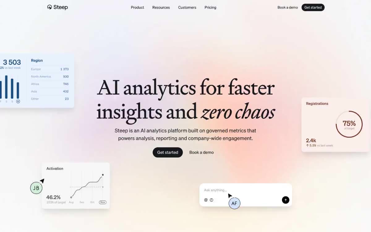
Steep presents analytics as editorial content—Signifier serif headlines float above a nearly monochrome white canvas, and a single warm peach accent (#fbe1d1) underscores the otherwise achromatic system. The page reads like a product magazine spread: large, cursive typeface, ample text space, large cards with soft 24px-radius edges, and pill-shaped controls flush with the surface. Components feel calm and weightless—shadows are subtle, borders are thin, and color is used for functional emphasis (peach callout, dark brown lettering on a peach background). Product surfaces (region tables, activation diagrams, AI builders) are presented as floating elements around the header rather than nested within the dashboard's shell.
The page layout has a maximum width of 1200px, centered, with the main sections occupying almost the entire page width but remaining within the container. The main layout features a centered header with a large serif font, a subheader, and a pair of pill buttons, surrounded by four floating product description cards (region table top left, registration card right, activation diagram bottom left, AI editor bottom center) that overlap a white canvas at varying offsets. Sections alternate between Paper White and Card Mist backgrounds, creating a calm rhythm without strong contrast. Feature sections use a two-column layout of text and UI with large 80px vertical gutters. Navigation is a single transparent top bar (no background, border, or shadow) with the logo on the left, navigation links in the center, and two calls to action (text link + filled pill button) on the right. The overall layout density is spacious—the page "breathes" between sections, and content never crowds the edges.
The visual design is product-focused, not lifestyle-focused: floating UI elements (regional tables with five-row data, line charts showing activations in August-November, radial progress rings, AI input fields) are arranged as cropped screenshots around editorial headlines. There are no photographs, illustrations, or abstract graphics. All visual product elements are placed on white floating cards with thin borders and soft shadows. Avatar circles feature a small cursor directional indicator—a visual motif signaling real-time interaction. The main composition is a collage of text and UI, rather than a centered headline with a stock photo.
Palette
Neutral
- Ink Black
#17191c— The main text, the filled button background, and the navigation logo are the only dark surfaces in the system; all calls to action and headlines in the main text appear against this near-black background. - Paper White
#ffffff— The page canvas, button text, and embossed card surfaces are the dominant background tone, carrying approximately 76 frequency points. - Mist Gray
#f2f2f3— Card surfaces, additional backgrounds, input field fills—an invisible layer under the paper for embedded content. - Fog White
#fafafb— An additional page background for alternating sections and surfaces on hover - one step above the paper to create subtle stripe variations. - Slate Gray
#777b86— Link color, muted auxiliary text, footer text - A cool, desaturated gray placed between the main text and the text that cannot be included. - Ash Gray
#979799— Additional labels, category tags (Marketing, Finance, Sales) - one step lighter than the link color.
Typography
from 15 to 90px · 8 steps
- Signifier — replacement: GT Sectra · outlines 400 · A serif font for headlines and titles—used exclusively for H1/H2 in three sizes; the font weight remains at 400 (regular) at all scales, a signature choice: a serif font whispers rather than screams like a bold font.
- Sohne — replacement: Inter · outlines 400, 430, 450, 480, 500 · The main, interface, and navigation fonts are versatile, covering everything from metadata to subheadings; semi-stepped weights (430, 450, 480) create a subtle hierarchy without jumping to bold.
Intervals and form
| Purpose | Meaning |
|---|---|
| Density | average |
| Basic step | 8px |
| Button radius | 9999px |
| Card radius | 24px |
| Shadows | no - borders instead of shadows |
| Between sections | 80px |
| Page width | 1200px |
AI will build your website in Steep style and fill it
- Fill with products and posts via the link - Instagram, TikTok, Facebook.
- Transfer content from your old site—just specify the address.
- Modern design on the best engine: React ( Next.js) with server rendering and SEO optimization out of the box.
- Fully automated SEO optimization for search results and neural network recommendations.
Similar styles
- Newformcap — Editorial newspaper in the dressing room
- Claude — An artifact printed on warm parchment—ink on bone paper, clay as the only breath of color
- 11x– Digital workers — A cinematic editorial wasteland—panoramic photographs of the landscape set against monumental serif headlines that read like a luxury magazine spread
- Revolut — A monochrome editorial work based on a photograph of clouds—white ink, pillbox buttons, a single blue stripe of color in an otherwise grayscale world.
- Scheduling — Editorial ink on cream paper
- Titan — warm-toned monochrome archive
- Programa — A Swiss design studio at midday. The white gallery wall is illuminated by a single yellow table lamp—everything is in shades of gray until a button, icon, or accent catches the eye, and then that single yellow accent defines the entire room.
- Sana Agents — Lime sparkle on white background in editorial
- Visual — Warm editorial samizdat. Cream paper, serif posters, monochrome marginalia, one yellow marker.
- Midday — Editorial brochure on vellum - 72px serif headline on a warm stone background, sans-serif body copy with spacing, pill-shaped controls, no shadows
- Chat for impact — A forest green clinic with pastel-colored rooms
- Handhold — Warm parchment beneath barely audible serifs—an editorial spread, hand-set without chromatic noise, where the finest 200-point serif font conveys the entire voice