
LUNCH
velvet podium on warm parchment
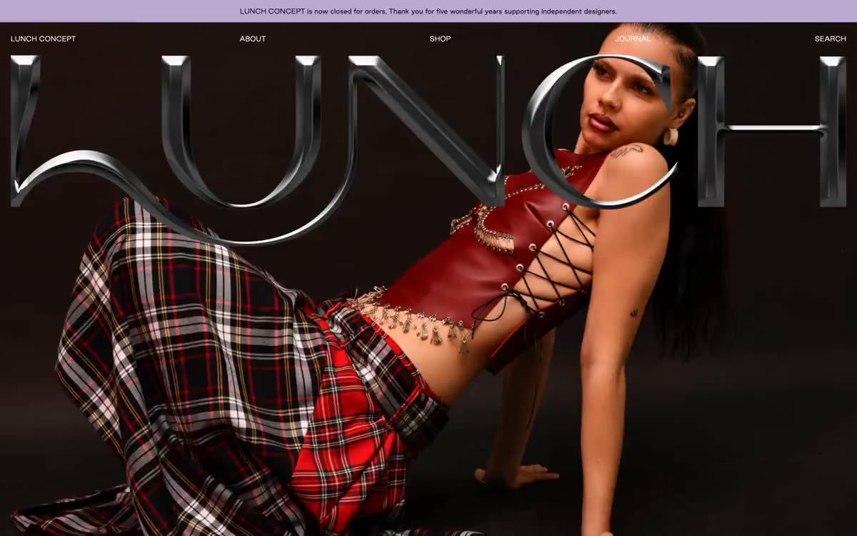
LUNCH CONCEPT reads like a printed fashion editorial translated to the web: a dark, full-page main photo element, where the brand logo is presented as enlarged 3D text with chrome accents, followed by a calm, catalog-like product gallery on warm parchment. The page alternates between cinematic confrontation and quiet restraint—the main element attacks, the main section whispers. A single, muted lavender color appears only in the ad line, in the "Sold Out" state, and in the footer, serving as a brand statement rather than a shout. A single, signature sans-serif font (Good Sans) is used primarily at modest sizes, and the main logo is the only moment of typographic spectacle. Interaction occurs solely through text links: no filled buttons, no gradients, no decorative chrome, save for the 3D logo of the main element.
Maximum width ~1280px for centered content sections; page title spans the entire page width from edge to edge. Page rhythm: dark page title spanning the entire page width (viewport height) → centered introductory text on a dark background → 4-5-column product grid on the same background → lilac veil footer strip. Navigation is located as a thin text strip above the page title (light text on a dark background) and above the introductory text (dark text on a light background). The product grid has a dense layout with internal alignment, without indents between images or visual separation. The introductory text is a narrow, centered column (~600-700px) with generous vertical space (60-80px) above and below. Overall density: spacious in editorial sections, compressed in the product grid.
Editorial fashion photography dominates the design: the main image features dark, high-contrast photos of models (somber studio lighting, avant-garde styling—red leather corsets, checkered plaids, striking poses), while the grid features crisp product/lookbook shots against a flat, neutral background (models and products are photographed against a light gray/white background, without lifestyle context). The images have crisp edges, a zero radius, and are tightly aligned with adjacent images in the grid. The main image occupies all four edges of the viewport, and a 3D chrome logo overlaps the object. Product images in the grid maintain a consistent height-to-width ratio across the entire row. There are no illustrations or icons, other than minimal text navigation. The visual language is: shoot well, crop sharply, and let the photo be the face of the brand.
Palette
Brand
- Lilac Veil
#b8aad0— Purple fill for background highlights, decorative stripes, and a soft accent behind the content.
Neutral
- Ink Black
#000000— All body text, navigation text, link borders, card borders, and icon borders form the structural line of the entire interface. - Warm Parchment
#f4f1e4— The background of the pages and sections in the editorial/product area is a calm background on which product photographs are placed. - Ivory Mist
#fcfaf1— The color of the navigation text on top of the dark main element, a subtle tint of texture, and subtle borders provide a warmer alternative to pure white for the UI in the dark section.
Typography
from 12 to 72px · 5 steps
- Good Sans — replacement: Söhne · outlines 400, 700 · A universal typeface for navigation, body text, product metadata, links, and all UI text. The dual weight system (regular 400 for body text/headings, bold 700 for brand names, prices, and highlights) creates hierarchy without increasing the size. Near-zero positive letter spacing makes it more editorial than geometric.
- Redaction — replacement: GT Sectra Display Bold · outlines 700 · For Body Text Only—This is a custom font for the large, chrome text "LUNCH" that serves as the base for the full-screen body text. It is used exactly once per page; it is a typographic signature, not a reusable component.
Intervals and form
| Purpose | Meaning |
|---|---|
| Density | dense |
| Basic step | 20-30px |
| Button radius | 0px |
| Card radius | 0px |
| Shadows | no - borders instead of shadows |
| Between sections | 60-80px |
| Page width | 1280px |
AI will build your website in LUNCH style and fill it
- Fill with products and posts via the link - Instagram, TikTok, Facebook.
- Transfer content from your old site—just specify the address.
- Modern design on the best engine: React ( Next.js) with server rendering and SEO optimization out of the box.
- Fully automated SEO optimization for search results and neural network recommendations.
Similar styles
- MindMarket — A cozy fairytale book on cream paper - a friendly editorial canvas where large Inter headlines and cut-out paper characters coexist on a sun-drenched, sticker-soft surface.
- Lamborghini — Black body color in the showroom, under the spotlights - one yellow car
- amp — Warm orange against a cool white background. The design is reminiscent of a premium fitness product photographed in a sun-drenched loft: one item, one accent, one confident font that does all the work.
- IKEA — a sun-drenched Swedish furniture showroom in disassembled form
- Microsoft — The retail catalog uses a signature blue color—imagine a square logo on a white showroom floor, where every design element is in blue.
- Vibrants — Skyborne Pharmacy on white marble - dark blue ink is the mortar and the rainbow spectrum is the medicine
- Isla Beauty — Creamy apothecary style with accents of surgical red—think warm parchment walls, amber bottles, and a single red stamp on every label.
- Swap — Mint Editorial Gallery: Light sage shades in rooms with bright lime accents and subtle serifs
- Cursor — A cozy parchment workshop, lit by smoldering coals
- Structured — Renaissance gallery on plasticine-like paper
- Apple (España) — The museum gallery, in soft daylight, is a single, captivating, weightless white space, with each exhibit illuminated by a spotlight against a lightly tinted wall.
- Amplemarket — A sun-drenched workplace strewn with confetti