
IKEA
a sun-drenched Swedish furniture showroom in disassembled form
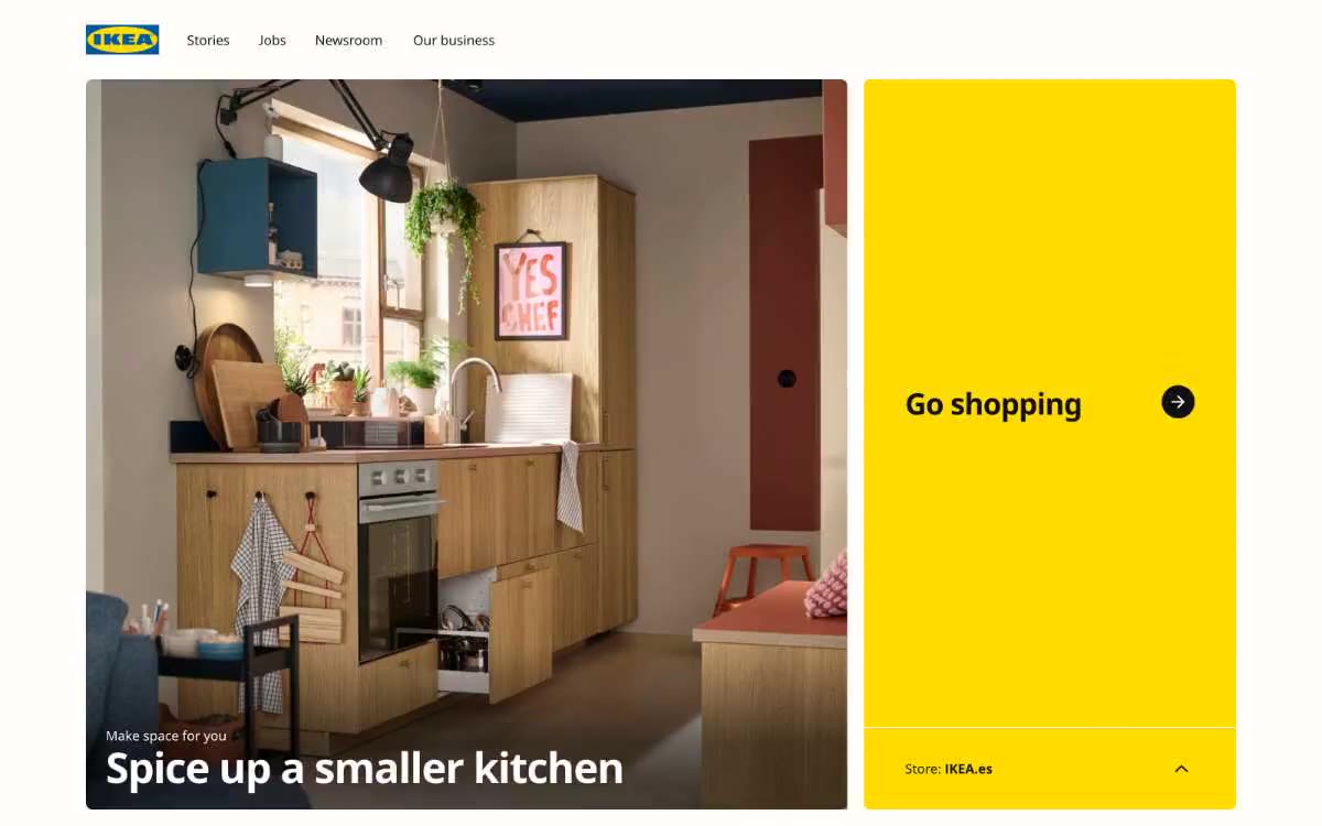
IKEA's interface looks like a high-contrast editorial spread: near-black type on a warm white background, complemented by flat yellow panels that serve as embedded call-to-action zones. The system is intentionally minimalist—one custom sans-serif font (Noto IKEA) in just two weights (400 and 700), a single corner radius for each component, and no shadows or gradients. This compactness is structural, not a minimalist trend: negative letter spacing (-0.029em in the heading, -0.027em in the body copy) gives even the 13px labels an architectural feel. Cards are large and focused on media content, arranged in large two-column blocks with text overlays ranging from gradient to black for improved readability. The yellow font #ffdb00 does all the work for the interface—it doesn't decorate, it merely activates.
A full-width design with a centered content container limited to approximately 1440px. Navigation is a simple, non-sticky top bar. The page is built from horizontal cards stacked vertically with approximately 80px gaps. The "hero" layout is a split layout—2/3 media card (image) + 1/3 solid yellow card with a call to action. The main body of the page uses two-column grids of cards, alternating blocks of images and text. Content density is spacious, never compact. Cards are large (approximately 600x400 pixels minimum) with generous padding. The "Timeline/History" section breaks up the grid with large numbers. There is no sidebar, no mega-menu, no complex navigation architecture.
The visual language is primarily product and lifestyle photography. The editing: bright, naturally lit, warm Scandinavian interiors with a lived-in feel—not the stark whiteness of a studio. People appear in scenes of interaction with the product (holding, assembling, using). Images always occupy the full width of the card, never cropped to organic shapes. Gradient black overlays appear at the bottom of any card with text. Flat illustrations are occasionally featured (for example, a map of Germany with cultural iconography in turquoise, green, and orange). The photographs are executed in an editorial style: no glossy stock photo effect, no overly stylized color correction.
Palette
Brand
- IKEA Yellow
#ffdb00— Key elements for filling calls to action, backgrounds for cards with featured images, accent panels in the main window - a one-of-a-kind color element of the system.
Neutral
- Ink Black
#111111— Main text, body text, headings, main borders (851 occurrences), icon outline. - Pure White
#ffffff— Page background, card surface, navigation background, button text on a dark background. - Warm White
#fffefb— A slightly creamy shade for buttons and cards—barely warmer than pure white—breaks the digital coldness. - Steel Gray
#818181— Secondary text, muted borders, disabled icon states - True Black
#000000— SVG icon fills, input field borders, and deep black accents where maximum contrast is needed. - Link Blue
#0159a3— The text link color, widely used in navigation and primary links, is the only blue color in the system.
Typography
from 13 to 51px · 5 steps
- Noto IKEA — replacement: Inter · outlines 400, 700 · The only font used is IKEA's signature Noto. The two-weight system (400 regular, 700 bold) is intentionally restrained: no italics, medium, or light weights. Headings at 700 point, at 36–51px, convey the entire brand style; the body copy at 16px remains neutral. Letter spacing decreases as the size increases, giving the headings a condensed and architectural feel.
Intervals and form
| Purpose | Meaning |
|---|---|
| Density | average |
| Basic step | 24px |
| Button radius | 8px |
| Card radius | 8px |
| Shadows | no - borders instead of shadows |
| Between sections | 80px |
| Page width | 1440px |
AI will build your website in IKEA style and fill it
- Fill with products and posts via the link - Instagram, TikTok, Facebook.
- Transfer content from your old site—just specify the address.
- Modern design on the best engine: React ( Next.js) with server rendering and SEO optimization out of the box.
- Fully automated SEO optimization for search results and neural network recommendations.
Similar styles
- MindMarket — A cozy fairytale book on cream paper - a friendly editorial canvas where large Inter headlines and cut-out paper characters coexist on a sun-drenched, sticker-soft surface.
- Lamborghini — Black body color in the showroom, under the spotlights - one yellow car
- amp — Warm orange against a cool white background. The design is reminiscent of a premium fitness product photographed in a sun-drenched loft: one item, one accent, one confident font that does all the work.
- LUNCH — velvet podium on warm parchment
- Microsoft — The retail catalog uses a signature blue color—imagine a square logo on a white showroom floor, where every design element is in blue.
- Vibrants — Skyborne Pharmacy on white marble - dark blue ink is the mortar and the rainbow spectrum is the medicine
- Isla Beauty — Creamy apothecary style with accents of surgical red—think warm parchment walls, amber bottles, and a single red stamp on every label.
- Swap — Mint Editorial Gallery: Light sage shades in rooms with bright lime accents and subtle serifs
- Cursor — A cozy parchment workshop, lit by smoldering coals
- Structured — Renaissance gallery on plasticine-like paper
- Apple (España) — The museum gallery, in soft daylight, is a single, captivating, weightless white space, with each exhibit illuminated by a spotlight against a lightly tinted wall.
- Amplemarket — A sun-drenched workplace strewn with confetti