
Glossier
Sunshine photoshoot - white paper, black ink, one bright yellow accent
Glossier functions like a digital beauty magazine: a nearly monochrome canvas of white and black, punctuated by a single, vibrant yellow accent that doubles as the brand's logo and sole call to action. The system is editorially restrained—oversized Apercu headlines, ample text space, full-page lifestyle photography that carries the bulk of the emotional weight—and utilitarian in execution: flat product cards, thin borders, and a complete lack of embellishment. Yellow isn't a secondary brand color; it IS the brand, used sparingly, so that every appearance feels like a camera flash. Everything else is meant to fade into the background: neutrals are warm grays with a subtle blush undertone, borders are subtle, and type is dense and condensed. The result is a storefront that feels confident, understated, and uncompromisingly modern.
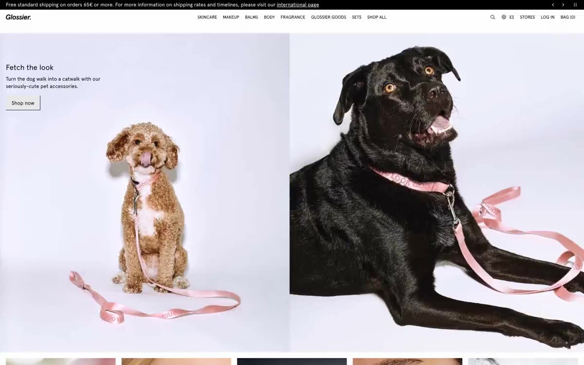
The page features a vertically arranged series of full-screen sections, each designed as a standalone editorial spread. The main section is a full-width photo with a floating white overlay (top left) and a massive yellow logo occupying the entire bottom of the page. Below the main section, sections alternate between full-screen images and grids of individual cards. The division of categories (skincare/makeup) into two columns with an equal ratio of images (50/50) occurs without a visible border—only a line connecting the images separates them. The product catalog uses a four-column grid of square cards on a #f7f7f7 canvas. Navigation is a minimalist top bar with a secondary ad strip above it. The gaps between sections are fairly large (64px), but the transitions between sections are smooth—without dividers or alternating background colors, except for the warm footer. The overall rhythm is: photograph, text, photograph, grid, photograph – like flipping through a fashion magazine.
Photography is the dominant visual language. The entire viewing area is filled with lifestyle images and portraits—warm golden hour lighting, soft close-ups of skin, hands holding product bottles against a backdrop of sun glare. The color palette in the photographs is warm and desaturated: peach skies, terracotta skin tones, deep ocean blues. Images always occupy the entire page surface, without rounded corners, frames, or overlays, with the exception of white text cards or the yellow logo. Product photos on catalog cards are shot against a pure white seamless background with flat, even lighting. The image-to-text ratio is approximately 70/30—the images convey emotion, the text, function. No illustrations, no abstract graphics, no 3D renderings.
Palette
Brand
- Glossier Yellow
#fff116— Yellow is used as a secondary accent for decorative details and to highlight less frequently used search queries. It should not be used as the primary color for a call to action.
Neutral
- Ink
#000000— Body text, navigation links, primary text, footer text, icon outlines, thin borders; dominant typographic and structural color. - Paper
#ffffff— Product card surfaces, fill areas, raised panels; the brightest surface level in the stack. - Fog
#f7f7f7— Page canvas, section backgrounds, transitions between images on the page; the base surface on which the entire website is located. - Blush
#faf2f4— Footer background, soft warm section dividers; subtle pinkish-white tint adds warmth to the bottom of the pages. - Mist
#f0f0f0— A light supporting surface for creating an unobtrusive background and separating sections. It shouldn't be used as the primary color for the call to action. - Ash
#e8e8e8— Input field borders, icon backgrounds, thin separator lines; structural border color for cards and form elements.
Typography
from 12 to 32px · 5 steps
- Apercu — replacement: Inter · outlines 400, 500, 700 · The primary typeface is used throughout the user interface—body copy at 16px/400, navigation and captions at 12–14px/500, subheadings at 20px/500, and editorial headlines at 32px/700. Apercu's geometric, humanistic design gives the brand a condensed, modern style; the near-zero letter spacing (0.002–0.003em) makes the typeface compact and magazine-like, rather than airy or friendly. The 700 weight is reserved for display elements in editorials, not UI elements.
- Apercu Mono — replacement: JetBrains Mono or IBM Plex Mono · outlines 400 · Micro-utilitarian typography for order metadata, tracking numbers, and labels next to the code; the monospaced version creates a technical texture against a proportional body type.
- GTStandard-M — replacement: Inter · outlines 400 · GTStandard-M - Found in the extracted data but not described by the AI.
Intervals and form
| Purpose | Meaning |
|---|---|
| Density | average |
| Basic step | 8px |
| Button radius | 0px |
| Card radius | 0px |
| Shadows | no - borders instead of shadows |
| Between sections | 64px |
| Page width | 1440px |
AI will build your website in Glossier style and fill it
- Fill with products and posts via the link - Instagram, TikTok, Facebook.
- Transfer content from your old site—just specify the address.
- Modern design on the best engine: React ( Next.js) with server rendering and SEO optimization out of the box.
- Fully automated SEO optimization for search results and neural network recommendations.
Similar styles
- Lightship — A cinematic diorama of the open road. Warm cream gallery walls adorned with large landscape photographs mounted at close intervals, thin black type barely visible on the frames, and a single bright orange accent breaking the monochrome like a bonfire in a meadow.
- Faire ES — wholesale catalog of warm cream
- Adanola — An editorial lookbook on white paper. A fashion shoot where typography and photography breathe on clean white surfaces, with black ink for the typeface and a subtle signature sans-serif font (Favorit), reflecting the brand's overall style.
- Oura Ring — A cozy oatmeal making workshop, bathed in soft daylight
- Stykka — A Scandinavian workshop in white light – a quiet, handcrafted showroom where the only voice is photography
- DJI — aerospace black canvas with a single electric blue highlight
- Altitude Beverages — Monochrome magazine spread. Imagine a fashion magazine spread stripped of all color except for the still photos—the text and white space tell the whole story.
- AATHER — An open palm, a single flame - a quiet luxury contained in stillness
- Cowboy — A Belgian bicycle gallery in a snow-white porcelain setting. A showroom where matte surfaces, large fonts used in editorial materials, and a virtual absence of decoration draw the eye to the bicycle and its contents.
- Refero — Editorial layout on white marble - a product page created by a typographer, where the serif headline is the brand's calling card, and everything else is unobtrusive
- Face Formula — A Scandinavian editorial portrait. A calm, magazine-style spread, where the model's gaze and the headline, written in a condensed serif font, speak for themselves against a cool, foggy backdrop.
- Shupatto — Museum display case on white marble