
Adanola
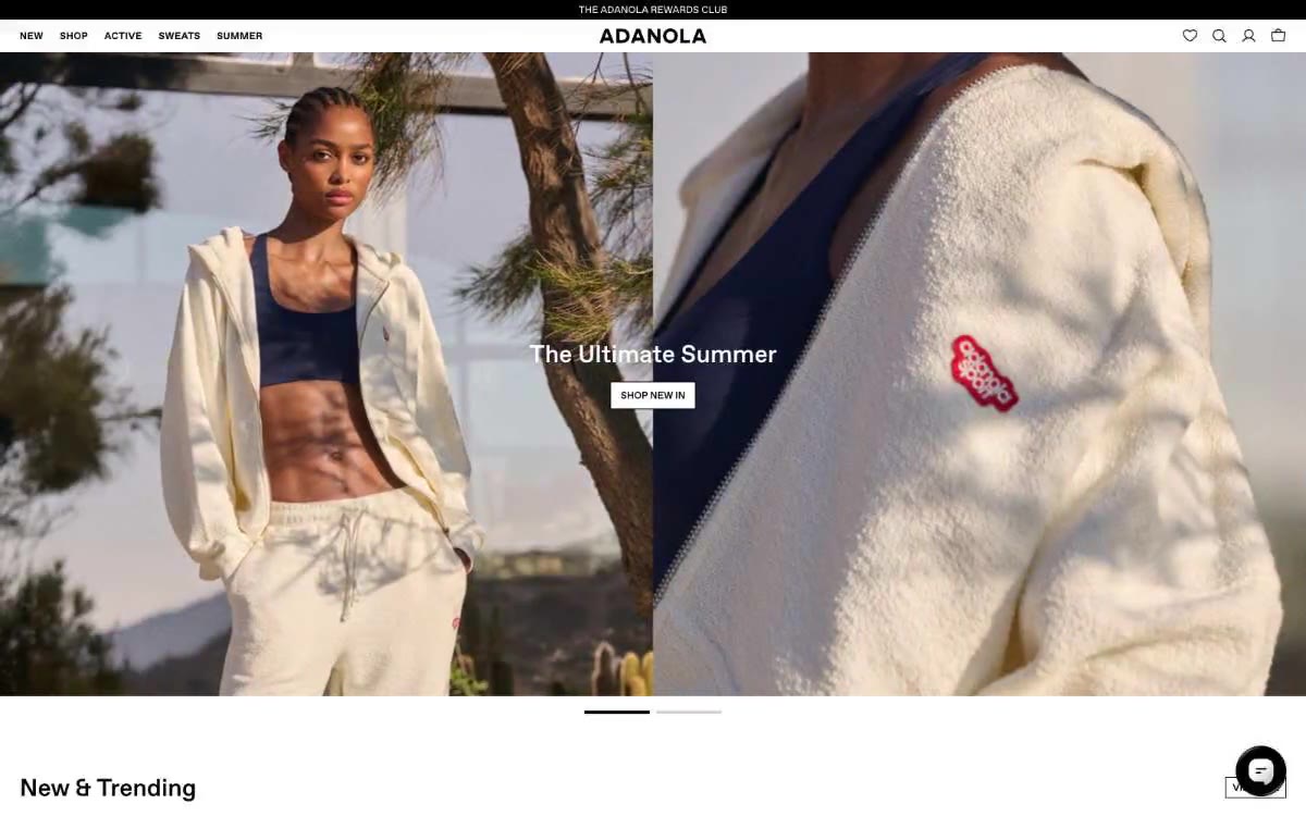
An editorial lookbook on white paper. A fashion shoot where typography and photography breathe on clean white surfaces, with black ink for the typeface and a subtle signature sans-serif font (Favorit), reflecting the brand's overall style.
Adanola is a gallery-like canvas for fashion, where product photography is the sole visual language and the user interface virtually disappears. The interface is nearly monochrome—white surfaces, black text, and a single, thin sans-serif font (Favorit)—allowing the color of the garments themselves to be the sole chromatic accent on most pages. The components are deliberately light: no shadows, gradients, or decorative borders, just subtle lines, subtle outlines of key actions, and corner radii that feel crisp rather than soft. Spacing is compact and uniform (basic), but generous white space around the images creates a calm, editorial rhythm, treating each product shot like a full-page editorial spread. Overall, the feel is closer to a high-quality print lookbook than a typical e-commerce grid.
The page layout is full-width, with content limited to a maximum width of approximately 1440px on desktop. The hero image is the full-width image with a centered headline and hidden call to action (CTA). Below the hero image, the page alternates between product grid sections (a 4-column grid on desktop) and editorial image blocks (two equal-width lifestyle photos). Navigation is a minimalist top bar with a black ad stripe above it—there is no fixed header, sidebar, or mega menu. Categories are browsed using simple horizontal filter tabs above the product grid rather than a separate category page. The rhythm is spacious: 64px+ vertical gutters between major sections, and compact 8-16px spacing within product cards. The grid is used consistently: 4 columns for products, 2 columns for editorial content, and one column for category navigation. There are no mosaic or asymmetrical layouts - everything is rigidly aligned to the grid to emphasize the structure of the catalog/lookbook.
The visual language, dominated by photography, centers on full-screen images of models in activewear. The editing is more editorial than commercial: the models are captured in natural motion (stretching, walking, stepping) rather than in static studio poses. Color rendition is natural and unfiltered—the colors of the clothes are true to life, without two-tone processing or color correction. Images have zero corner radius and are unmasked—they are rectangular frames that fill the containers from edge to edge. The main image uses a wide aspect ratio (~16:6) without overlaying graphics, allowing the photography to carry the visual weight on its own. Product card images are clean studio shots against a neutral background, tightly cropped to the clothes. The overall content density is predominantly images in the editorial sections and a grid in the product descriptions, with text always subordinate to the images. No illustrations, 3D renders, or abstract graphics—photography is the sole visual medium.
Palette
Neutral
- Carbon Ink
#000000— Body text, filled action buttons, icon outlines, thin lines—the dominant font throughout the interface. - Paper White
#ffffff— Canvas pages, cardboard surfaces, text on dark background, background images. - Soft Mist
#e5e7eb— Subtle surface changes, disabled states, skeletal background, light dividers. - Warm Fog
#f0efe7— The light beige surface provides subtle stripes between product rows and editorial sections. - Blush Sand
#f5ebd5— A warm, creamy surface tone for highlight sections and seasonal accents in editorial content. - Smoke Charcoal
#333333— Additional text, input field borders, discreet UI design.
Typography
from 14 to 30px · 3 steps
- Favorit — replacement: Inter · outlines 400, 500, 700 · Brand and custom font – used in all navigation, headings, body text, buttons, input fields, and product cards. A custom monolinear sans-serif font with narrow letter spacing (0.025em). Alternatives: Inter, Söhne, or Neue Haas Grotesk. A medium weight of 400 with 30px letter spacing for headlines is a brand choice: most fashion websites use decorative serif or bold fonts, but Adanola's headlines, set in a regular sans-serif font, look more like editorial captions than advertising slogans.
- Nunito Sans — replacement: Nunito Sans · outlines 400, 700 · A secondary fallback for form input fields and small UI elements.
- Arial — replacement: Arial · outlines 400 · A fallback system for legacy email and content blocks.
Intervals and form
| Purpose | Meaning |
|---|---|
| Density | average |
| Basic step | 8px |
| Button radius | 4px |
| Card radius | 0px |
| Shadows | no - borders instead of shadows |
| Between sections | 64px |
| Page width | 1440px |
AI will build your website in Adanola style and fill it
- Fill with products and posts via the link - Instagram, TikTok, Facebook.
- Transfer content from your old site—just specify the address.
- Modern design on the best engine: React ( Next.js) with server rendering and SEO optimization out of the box.
- Fully automated SEO optimization for search results and neural network recommendations.
Similar styles
- Lightship — A cinematic diorama of the open road. Warm cream gallery walls adorned with large landscape photographs mounted at close intervals, thin black type barely visible on the frames, and a single bright orange accent breaking the monochrome like a bonfire in a meadow.
- Faire ES — wholesale catalog of warm cream
- Oura Ring — A cozy oatmeal making workshop, bathed in soft daylight
- Stykka — A Scandinavian workshop in white light – a quiet, handcrafted showroom where the only voice is photography
- DJI — aerospace black canvas with a single electric blue highlight
- Altitude Beverages — Monochrome magazine spread. Imagine a fashion magazine spread stripped of all color except for the still photos—the text and white space tell the whole story.
- AATHER — An open palm, a single flame - a quiet luxury contained in stillness
- Cowboy — A Belgian bicycle gallery in a snow-white porcelain setting. A showroom where matte surfaces, large fonts used in editorial materials, and a virtual absence of decoration draw the eye to the bicycle and its contents.
- Refero — Editorial layout on white marble - a product page created by a typographer, where the serif headline is the brand's calling card, and everything else is unobtrusive
- Face Formula — A Scandinavian editorial portrait. A calm, magazine-style spread, where the model's gaze and the headline, written in a condensed serif font, speak for themselves against a cool, foggy backdrop.
- Shupatto — Museum display case on white marble
- Liron Moran Interiors — fashion photo shoot on dark linen