
Caldera
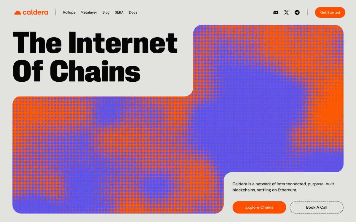
Forge fire on warm limestone. The canvas is raw, warm plaster, and each orange element looks like smoldering embers pressed into the surface.
Caldera operates on a warm limestone canvas, bathed in molten orange. The interface is flat and shadowless, allowing the ultra-bold, condensed type at a near-architectural scale (up to 189px) to carry the entire structural load. A single vibrant orange (#fc5000) acts as the sole, aggressive chromatic accent against a background of monochrome, warm grays, plasma purple is reserved for the main halftone image, and sulfur yellow for tags. The visual language is volcanic: condensed, heavy letters, halftone dot patterns, 40px radii on cards and buttons, and 800px pill-shaped controls—warmth encapsulated in a soft, paper-like surface.
The visual palette is minimalist and thoughtful. The main window uses an abstract halftone dot pattern (orange dots on a purple-to-orange gradient) instead of a photograph—it serves not as decoration, but as an artistic expression of the brand. Cards with product information and announcements use either solid Ember blocks or a halftone Plasma Violet as image fills, providing a unified graphic system. Partner/integration logos appear as monochrome icons on a light background. There are no photographs, 3D renders, or lifestyle images. Icons are small, monochrome, and minimalist—Discord, X, and Telegram are located in the navigation as simple glyphs. The visual language is graphic and editorial, not photographic: it resembles poster design rather than stock images.
Palette
Brand
- Ember
#fc5000— Primary action buttons, stat cards, and key visual accents are the only aggressive color accent; its richness against the warm gray tones creates a sense of urgency without the need for additional decorative elements. - Plasma Violet
#524ae9— Main Halftone Gradient Base, One Additional Card Surface - Used almost exclusively in the main dot pattern and on one dedicated card; never used for controls.
Neutral
- Sulfur
#f5f28e— The background for the tag and category icons, small highlights, is a soft yellow color used to indicate blog post categories and program announcements. - Limestone
#f7f6f2— Card surfaces, content block backgrounds, and additional button fills are a lighter, warmer shade of white that makes the elements stand out against the page canvas. - Pumice
#e2e2df— The main background of the page is a warm medium gray that serves as the foundation for each section; it is slightly darker than the surface of the cardstock, allowing for a subtle separation of figure and background without shadows. - Obsidian
#070607— The main text, headings, link text, and button frames are almost black with a barely noticeable warm tint that matches the warm colors of the canvas. - Chalk
#ffffff— Text in dark sections, input text on dark backgrounds, high-contrast overlays - Pure white is used only where maximum contrast with dark surfaces is required.
Typography
from 12 to 189px · 10 steps
- PP Neue Corp Compact — replacement: Bebas Neue · outlines 400 (Ultrabold cut) · All headings and display text. A custom-designed, condensed, ultra-bold font lends the headings an industrial, sign-like heft. The 189px size in the main block reflects the brand's signature style: condensed, almost structural rather than typographic. The "ss06" and "ss10" settings activate alternate letterforms and spacing for a more aggressive, condensed rhythm. Positive letter spacing (+0.02em) is unusual for display sizes and prevents a feeling of cramped text at 80–189px.
- DM Sans — replacement: Inter · outlines 500 (Medium only — never Regular or Bold) · The main text, navigation links, button labels, and secondary headings are up to 30px. The medium font weight was chosen deliberately—Regular would look too thin against the extra-bold heading font, and Bold would compete with it. DM Sans creates a humanistic, slightly geometric counterpoint to the industrial heading font.
- System sans-serif — replacement: Inter · outlines 400 · Captions, metatext, dates, microtags. Used only in 12px, where weight and brand recognition are less important than saving on size.
Intervals and form
| Purpose | Meaning |
|---|---|
| Density | average |
| Basic step | 16px |
| Button radius | 40px |
| Card radius | 40px |
| Shadows | no - borders instead of shadows |
| Between sections | 80px |
| Page width | 1280px |
AI will build your website in Caldera style and fill it
- Fill with products and posts via the link - Instagram, TikTok, Facebook.
- Transfer content from your old site—just specify the address.
- Modern design on the best engine: React ( Next.js) with server rendering and SEO optimization out of the box.
- Fully automated SEO optimization for search results and neural network recommendations.
Similar styles
- teenage engineering — Industrial catalog in studio lighting - the product is the only significant object on the page, and everything else is discussed around it
- basement — An empty printing press at 3am – huge, compressed fonts splaying across the pitch black, a single glimmer of orange light on the navigation bar, everything else white or ghostly grey.
- amra — An iridescent sphere on a white background—the lavender accent is the only color pulse on an almost perfectly achromatic page, and the single gradient sphere does the work that the main illustration usually does.
- Stink Studios — A film studio at midnight - the projector hums, the room is dark, only the film is lit
- Andrei Rybin — A monochrome sketchbook is a designer notebook in which phone screens are attached to a white wall like contact sheets.
- Uniswap Cup — The broadcast of the eSports competition takes place on a mock-up site - a pink marker outlines a grid of white squares and thin lines
- Freytag Anderson — The cinema curtain rises on a single word. A huge moving image takes up the entire screen, the brand name sits in the corner like a title, and nothing else distracts.
- Integrated Biosciences — bioluminescence lab at midnight
- Vercel — Terminal printed on white paper
- Mintlify — A cloud garden above a glass table. The hand-drawn sky and documentary are framed together—the only place where color and concept collide before the page fades into monastic white.
- Gleap — A workspace decorated in warm cream tones with graphite accents—a studio where matte black ink dots seem to float above the linen architecture.
- ClickUp — A powerful dashboard on white marble. The page is a product brochure for a productivity tool, so the visual language is borrowed from the product itself: dense lists, status indicators, groups of avatars, and bold typographic statements that look like a product specification on display.