
Apple (España)
A cathedral of white space with barely audible headlines. A vast, bright hall where enormous 700-density fonts hang in the air, held together only by pastel colors and a single blue thread.
Apple's product page language is a study in typographic generosity: huge SF Pro Display headlines hovering against an off-white background, surrounded by vast white space that makes every word feel deliberate. The palette is near-monochromatic—text in #1d1d1f, canvas alternating between #ffffff and #f5f5f7—with a single blue accent (#0071e3) reserved exclusively for interactive moments. Color is present in the product images themselves (pastel tones), never as decorative UI elements. Components are frameless: rounded cards with a 28px radius, pill-shaped buttons almost touching the edges of the page, with no visible containers or drop shadows. Rhythm is created by alternating white and gray stripes, not dividers or borders.
Sections occupy the full width of the page, stretching edge to edge with generous padding (approximately 40-100 sides). The maximum content width is effectively centered within each strip. The main element is a centered stack: an eyebrow-shaped label, an enlarged headline, a single call-to-action button, a price row, and then a product image filling the bottom of the viewport. Sections follow a repeating pattern: a left-aligned headline within the strip, followed by either a two-column layout with product descriptions (text on the left/image on the right or alternating), a three-column grid of cards, or a centered visual showcase. Content rhythm is entirely controlled by alternating white and three-color backgrounds with vertical gaps of 100-100 cm—no dividers, no cards carrying elements. Global navigation is a single, fixed bar. Product specification sections use full-width bands with generous padding, where text is centered in narrow columns (~560px) against a wider visual area.
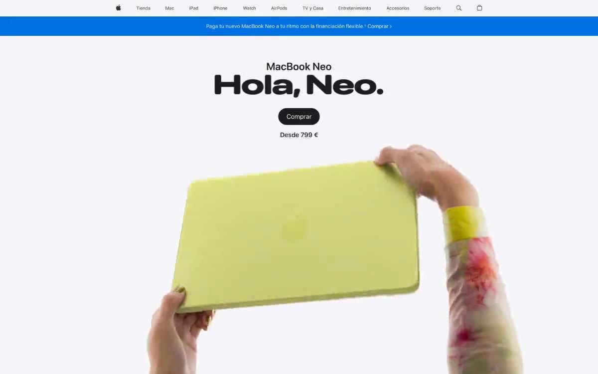
Apple's visual language is primarily product photography: close-ups of hardware against a pure white or color background, without lifestyle context or staged scenes. The main image shows hands holding a pastel green MacBook Neo—the human element is secondary, demonstrating scale and texture rather than emotion. In the product variant sections, two devices are presented side by side against a background of matching trim colors (pink, green, silver, sky blue), each card a flat color field with the product at the center. Detail shots use extreme close-ups (the laptop hinge, the camera module) against a neutral background. There are no illustrations, no abstract graphics, no decorative images—the product itself is the visual element. Iconography is everywhere—monochrome line icons in the SF Symbols style, 1.5–2px thick, taken from the Apple system icon set. The photography is always done in a high-key manner: uniform, shadow-free lighting that reduces the product to a graphic form rather than a three-dimensional object.
Palette
Brand
- Electric Blue
#0071e3— Filled action buttons are the only color accent in the UI, used sparingly for calls to action. - Link Blue
#0066cc— Inline text links, links with arrows and chevrons. - Citrus Gradient
#3b3b23— An alternative finish that has become the product's signature feature is a dark base that fades into yellow-green highlights.
Neutral
- Primary Ink
#1d1d1f— Headlines, body text, and button labels are the dominant foreground tone across all surfaces; the background of the main product image smoothly transitions from a solid #1d1d1f at the top to a chromatic blue. - Mid Gray
#707070— Secondary text, inactive navigation state, muted UI labels - Deep Gray
#474747— Navigation text and iconography are in medium font. - Hairline
#d6d6d6— Thin boundaries between sections and UI elements. - Canvas
#f5f5f7— Alternating section backgrounds - a gray stripe that separates the white areas. - Paper
#ffffff— Card surface, main page background, button text on a dark background.
Typography
from 12 to 96px · 10 steps
- SF Pro Display — replacement: Inter · outlines 600, 700 · Hero headings and subheadings for display — 700 weight at 80–96px with negative letter spacing of -1.44px creates Apple's signature "massive headline floating in white." Substitutes: Inter, system-ui
- SF Pro Display — replacement: Inter · outlines 600 · Section headings, card titles, subheadings - a 600 font with slightly positive letter spacing feels warm and friendly at medium sizes, unlike the short headings above.
- SF Pro Text — replacement: Inter · outlines 400, 500, 600 · For body text, navigation, supporting paragraphs, and small captions, a font with an index of 400 at 17px is the primary font. Negative letter spacing allows for a more concise main text on information-heavy pages.
Intervals and form
| Purpose | Meaning |
|---|---|
| Density | dense |
| Basic step | 8-10px |
| Button radius | 980px |
| Card radius | 28px |
| Shadows | no - borders instead of shadows |
| Between sections | 100-120px |
| Page width | 1200px |
AI will build your website in Apple (España) style and fill it
- Fill with products and posts via the link - Instagram, TikTok, Facebook.
- Transfer content from your old site—just specify the address.
- Modern design on the best engine: React ( Next.js) with server rendering and SEO optimization out of the box.
- Fully automated SEO optimization for search results and neural network recommendations.
Similar styles
- Airbnb — A quiet white gallery wall with a single coral red bookmark
- Peak Design — Gallery wall, partially illuminated
- Ramp — The editorial finance department, black and white pages with a single neon marker. The publication's practically monochrome surface, where a single bright lime-green stroke transforms every interaction into a monetary signal.
- 099 SUPPLY — A gallery wall filled with black and white objects
- Orderful — Industrial Logistics Control Deck - A printed logistics dispatcher checklist, done in black ink and surgical red, each page discreet enough to allow one operator to shout out something important.
- Apple (España) — white gallery display case
- teenage engineering — Industrial catalog in studio lighting - the product is the only significant object on the page, and everything else is discussed around it
- Apple (España) — A gallery window in the morning fog
- Lightship — A cinematic diorama of the open road. Warm cream gallery walls adorned with large landscape photographs mounted at close intervals, thin black type barely visible on the frames, and a single bright orange accent breaking the monochrome like a bonfire in a meadow.
- Custo — A gunmetal-colored gallery with a monolithic font. A showroom in muted gray-green tones, where a single dark object and 57px font speak for themselves.
- Silencio — A white room with floating artifacts. A gallery display made of warm paper, where each element occupies its place against a background of negative volume, and the silence is an intentional design decision.
- ORYZO AI — A photo essay about a darkroom. A solitary object hovering in the warm darkness, cream font the only decoration.