
Allbirds
Natural materials on white linen
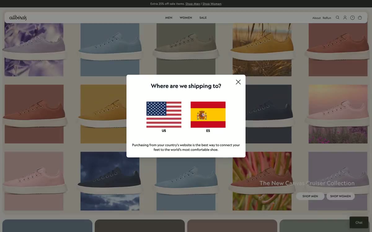
Allbirds operates with a calm, natural confidence—a nearly entirely achromatic canvas, complemented by warm sand (#e0dacf) and muted earth tones drawn directly from product photography. The user interface doesn't interfere with the product experience: white surfaces, thin borders, all-caps navigation, and pill-shaped controls that feel more like physical buttons than web elements. Self Modern (a custom serif font) is used for the few crucial moments requiring editorial attention—headlines and collection names—while Geograph is used for each lettering, body copy, and button in three balanced weights. Category cards become a color system: each takes its background hue from the featured product, transforming the navigation into a living Pantone palette.
The maximum width is ~1200px, centered with generous side padding. The main element is a full-width editorial strip on a warm sand background with a large product carousel radiating from the center. The category navigation is a grid of four identical colored cards in four columns, each containing a single centered shoe model. Below the fold, the layout alternates between full-width split panels (lifestyle photo on the left + product sample on the right) and centered product carousels under a small, underlined section title. The overall rhythm is: full-width editorial panel → four-column grid → centered product carousel → two-column split → centered product carousel. The spacing between sections is 40-56px, creating airy but not overwhelming transitions. The navigation is a minimalist, fixed top bar with centered primary links.
Photography is the entire visual system. All product shots are close-up, from a slight angle, against a solid background that matches or complements the shoe's accent color, effectively turning each photo into a color study. The lifestyle photos are shot in warm, sunny tones, in natural settings (agave fields, wooden decks, rough terrain), subtly muted to match the muted palette. There are no illustrations, no 3D renders, no abstract graphics. In collaboration with Pantone, the literal color palette is used as a graphic element. The iconography is minimalist and monochrome (outline icons in navigation and auxiliary positions).
Palette
Neutral
- Canvas White
#ffffff— Page background images, card surfaces, product card background images. - Charcoal
#212121— A neutral color is supported for secondary UI elements, dividers, and muted labels. It should not be used as the primary color for calls to action. - True Black
#000000— Headings, icons, high-contrast frames, navigation text. - Warm Sand
#e0dacf— Main section background, additional surface shade, large editorial panels. - Olive Char
#222519— A neutral color is supported for secondary UI elements, dividers, and muted labels. It should not be used as the primary color for calls to action. - Iron Gray
#525252— Secondary text, auxiliary text, unobtrusive frames.
Typography
from 12 to 40px · 6 steps
- Self Modern — replacement: Playfair Display · outlines 400 · Headlines and editorial are used sparingly, highlighting key phrases and collection titles. Serif and italic typefaces break up the monotony of sans-serif typefaces and convey the message: "This is the essence of the story."
- Geograph — replacement: Inter · outlines 400, 500, 700 · The primary font for the user interface includes body text, navigation labels, buttons, product headings, footers, input fields, and icons. 500 for highlighted headings, 700 for product names. Wide letter spacing (0.025em–0.10em) in capital letters in navigation labels and categories establishes a consistent brand style.
- HurmeGeometricSans3 — replacement: Inter · outlines 400 · Rarely used as a backup or dedicated label for a button. Geograph uses this system daily.
Intervals and form
| Purpose | Meaning |
|---|---|
| Density | dense |
| Basic step | 8-16px |
| Button radius | 9999px (pill) |
| Card radius | 16px |
| Shadows | no - borders instead of shadows |
| Between sections | 40-56px |
| Page width | 1200px |
AI will build your website in Allbirds style and fill it
- Fill with products and posts via the link - Instagram, TikTok, Facebook.
- Transfer content from your old site—just specify the address.
- Modern design on the best engine: React ( Next.js) with server rendering and SEO optimization out of the box.
- Fully automated SEO optimization for search results and neural network recommendations.
Similar styles
- Lightship — A cinematic diorama of the open road. Warm cream gallery walls adorned with large landscape photographs mounted at close intervals, thin black type barely visible on the frames, and a single bright orange accent breaking the monochrome like a bonfire in a meadow.
- Faire ES — wholesale catalog of warm cream
- Adanola — An editorial lookbook on white paper. A fashion shoot where typography and photography breathe on clean white surfaces, with black ink for the typeface and a subtle signature sans-serif font (Favorit), reflecting the brand's overall style.
- Oura Ring — A cozy oatmeal making workshop, bathed in soft daylight
- Stykka — A Scandinavian workshop in white light – a quiet, handcrafted showroom where the only voice is photography
- DJI — aerospace black canvas with a single electric blue highlight
- Altitude Beverages — Monochrome magazine spread. Imagine a fashion magazine spread stripped of all color except for the still photos—the text and white space tell the whole story.
- AATHER — An open palm, a single flame - a quiet luxury contained in stillness
- Cowboy — A Belgian bicycle gallery in a snow-white porcelain setting. A showroom where matte surfaces, large fonts used in editorial materials, and a virtual absence of decoration draw the eye to the bicycle and its contents.
- Refero — Editorial layout on white marble - a product page created by a typographer, where the serif headline is the brand's calling card, and everything else is unobtrusive
- Face Formula — A Scandinavian editorial portrait. A calm, magazine-style spread, where the model's gaze and the headline, written in a condensed serif font, speak for themselves against a cool, foggy backdrop.
- Shupatto — Museum display case on white marble