
Wise
Deep moss with a limestone tension. Limestone sparks on the almost black forest floor, and massive, angular figures signal every movement.
The Wise typeface speaks with a confident, slightly loud voice: a deep forest green (#163300) occupies most of the surface area—text, navigation, dark sections, icons—while a single bright lime green (#9fe870) serves as functional punctuation on calls to action, active tabs, and key elements. The typeface is almost aggressive: Wise Sans with a line weight of 900, densely packed, stands out in large letters (100px+) on the home screen. The rest of the system remains discreet on an off-white canvas with soft gray surfaces (#e8ebe6). Components are pill-shaped by default—buttons, navigation segments, checkbox thumbnails, image masks—with small radii (10px) reserved for cards and input fields. Color gradients are rare; instead, the combination of salamander and forest green smoothly changes as sections darken, creating a rhythm without excessive decoration.
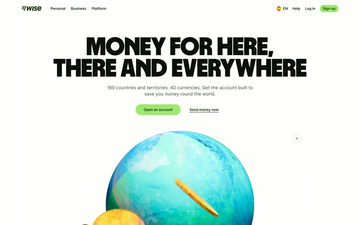
A 1200px-maximum-width container, centered, with a top and dark section spanning the entire width of the page. The header layout features a massive, centered headline on a white background, with a large illustration (globe) extending beyond the bottom edge of the viewport. The section rhythm alternates between white, light green, and a dark section in "forest ink," creating a natural color rhythm. The content layout is primarily centered: blocks of text and images in two columns at the top, or rows with primary elements in three columns in the secondary sections. A five-column grid with flags is used to display the list of countries. The navigation is a single, fixed top bar with a segmented toggle. The QR code remains fixed in the lower right corner at all scroll positions.
3D illustrations depicting a globe with gold coins create the brand's visual world—tactile, slightly surreal, executed with soft gradients and warm lighting. Photography is minimalist; when used, it's high-key and casual. National flags are presented as circular thumbnails in a five-column grid—the only "iconic" system is national identity. No abstract graphic elements, no standard templates. The globe and coins are a recurring motif of the mascot, signaling global reach through a single, warm, optimistic object, rather than a montage.
Palette
Brand
- Forest Ink
#163300— The brand's dominant dark style—navigation text, dark section backgrounds, body text on light surfaces, icon outlines, and filled navigation elements—is what defines its strength: wherever weight or authority is required, you choose Forest Ink. - Lime Voltage
#9fe870— Green is used as a secondary accent for decorative details and to highlight less frequently used search queries. It should not be used as the primary color for calls to action. - Spruce
#054d28— A secondary dark green is used for card surfaces, minor iconography, and to add depth to dark areas where Forest Ink is too saturated.
Neutral
- Linen Mist
#e2f6d5— A light green shade for soft highlights on surfaces, tinted card backgrounds, and hover states on navigation bars. A subtle shade of signature green for discreet container design elements. - Signal Blue
#0b4c72— The blue color serves as an additional accent for decorative details and to emphasize low frequencies. - Alarm Red
#cb272f— Red serves as a supporting accent for decorative details and to highlight uncommon colors. Use it as a supporting accent, not as a status color. - Charcoal
#454745— Body copy, body text, rich UI - a slightly warm black that feels softer than a pure #000 on a white background. - Obsidian
#0e0f0c— Headings, high-contrast headings, pure black elements in the navigation and main menu. Black with a slightly greenish tint, not a neutral gray. - Pebble
#868685— Subdued secondary text, placeholder text, icon outlines, and input field borders. Medium gray, receding into the distance.
Typography
from 12 to 105px · 10 steps
- Inter — replacement: Inter (native Google Fonts) · outlines 400,500,600,700 · Body text, user interface, captions, and subheadings throughout the product. A 700-weight font is used for mid-level headings (36–45px), 500–600 for subheadings and captions, and 400 for body text and captions. Inter provides a subtler look, while Wise Sans provides a bolder look.
- Wise Sans — replacement: Inter Black (900) with -0.04em tracking · outlines 900 · Headlines are a brand's calling card. A super-dense 900 font with 89–105px pitch and tight letter spacing transforms each headline into a bold, bold ad. They are used sparingly: as body text, for section headings, and for campaign highlights.
- monospace — replacement: Inter · outlines 400 · monospaced - found in the extracted data but not described by the AI.
Intervals and form
| Purpose | Meaning |
|---|---|
| Density | dense |
| Basic step | 8-12px |
| Button radius | 9999px |
| Card radius | 10px |
| Shadows | no - borders instead of shadows |
| Between sections | 64-80px |
| Page width | 1200px |
AI will build your website in Wise style and fill it
- Fill with products and posts via the link - Instagram, TikTok, Facebook.
- Transfer content from your old site—just specify the address.
- Modern design on the best engine: React ( Next.js) with server rendering and SEO optimization out of the box.
- Fully automated SEO optimization for search results and neural network recommendations.
Similar styles
- Integrated Biosciences — bioluminescence lab at midnight
- Huly — Northern Lights at Midnight Observatory - the protagonist is a vertical beam of purple fading into coral, and each quiet section below it borrows the same two-tone story told in a more subdued tone
- Dia Browser — A darkroom gallery space blends with an editorial newspaper. The pitch-black scene reveals a sunlit newspaper spread, each section marked by a single serif headline.
- Mintlify — A cloud garden above a glass table. The hand-drawn sky and documentary are framed together—the only place where color and concept collide before the page fades into monastic white.
- Gleap — A workspace decorated in warm cream tones with graphite accents—a studio where matte black ink dots seem to float above the linen architecture.
- ClickUp — A powerful dashboard on white marble. The page is a product brochure for a productivity tool, so the visual language is borrowed from the product itself: dense lists, status indicators, groups of avatars, and bold typographic statements that look like a product specification on display.
- monday — White workshop with pastel stickers
- Portal — Twilight Serif Editorial - A premium spread in an independent magazine, designed in the style of iOS
- Slack — The stage is eggplant-colored with white spotlights. A deep plum hue dominates the dark areas, while the off-white canvas allows the large, avant-garde titles to breathe freely.
- Base44 — Sunlit notebook with lime marker
- Letters — A morning appointment at an open-air clinic—a sterile white table under a soft blue ceiling, strewn with surgical blue instruments
- Duolingo — Green playground with thick marking lines