
Superpower
Bioluminescent Health Management Center
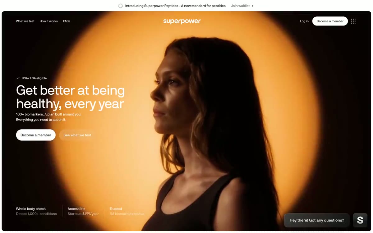
Superpower embodies a serious clinical promise in a cinematic, atmospheric user interface: dark, full-width photographs seamlessly transition into crisp white content surfaces, while a single vibrant sunrise orange accent pulses throughout the system. The typography represents the brand—a signature geometric sans-serif with minimal negative letter spacing, scaling from 11px for metadata to 66px for display, with line spacing that compresses as the size increases (1.00 for display, 1.40–1.50 for body copy). A floating, dark, capsule-shaped navigation bar hovers above the images, and capsule-shaped calls to action create a tension between clinical precision and warm, vital energy. Surfaces are largely flat—the system relies on plenty of white space, subtle zinc dividers, and a single, subtle shadow pattern rather than a strong elevation. Colours are used sparingly: almost everything is black, white or zinc grey, with orange appearing only as functional punctuation marks in actions and branding.
The main image is dominated by a full-width cinematic photograph—a person's silhouette against a deep turquoise-blue sky; the image is intentionally dark and moody to create emotional weight and contrast with the health promise. Secondary images are narrow, uncluttered product-style shots (the marbled orange membership card, app screenshots) rather than lifestyle photography. There are no illustrations, no 3D renders, no abstract graphics—the photographic contrast is the visual identity. The membership card is adorned with an organic marble pattern/lava lamp in Sunrise tones—the only decorative visual element. Icons are 7.5px line-radius (soft rounded squares) with subtle strokes of black Carbon.
Palette
Brand
- Sunrise Coral
#fc5f2b— Orange is used as a secondary accent for decorative details and to highlight infrequent cues. It should not be used as the primary color for calls to action. - Coral Glow
#ff8b64— Gradient end point combined with Sunrise Coral color for decorative design of membership cards.
Neutral
- Carbon Black
#18181b— Main text, floating navigation bar fill, headings, icon outline. - Pure Black
#000000— Logo, text sign, frames with deep contrast - Zinc Gray
#71717a— Main text, additional descriptions, hidden metadata, auxiliary text. - Ash Gray
#a1a1aa— Tertiary text, inactive borders, disabled states - Mist Gray
#e4e4e7— Fine edging lines, card outlines, dividing lines, button frames. - Fog Gray
#f4f4f5— Subtle surface irregularities, muted background, image superimposed on a mesh base.
Typography
from 11 to 66px · 8 steps
- NB International Pro — replacement: Inter Tight · outlines 400, 700 · Everything—design, headings, body copy, user interface, and navigation—is seamlessly integrated. The signature solution is aggressively narrow negative letter spacing, scalable depending on size (from -0.025em to 66px for small body copy), combined with line spacing that compresses as the size increases, giving the headlines a monolithic, poster-like density that distinguishes Superpower from its lightweight competitors in the medical technology space.
- NB International Mono Pro — replacement: JetBrains Mono · outlines 400 · Tabular metadata, microtext annotations, technical labels are used sparingly in situations requiring a clinical/instrumental approach.
Intervals and form
| Purpose | Meaning |
|---|---|
| Density | average |
| Basic step | 11px |
| Button radius | 9999px |
| Card radius | 15px |
| Shadows | no - borders instead of shadows |
| Between sections | 75px |
| Page width | 1200px |
AI will build your website in Superpower style and fill it
- Fill with products and posts via the link - Instagram, TikTok, Facebook.
- Transfer content from your old site—just specify the address.
- Modern design on the best engine: React ( Next.js) with server rendering and SEO optimization out of the box.
- Fully automated SEO optimization for search results and neural network recommendations.
Similar styles
- Visitors — white engineering drawing
- Dock — Sunlit Cream Paper, Cobalt Pulse
- Flying Papers — Confession on a Saturday Morning Cartoon
- Quizlet — The classroom is decorated in a variety of colors against a white background - a quiet desk, behind which four pastel cards are the only bright accent against a backdrop of cool gray walls and a single mark made with an indigo marker.
- ON.energy — Yellow high voltage warning sign on midnight steel
- Navigate — A large set of stickers attached to a board: large grotesque font, all in the form of tablets and five multi-colored icons, repeating like a logo
- Linear — midnight precision instrument
- Pop Site — A stark typographic gallery – monumental black headlines floating on white walls, with a single blue dot expressing intent
- Hyperstudio — The design is scratched into obsidian. Text and fine lines frame a white space of pure black, with occasional golden compass marks indicating the way.
- Pa'lais — A botanical sketchbook, as if soaked in honey. Cream paper, blue toile de Jouy line illustrations, and warm pops of color evoke a handmade recipe book, while a bold, condensed font and plenty of white space give it a modern, editorial feel.
- Raus — A cozy journal written on cream paper—each page is like a postcard from the forest.
- Privy — An editorial rendered in ink on marble. White marble canvas, tightly compressed black serif headlines, a single purple banner crossing the top—restraint as authority.