
Spotify
Night jukebox control room
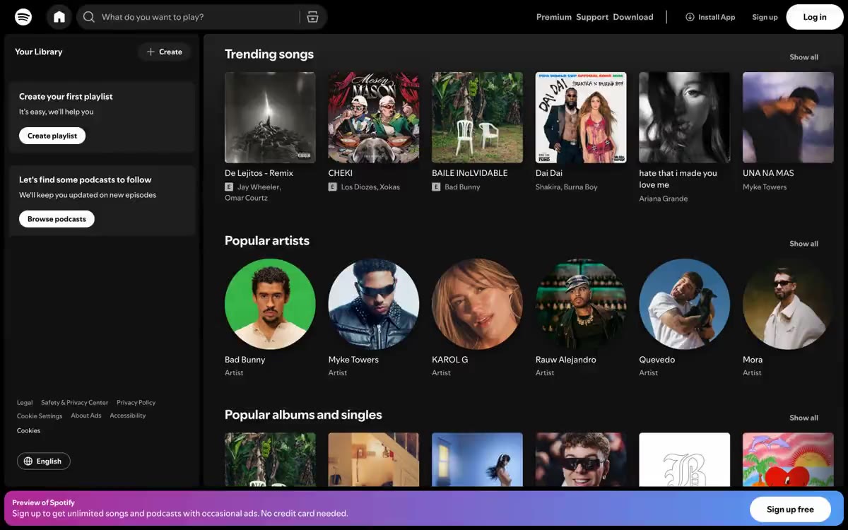
Spotify's web interface is a dense, dark media control center: a near-black canvas adorned with vibrant album art, a single signature green accent, and pill-shaped controls. The typography is compact and utilitarian—a custom-designed geometric sans-serif typeface at a small size, allowing the album art and artist photos to do the bulk of the visual work. The layout is a fixed two-column shell (sidebar + main feed) with a grid of square album art and round avatars, creating a rhythmic alternation of geometric types. The interface avoids sharp changes in height, relying on subtle surface distinctions (#121212 cards on a #000000 canvas) and a single large gradient banner for energy. The result is a feel of a DJ booth: information-dense, acoustically dark, and ready to play at a glance.
A fixed two-column layout features a left sidebar ("Your Library") and a responsive main content area. The top bar is a full-width black bar with search on the left and account actions on the right. The main content scrolls vertically, with horizontal carousels of cards—popular songs in a 5-column square grid, popular artists in a 5-column circular grid, and popular albums/singles continuing this pattern. The spacing between sections is compact (32 cm). The bottom ad banner is anchored at the bottom of the viewport. Navigation is handled exclusively via the top bar and sidebar—no mega-menus or breadcrumbs. The rhythm alternates: square cards → round cards → square cards, creating geometric contrast between sections.
Album covers and artist photos are the primary visual content. The covers are presented as dense square fragments (1:1 aspect ratio) with a 6px radius—crisp enough to look editorial yet soft enough to be contemporary. Artist photos are round fragments, emphasizing the face as an identifier. The main interface is free of decorative photos, lifestyle images, or abstract graphics. The only non-photographic visual element is a purple-to-blue gradient banner at the bottom, which serves as the sole element of the brand color. Icons are minimalist, monolinear, white on a dark background—small and functional, never decorative.
Palette
Brand
- Spotify Green
#1ed760— Green is used as a secondary accent for decorative details and to highlight less frequently used search queries. It should not be used as the primary color for calls to action.
Neutral
- Pure White
#ffffff— A light supporting surface for creating an unobtrusive background and separating sections. It shouldn't be used as the primary color for the call to action. - Signal Red
#b85850— Red serves as a supporting accent for decorative details and to highlight uncommon colors. Use it as a supporting accent, not as a status color. - Void Black
#000000— Page canvas, top navigation background, deepest surface layer - Carbon
#121212— Cardboard surfaces, side panels, secondary surface layer over canvas - Graphite
#1f1f1f— Raised surface - hover states, input fields, selected navigation elements. - Smoke
#292929— Active navigation background, slight backlight effect.
Typography
from 11 to 24px · 4 steps
- SpotifyMixUI — replacement: Inter · outlines 400, 600, 700 · Body copy, navigation, buttons, metadata, small captions—a compact, information-rich design designed to be subtle, allowing the artistic elements to dominate.
- SpotifyMixUITitle — replacement: Inter weight 700 · outlines 700 · Section headings ("Popular Songs," "Popular Artists") - a bold, moderate-sized font makes the headings stand out without overloading the card grid.
Intervals and form
| Purpose | Meaning |
|---|---|
| Density | dense |
| Basic step | 8-12px |
| Button radius | 9999px |
| Card radius | 6px |
| Shadows | minimal |
| Between sections | 32-48px |
AI will build your website in Spotify style and fill it
- Fill with products and posts via the link - Instagram, TikTok, Facebook.
- Transfer content from your old site—just specify the address.
- Modern design on the best engine: React ( Next.js) with server rendering and SEO optimization out of the box.
- Fully automated SEO optimization for search results and neural network recommendations.
Similar styles
- Resend — black velvet with purple neon color
- Neon — A server room after dark. Pure darkness, where the only light comes from data and user interactions.
- Discord — The game world is hidden behind a pop-up chat window - each section is a self-contained environment with its own lighting and set of characters
- Idle Finance — The neon trading floor of the deep-sea terminals is a dark naval terminal where a single blue light pierces the gloom.
- Midjourney — A bioluminescent terminal in the deep ocean. A deep-sea world where intelligence visually generates itself in ASCII streams, and controls appear as faintly glowing patterns.
- Netflix — Infinite Digital Shelf. A cinematic experience where an endless library of content is presented against a pitch-black, theatrical backdrop.
- Wope — Wope is a purple horizon interface. Imagine a dark observatory table with a purple light beaming from beneath the glass.
- basement — An empty printing press at 3am – huge, compressed fonts splaying across the pitch black, a single glimmer of orange light on the navigation bar, everything else white or ghostly grey.
- Ori — The server room at midnight is a black void, white light, one switch on.
- Amaterasu — Celestial Turquoise Sanctuary
- Stink Studios — A film studio at midnight - the projector hums, the room is dark, only the film is lit
- Obsidian — A repository of crystalline knowledge. A clear, multifaceted digital space designed for clarity and focus, with luminous purple veins of interaction.