
ORYZO AI
A photo essay about a darkroom. A solitary object hovering in the warm darkness, cream font the only decoration.
ORYZO's visual system treats each individual product object as a museum piece: a canvas in warm, dark tones, creamy type floating in large negative space, and a complete absence of interface elements competing with the form. All text elements are written in all-caps with a 500-weight font, with the exception of the body copy at 29px/400, which is the system's only conversational element. A single, bright orange color is used only for attribution lines and studio links—never for buttons or calls to action—hence its rarity. The layout alternates between two modes: a photographic hero (the product in context with tools and materials) and a void-based display mode (the product isolated against a warm, dark background), connected by thin, dotted dividers and pill-shaped controls.
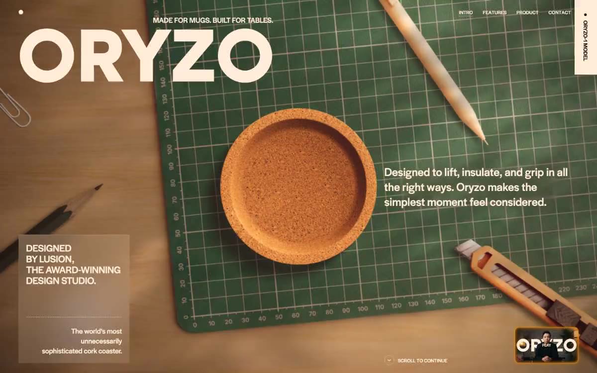
The entire page is unlimited in width—there is no maximum-width container, and each section takes up 100vw. Home screen: a full-screen photo from top to bottom with a massive ORYZO logo (51px+) in the top left corner, a tagline above, fixed minimalist navigation in the top right corner, a vertical sidebar along the right edge, a translucent info card in the bottom left corner, and a video thumbnail in the bottom right corner. Subsequent sections: a full-screen Walnut Shadow canvas with a centered 3D render of the product surrounded by a left-aligned title and right-aligned body copy—a three-column grid (text/object/text) with wide 18px gutters. Transitions between sections are smooth, dark on a dark background; the only breaks are thin dotted dividers. Navigation is fixed, transparent, with a maximum of 4 elements. There's no sidebar, no chrome in the footer, no cards within cards—every screen feels like a single entity.
The photographs are editorial in nature, shot from a top-down perspective and in context: a cork coaster rests on a green cutting mat, surrounded by pencils, a craft knife, and a paperclip—the tools of the trade visible in the frame. The green cutting mat (#445231) is a display element only, not a UI element. The sections dedicated to product presentation are dominated by 3D renderings: the cork coaster is shown isolated against a Walnut Shadow background, lit from the top right with a warm rim light, with alternating angles from top-down to three-quarters. There are no lifestyle photos, no people, no stock images—the object is the protagonist, and the tools are its context. The images occupy the entire screen, have crisp edges (no rounded masks), and are processed with high contrast and warm color correction.
Palette
Neutral
- Warm Cream
#ffedd7— Light text on dark surfaces, inverted captions and high-contrast images. - Walnut Shadow
#100904— The page's canvas and deepest background are warm, almost black, but not pure black. A void lurks behind every product announcement. - Bark Brown
#382416— The raised surface and filled background of the button are one color step above the canvas, used for a single, continuous call to action. - Cork Border
#40372e— Subtle dividing lines, dotted section dividers, barely noticeable container borders – one step warmer than the canvas itself. - Driftwood
#6c5f51— A warm, medium-toned gray for secondary partitions and muted structural elements, it bridges the gap between Bark and Cream. - Ember Accent
#dc5000— Orange is used to highlight links, tags and short phrases.
Typography
from 18 to 51px · 5 steps
- halyard-display-variable — replacement: Inter or Söhne · outlines 400, 500 · A single font. The 500 weight with a 51px pitch is used for headings, demonstrating exceptional confidence in the use of capital letters; the same font with a 400/29px pitch becomes the sole font for body text, using mixed case. Letter spacing remains standard—the geometric shapes do their job without compression. For a closer structural match, you can use 'Inter', 'Söhne', or 'Neue Haas Grotesk'.
- Arial — replacement: system-ui · outlines 400, 500 · A system-wide fallback for microlegal labels (8px uppercase, e.g., "* ADOBE ILLUSTRATOR"). This isn't a design decision, but a requirement for automatically generated system disclaimers.
Intervals and form
| Purpose | Meaning |
|---|---|
| Density | average |
| Basic step | 18px |
| Button radius | 8px |
| Card radius | 12px |
| Shadows | no - borders instead of shadows |
AI will build your website in ORYZO AI style and fill it
- Fill with products and posts via the link - Instagram, TikTok, Facebook.
- Transfer content from your old site—just specify the address.
- Modern design on the best engine: React ( Next.js) with server rendering and SEO optimization out of the box.
- Fully automated SEO optimization for search results and neural network recommendations.
Similar styles
- 21 TSI — A crimson void, a single silhouette – a high fashion editorial where the user interface dissolves into the atmosphere
- Ysl — A still from a black and white film - one model under one logo, nothing else is allowed
- Channel Studio — A studio photo lab with one coral lampshade
- Assembly Coffee London — Coals in a dark roastery. A nearly black canvas with warm, dimly lit product photos and cursive serif lettering—the feel of a specialty coffee menu printed in a midnight samizdat.
- PostNew — A gallery open after hours and designed in daylight
- Factory — The "war room" terminal at midnight. The "factory" is a stark black control panel where a single white card lands like a flashlight-lit dispatch—the only object in the room is the work itself.
- Numbered — A fashion shoot on black velvet. A nearly black catwalk, where the frame is filled with a single face, the only marks being white ink and a barely perceptible bronze thread.
- Apple (España) — black theater with illuminated fittings
- Home page | Impossible Foods — A blood-red punk poster in velvet darkness. A custom-designed, compressed banner blurs across a wine-colored canvas, while solid red calls to action poke through like a price tag on a butcher's block.
- Ferrari — A frenetic cavallino on black marble. Black voids interrupted by the unmistakable Ferrari red, white capital letters, and full-width cinematic shots.
- OpenSea — Black trading terminal with matte blue framed frames
- Arthursimonini — Film program printed in black ink