
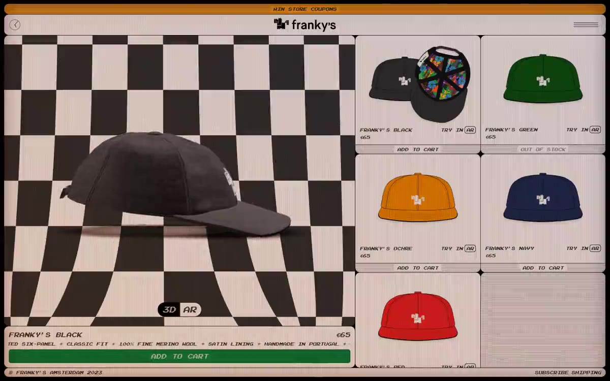
FRANKY'S
A retro gaming kiosk on the counter of a skate shop
Franky's visual language is a combination of retro arcade and skateboard shop: a warm cream canvas (#f3e5df) framed by rigid pixel borders, a ubiquitous black-and-white checkerboard, and a single pixel font, Arcade, used for every word on the website. The palette is intentionally sparse—only two chromatic colors remain (signal orange #faa21f for the sign and rich green #128e44 for the buy button), with the entire hierarchy expressed by increasing the Arcade font weight from 400 to 700 and by using black against the cream background. Surfaces remain flat and monolithic; depth is achieved only through the inserted 1px cream line on the buttons and the tonal play of the checkerboard. The components are reminiscent of 1990s storefront sprites: thick black borders, tight 6-12px border radii, compact 4-8px padding, and 3D/AR toggles that look like pixelated icons rather than chrome elements. The new pages are meant to maintain the arcade-like atmosphere: no gradients other than an orange scrolling text, no soft shadows, no decorative typography—only cream-colored paper, black pixelated lines, and a single warm orange color.
On desktop, the product page displays a full-width, centered layout with a maximum width of 1200px. The top-to-bottom rhythm is: orange scrolling text → cream-colored header with a black line → two-column split (55% checkerboard on the homepage / 45% two-column grid of product cards) → cream-colored stripe in the footer. On mobile, the homepage collapses into a full-width checkerboard, and the grid becomes a single-column layout. Cards are evenly distributed in a two-column grid with gray Pixel (#e5e7eb) dividers between them. The spacing between sections is minimal (43–61px), and the interface never uses dark stripes that span the entire width of the page—the cream canvas is displayed without interruption.
A photograph of caps against a clean cream background, centered and tightly cropped, with a soft, charcoal-black shadow underneath. No lifestyle, no models, no context—the cap is the star. A checkerboard pattern behind the main element serves as the graphic surface. No illustrations, no 3D renders except for the augmented reality toggle, no decorative icons except for the pixelated cross in the logo.
Palette
Brand
- Marquee Orange
#faa21f— Notification bar at the top of the screen, accent elements, branding. - Buy Green
#128e44— The "ADD TO CART" button is filled in - the only purchase action marked in green.
Neutral
- Arcade Cream
#f3e5df— Page background, product card surfaces, button inserts. - Ink Black
#000000— Main text, checkerboard layout, all UI borders, card outlines, icon borders. - Pixel Gray
#e5e7eb— Thin borders, card dividers, structural rules between grid cells. - Charcoal
#333333— Secondary surface tone, checkerboard shadow squares, shadow color - Carbon
#151515— Rich neutral tones for filling illustrations and the densest checkerboard tiles. - Muted Gray
#737373— Disabled/muted text on buttons and in body text
Typography
from 10 to 18px · 4 steps
- Arcade — replacement: VT323 · outlines 400, 700 · A single font is used throughout the interface—all headings, labels, prices, buttons, body text, and icons are in Arcade. The transition from 400 to 700 is the only tool for creating hierarchy; using a second font would ruin the kiosk illusion.
Intervals and form
| Purpose | Meaning |
|---|---|
| Density | dense |
| Basic step | 4-8px |
| Button radius | 6px |
| Card radius | 12px |
| Shadows | no - borders instead of shadows |
| Between sections | 43-61px |
| Page width | 1200px |
AI will build your website in FRANKY'S style and fill it
- Fill with products and posts via the link - Instagram, TikTok, Facebook.
- Transfer content from your old site—just specify the address.
- Modern design on the best engine: React ( Next.js) with server rendering and SEO optimization out of the box.
- Fully automated SEO optimization for search results and neural network recommendations.
Similar styles
- 099 SUPPLY — A gallery wall filled with black and white objects
- teenage engineering — Industrial catalog in studio lighting - the product is the only significant object on the page, and everything else is discussed around it
- Custo — A gunmetal-colored gallery with a monolithic font. A showroom in muted gray-green tones, where a single dark object and 57px font speak for themselves.
- Walden — The silence of the forest floor - every product is a stone, every pixel is moss and silence
- Fiverr — The digital bazaar's focal point is a vibrant green pulse against dark theater stages. A single neon green dot serves as an anchor for the logo; the rest is monochrome, designed to highlight the appeal of the services offered.
- Peloton — A red beacon on a jet-black runway. A fitness showroom where a single bright red CTA sign cuts through the vast, dark exhibition space and leads to clean, white product rooms.
- HOUSEPLANT — a bookstore with nuts on linen paper
- Adam Lippes — A monochrome editorial studio on cream paper – a Vogue spread where the only decoration is the layout grid, not the color palette.
- Elektron — The equipment control panel at midnight is a nearly black canvas, where product photos shine while the interface remains virtually invisible.
- Sigmaphoto — The Monochrome Gallery of Precision Instruments is a quiet white room where the only color that matters is the one that calls you to action.
- Channel Studio — A studio photo lab with one coral lampshade
- Specht Studio — A gallery wall filled with discreet curiosity. The studio's own chrome finish is a white surface and black lettering; the visual fireworks are entirely concentrated within the project's tilework.